hue-rotate()
Summary
Shifts an element’s relative hue, for use by the filter property. Accepts either a deg or rad angle measurement representing a wheel of hues.
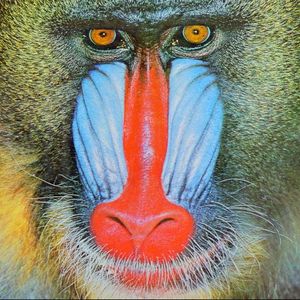
This CSS property value is reflected in the following image:
filter: hue-rotate(90deg);

Specifying measurements greater than 360° (or 2π rad) allows animations to cycle more than once around the color wheel. This example cycles colors three times, returning to its original set of hues (360 × 3):
@keyframes spinCycle {
    from { filter: hue-rotate(0deg)    }
    to   { filter: hue-rotate(1080deg) }
}
Examples
The following example shows the difference between two images, where one has a hue rotation of 180 degrees.

<!DOCTYPE html>
<html>
  <head>
    <title>Filter example</title>
    <style>
      .foo {
        float: left;
      }

      .bar {
        -webkit-filter: hue-rotate(180deg);
      }
    </style>
  </head>
  <body>
    <img src="/logo/wplogo_transparent_xlg.png" class="foo" />
    <img src="/logo/wplogo_transparent_xlg.png" class="foo bar" />
  </body>
</html>
Notes
The CSS filter corresponds to this SVG filter definition, based on a variable angle passed to the function:
<filter id="hue-rotate">
  <feColorMatrix type="hueRotate" values="[angle]"/>
</filter>
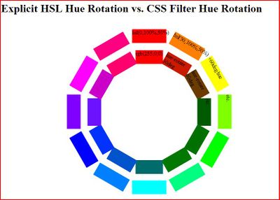
Note that the hue rotation algorithm for CSS filters only approximates a hue-rotation in HSL - the content is never actually converted to the HSL color space. This results in brightness and saturation clipping for saturated colors in certain ranges. For example, pure RGB colors, such as rgb(255,0,0), do not produce expected results, especially between 0 and 90 degrees. A comparison of manually rotated colors (outer ring) made by explicitly defining HSL colors, and their hue-rotate() equivalent (inner ring) using a base of pure RGB red (HSL equivalent: 0,100%,50%) is shown below. As you can see, the 60 degree hue rotation that should produce a bright saturated yellow, instead produces a color of the correct hue, but incorrect saturation and brightness.
Related specifications
- Filter Effects 1.0
- Editor’s Draft
- Filter Effects 1.0
- Working Draft
See also
Related articles
Filters
hue-rotate()