SVG grand tour
By Mike Sierra
Summary
This guide shows you how to build a pair of animating eyeballs, providing a comprehensive tour of SVG features detailed in other tutorials. It shows how to maintain a set of reusable graphic components, and provides essential context on SVG transforms and coordinate spaces.
SVG is a standard markup format, like HTML and XML, that renders Scalable Vector Graphics within web browsers. Vector or drawing-style graphics are implemented as pure shapes that render crisply at any magnification. In contrast, raster or paint-style images consist of a series of pixels that may not display well when zoomed at high resolution. Use SVG if you want to freely interact with portions of a graphic. Since SVG renders within the browser’s DOM, each graphic component can be styled through CSS, manipulated with JavaScript through core APIs, and can appear comfortably within HTML pages.
This section of the guide shows how SVG is deployed along with other core web standards, with which you should already be familiar. It highlights some notable differences, and provides a quick tour of many SVG features that are covered in more detail in other sections. It focuses on the unique way you can build complex interactive graphics from reusable components, and how to flexibly resize them and place them within various drawing surfaces.
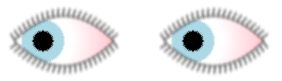
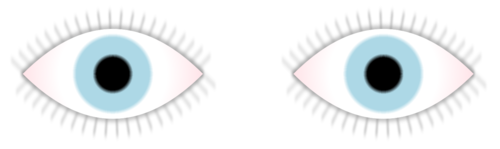
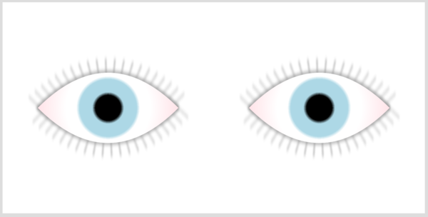
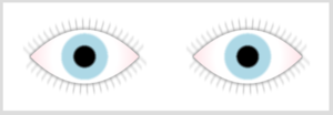
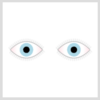
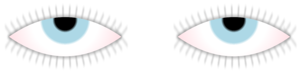
As part of a grand tour to get a feel for SVG markup, you’ll stroll through an example that shows how to build a pair of eyes, and how to move them around and make them blink. View the accompanying live demo here.
Defining the drawing area
There are several ways to deploy SVG, with various options outlined in the section at the bottom of this page. Examples used throughout this guide feature inline SVG that’s directly embedded within HTML, which allows you to flexibly apply CSS and JavaScript to both the SVG graphic and the HTML content. The basic markup looks like this, with an svg element encapsulating the graphics:
<!DOCTYPE html>
<html>
<head>
<title>SVG grand tour demo</title>
<link href="css/eyeballs.css" rel="stylesheet" />
</head>
<body>
<svg width="600" height="200">
   <title>eyeballs</title>
   <desc>interactive demo showcasing several SVG features</desc>
</svg>
<script src="js/eyeballs.js"></script>
</body>
</html>
You can add title and desc elements wherever necessary to comment your markup.
(See SVG deployment for different ways to render SVG content.)
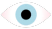
The eyeball
Adding this line within the svg region produces a circle. The cx and cy attributes position its center point, and the r sizes it relative to that point:
<circle id="eyeball" cx="100" cy="100" r="50"/>
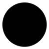
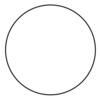
By default, it’s filled black. Adding a fill attribute allows you to color the background white, and a stroke attribute helps clarify the edge of the shape:
<circle id="eyeball" cx="100" cy="100" r="50" fill="white" stroke="black"/>
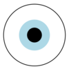
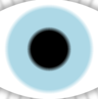
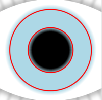
To add the iris and pupil, you can add more circles that specify different fill colors. Declaring the larger circles first prevents them from obscuring the smaller ones:
<circle id="eyeball" cx="100" cy="100" r="50" fill="white" stroke="black"/>
<circle id="iris"    cx="100" cy="100" r="25" fill="lightblue"/>
<circle id="pupil"   cx="100" cy="100" r="12" fill="black"/>
(See SVG shapes for more about basic graphic elements such as circles, ellipses, rectangles, and polygons.)
Styling via CSS
In this example, the id, cx, cy, and r are all ordinary attributes, while the fill and stroke are known as presentation attributes. These are simply CSS properties that happen to be expressed as attributes. Other than the tendency of longer CSS property names to use dashes-between-lowercase-words rather than camelCase for attribute names, there may be no way to tell the difference by looking at them.
Many CSS properties such as fill and stroke apply only to SVG content. Some, like font-size, apply to both SVG and HTML. Some behave like CSS properties that you apply to HTML, but are named differently. The fill property provides much the same capabilities in SVG as the background-color and background-image properties do for HTML. Since fill is a CSS property, You can also modify it locally via the style attribute. Doing so actually takes precedence over the value of presentation attributes, so this example changes the eye color to brown:
<circle id="iris" cx="100" cy="100" r="25" fill="lightblue" style="fill:brown"/>
As in HTML, you can consolidate CSS within style sheets to separate it from markup. Placing this CSS in the eyeballs.css file referenced from the HTML applies it to the slightly pared-down SVG markup that follows:
#eyeball { fill: white; stroke: black }
#iris { fill: lightblue }
#pupil { fill: black }
<circle id="eyeball" cx="100" cy="100" r="50"/>
<circle id="iris"    cx="100" cy="100" r="25"/>
<circle id="pupil"   cx="100" cy="100" r="12"/>
As you’ll see below, there are some cases where you want to avoid using style sheets.
(See SVG deployment for different ways to apply CSS.)
Applying a gradient
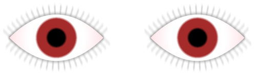
The concentric circles provide a good way to implement the edge of the iris and pupil, but are not good for the slight bloodshot color towards the edge of the eye. As an alternative, you can implement the entire eyeball as a large circle, within which a radial gradient builds a series of concentric rings:
<circle id="eyeball" cx="100" cy="100" r="150" fill="url(#eyeballFill)" />

<radialGradient id="eyeballFill">
  <stop id="inner"           offset="12%"  stop-color="black" />
  <stop id="pupil"           offset="15%"  stop-color="lightblue" />
  <stop id="iris"            offset="27%"  stop-color="lightblue" />
  <stop id="white"           offset="30%"  stop-color="white" />
  <stop id="bloodshotExtent" offset="40%"  stop-color="white" />
  <stop id="outer"           offset="100%" stop-color="pink" />
</radialGradient>
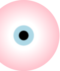
The circle element’s fill attribute uses CSS’s url() function to reference the id of the radialGradient element. Its nested stop elements define fairly abrupt gradations from the center towards the edge—from black to blue and then to white—followed by a more gradual transition to pink around the edge of the circle. SVG gradients work similarly to CSS gradients available for HTML content, but CSS gradients are only available via the background-image property, which doesn’t apply to SVG.
(See SVG graphics for details about gradients, and other information on using patterns and images.)
Referencing graphics
This new circle is much larger than the actual eyeball, because we want to move it around behind a smaller pair of eyelids. (Don’t worry for now that the shape is wider than the drawing area.) Before you build the eyelids, you should stash away the graphic components you’ve already defined. Add a defs region to the svg:
<!DOCTYPE html>
<html>
<head>
<title>SVG grand tour demo</title>
<link href="css/eyeballs.css" rel="stylesheet" />
</head>
<body>
<svg width="600" height="200">
   <title>eyeballs</title>
   <desc>interactive demo showcasing several SVG features</desc>
   <defs>
      <!-- place components here -->
   </defs>
</svg>
<script src="js/eyeballs.js"></script>
</body>
</html>
If you move the radialGradient within the defs region, the circle still references it as before, but if you move the circle there, it doesn’t render.
The SVG use element allows you a way to reuse graphic components repeatedly, and to place them in differently sized areas. After placing the circle within the defs region, pointing to it with a use element placed outside the defs makes it render:
<use xlink:href="#eyeball"/>
The use element can be a bit mystifying at first. It’s not simply a copy of the object it points to, but a deep reference. Any changes made to the prototype circle or radialGradient components appears dynamically wherever a use element references them. Despite this flexibility, you can’t redefine any of the referenced object’s attributes. But you can add optional presentation attributes that aren’t already defined there.
Since the use and its target element are placed in different parts of the document tree, CSS style sheets that ordinarily apply to the target do not automatically cascade to the use. However, you can apply CSS separately to the use element. This example applies the same style sheet based on the id of the target, and the class of any use that references it:
<style>
#eyeball, .eyeball {
    fill: url(#eyeballFill);
}
</style>
<svg width="200" height="200">
<defs>
<circle id="eyeball" cx="100" cy="100" r="150" />
<defs>
<use xlink:href="#eyeball" class="eyeball" id="eyeball_1"/>
</svg>
Note that if the targeted circle were also to share the same eyeball class in this example, then the use element would not have the flexibility to be able to change it.
Notice as well that the use element needs the xlink namespace to qualify the standard href attribute, which is also available in HTML with no namespace qualifier. This xlink:href attribute offers a different way to reference an object than the CSS url() syntax you see in the example above.
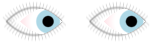
The eyelids
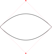
To place the eyeball within eyelids requires a clipping path, which allows an object to render only when it appears within another shape. In this case, the eyelids shape is a free-form path whose d (definition) attribute draws two curves that face each other:
<path id="eyelids" d="M 200,100 Q 100,200 0,100 Q 100,0 200,100" />
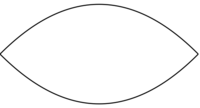
Each curve’s definition includes control points that influence the shape of the curve, but that do not themselves render. Starting from the right corner (M for move to), the first quadratic (Q) curve’s control point is placed at the top, and the destination is the left corner. The second quadratic curve places its control point at the bottom corner and ends up at the right corner:
To make the shape behave as a clipping path, place a clipPath element around the path. You will actually need to use this shape again, so it is best to use a reference to it:
<clipPath id="clipEyelid">
    <use xlink:href="#eyelids" class="eyelids" />
</clipPath>
Now apply the clip-path property to apply the clipping path to the eyeball shape. This example shows it assigned separately via CSS:
.eyeball {
    fill       : url(#eyeballFill);
    clip-path  : url(#clipEyelid);
}
<use xlink:href="#eyeball" class="eyeball" />
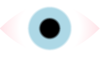
The only problem now is that the eyelid has disappeared. Clipping paths don’t actually render, so we need to point another reference to it. The first use below places the eyeball within the clipping path, and the second produces the path itself. The third use that appears outside the defs renders the entire object:
<defs>
<g id="eye">
  <use xlink:href="#eyeball" class="eyeball" />
  <use xlink:href="#eyelids" class="eyelids" />
</g>
</defs>
<use xlink:href="#eye" />
It becomes useful here to group the two graphic elements, wrapping a g element around them to consolidate a larger semantic eye object. You can reference the grouped object, and you will see below, move or otherwise transform it as a unit.
(See SVG shapes for details on path commands, and SVG graphics for clipping paths.)
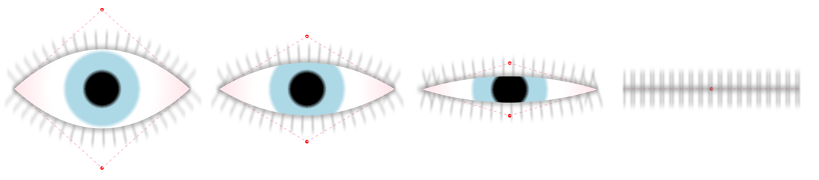
The eyelashes
Drawing the eyelashes along the eyelid requires a bit of creativity. We need to add a third reference to the eyelid shape.
<g id="eye">
  <use xlink:href="#eyelids" class="eyelashes" />
  <use xlink:href="#eyelids" class="eyelids"   />
  <use xlink:href="#eyeball" class="eyeball"   />
</g>
The eyelashes class presents the underlying eyelids shape much differently:
.eyelashes {
    fill              : none;
    stroke            : #ddd;
    stroke-width      : 40;
    stroke-dasharray  : 1,10;
    stroke-linejoin   : bevel;
}
The stroke-width thickens the edge so that it extends both inside and outside the shape. By default, the stroke is solid, but you can apply a dash pattern to break it into segments. Setting the stroke-dasharray property to 1,10 specifies that for every pixel rendered around the edge of the shape, skip another ten pixels. This has the effect of drawing individual eyelashes:
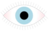
The beveled stroke-linejoin property prevents the stroke from rendering too far past the sharp corner of the eye where the eyelids meet.
(See SVG shapes for details on various stroke properties.)
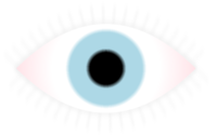
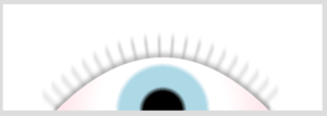
Applying eyeliner
Even after lightening the color of the stroke, the eyelashes appear way too crisp and thin compared to the eyeball, and could be softened and thickened up a bit. SVG filters provide many image processing tools that you can mix and match to produce such special visual effects.
Add a filter element to the defs region. It serves as a wrapper for various filter effect components, which by default are applied in sequence. In this case, the feGaussianBlur effect scatters the pixels around randomly (a bit more vertically than horizontally), and feComponentTransfer darkens the result:
<filter
    id           = "soften"
    x            = "-20"
    y            = "-20"
    width        = "250"
    height       = "250"
    filterUnits  = "userSpaceOnUse"
>
  <desc>soften eyelid and eyelashes</desc>
  <feGaussianBlur stdDeviation="1 3" />
  <feComponentTransfer>
      <feFuncR type="linear" slope="0.3"/>
      <feFuncG type="linear" slope="0.3"/>
      <feFuncB type="linear" slope="0.3"/>
  </feComponentTransfer>
</filter>
Since the eyelid renders horizontally between 0 and 200 pixels, the eyelashes spill slightly outside the the left edge of the original drawing area. The filter element’s x/y/width/height attributes apply the effect to a wider set of dimensions. Setting filterUnits to userSpaceOnUse uses the same coordinate system as the shape to which the filter is applied; otherwise values would be interpreted as percentages of the object’s bounding box.
Use the filter property to assign the effect to the shape used to render the eyelids and eyelashes:
#eyelids {
    filter : url(#soften);
}
Here is how it appears, first after the blur, then after the subsequent darkening:
(See SVG filters for information on various ways to combine SVG’s filter effects.)
Transforms and coordinate spaces
To finish off the graphic, group another instance of the eye object into a higher-level eyes object:
<g id="eyes">
  <use xlink:href="#eye"/>
  <use xlink:href="#eye"/>
</g>
This renders the same shape twice at the same location. To space them out, apply a transform. This moves the character’s right eye to the right a bit, and the left eye 300 units further:
<g id="eyes">
  <use xlink:href="#eye" id="eyeRight" transform="translate(50,0)"/>
  <use xlink:href="#eye" id="eyeLeft"  transform="translate(350,0)"/>
</g>
The transform attribute’s translate() function provides a flexible way to reposition objects referenced via use, but transforms can be applied to most any graphic element. SVG transforms provide the same functionality as two-dimensional CSS transforms. The scale() function accepts a decimal value to size the object, where 1 is the current size, 0 vanishes to a point, and values greater than 1 increase the size. The rotate() function accepts a deg or rad angle measurement that spins the object. The skewX() and skewY() also accepts an angle with which to shear the object horizontally or vertically. And translate() shifts the object’s position.
Once the eyes are semantically grouped, a single use element outside the defs region renders them:
<use xlink:href="#eyes"/>
When presenting the eyes with other interface elements, you may want to resize them. The original svg element specified that they should appear within a 600×200-pixel rectangle:
<svg width="600" height="200">
But what if that’s much too big for the context in which they are to appear? If you shrink it down, using either width/height attributes or CSS, its dimensions no longer match the various measurements specified within the graphic:
<style>
svg {
    width  : 300px;
    height : 100px;
}
</style>
    <!-- ...or... -->
<svg width="300" height="100">
The solution is to define a custom box using the viewBox attribute. Doing so declares a set of abstract units for exclusive use within the graphic, which may bear no relation to the outer coordinate space in which the graphic is presented, to which the SVG’s width and height apply:
<svg width="300" height="100" viewBox="0 0 600 200">
Adding a preserveAspectRatio attribute controls what happens in cases when the shape of the viewBox doesn’t match the viewport within which the graphic appears. In this case, xMidYMid centers it and shrinks it enough for the entire graphic to appear:
<svg width="100" height="100" viewBox="0 0 600 200" preserveAspectRatio="xMidYMid">
Glancing
The only remaining problem is that the graphic doesn’t actually do anything. We want to make the eyes to move.
In many cases, you can use CSS techniques to animate numeric and color properties that apply to SVG. For example, here’s a way to gradually change the eye color, by toggling between the gradient color stops’ blue and brown classes:
 .blue  { stop-color   : lightblue; }
 .brown { stop-color   : brown; }
 stop {
    transition         : all 5s;
    -webkit-transition : all 5s;
    -moz-transition    : all 5s;
 }
You can’t use that familiar approach for SVG attributes. SVG has its own mechanism (based on the SMIL standard) to animate attribute values. We’ll use it to make the eye glance to the side.
First, let’s try to move the eye statically using a translate() transform described above:
<circle id="eyeball" cx="100" cy="100" r="50" transform="translate(50,0)"/>
That certainly didn’t do what we want. It moved the entire eyeball, including the clipping path behind which it is supposed to render. Instead, modify the cx attribute, which sets the position of the center of the circle:
<circle id="eyeball" cx="150" cy="100" r="50"/>

That’s much better. Now return the cx to its original value. To get it to move dynamically, place an animate element within the eyeball object whose attribute you want to modify:
<circle id="eyeball" cx="100" cy="100" r="150" >
    <animate
        id             = "glanceStart"
        attributeType  = "XML"
        attributeName  = "cx"
        begin          = "1s"
        dur            = "0.5s"
        from           = "100"
        to             = "150"
    />
</circle>
Let’s step through what each attribute does:
attributeType clarifies that the value we’re manipulating is an XML attribute, not a CSS property.
attributeName provides the name of the attribute to modify, cx in this case.
begin specifies a delay after which the animation executes, in this case 1 second. A begin value of 0s animates immediately. (If you leave out this attribute, the animation does not play by default, but you can control it with JavaScript as described below.)
dur specifies the animation’s duration, half a second in this case.
from and to provide the values between which the animation should transition. In this case, it moves the eyeball 50 units to the right.
As it appears above, the animation moves the eyes to the right, then immediately snaps back. There’s an attribute called fill, which is unfortunately named the same as the fill property that applies colors and gradients to shapes. Adding a fill attribute here and setting it to freeze would keep the eyes looking to the side after the animation ends. But instead, we’ll add another animation to return the eyes to their original state:
<circle id="eyeball" cx="100" cy="100" r="150" >
    <animate
        id             = "glanceStart"
        attributeType  = "XML"
        attributeName  = "cx"
        begin          = "1s"
        dur            = "0.5s"
        from           = "100"
        to             = "150"
    />
    <animate
        id             = "glanceEnd"
        attributeType  = "XML"
        attributeName  = "cx"
        begin          = "glanceStart.end"
        dur            = "0.5s"
        from           = "150"
        to             = "100"
    />
</circle>
Aside from the inversion of the from and to values, note the glanceEnd animation’s begin time is expressed in terms of whenever the previous glanceStart animation ends. And notice that in addition to the xlink:href and url() syntax we’ve seen used to reference objects, now we see a third form of dot syntax that references the glanceStart identifier along with the value of its end attribute.
(See SVG animations for details.)
Blinking
As is true for CSS transitions and animations, you can animate most any numeric or color value. You can also animate complex series of coordinates used in path definitions, so long as the sequence of path commands match so that there are corresponding sets of points. This allows the eyes to blink. Add this to the eyelids object:
<path id="eyelids" d="M 200,100 Q 100,200 0,100 Q 100,0 200,100">
    <animate
        id            = "blink"
        attributeType = "XML"
        attributeName = "d"
        from          = "M 200,100 Q 100,200 0,100 Q 100,0 200,100"
        to            = "M 200,100 Q 100,100 0,100 Q 100,100 200,100"
        begin         = "4s; 6s; 8s; 9s; 11.5s; 13s"
        dur           = "0.1s"
    />
</path>
In this case, the begin attribute specifies half a dozen different values, so the animation executes several times . Between the from and to values, the only values that are modified are the positions of the two control points that affect the shape of the curve, so the animation behaves like this:
You can use JavaScript to control these animations more flexibly. To do so, call the beginElement() method on the animation object. This example shifts the x/y coordinates to which the eyes glance, with an optional duration parameter to regulate the speed:
function glanceTo(x,y,dur) {
    dur = (dur || 0.5) + 's'; // assign 3rd param or default
    var toThere = document.querySelector('#glanceStart');
    var andBack = document.querySelector('#glanceEnd');
    toThere.setAttribute("to", x + " " + y);
    andBack.setAttribute("from", x + " " + y);
    toThere.setAttribute("dur", dur);
    andBack.setAttribute("dur", dur);
    toThere.beginElement();
}
Calling this function keeps the eyes blinking at random points between two and five seconds:
function blink() {
    var minDelay = 2000;
    var maxExtraDelay = 3000;
    document.querySelector('#blink').beginElement();
    setTimeout(blink, (Math.floor(Math.random() * maxExtraDelay) + minDelay));
}
(See SVG animations for details.)
Interactive Zoom
Suppose you want to click on the graphic to get a closer look at it. Scaling the eyeball would be difficult, because there are now two of them, and they would collide with each other. Instead, you can alter the dimensions of the current viewBox to zoom into the scene.
Links use the same a element as in HTML, but as usual the xlink:href attribute needs its namespace qualified, and it needs to wrap other SVG elements rather than plain text. This link encapsulates the wrapper for both eyes, so clicking on either one activates the link:
<a xlink:href="#zoomIn">
  <use xlink:href="#eyes"/>
</a>
<view id="zoomIn" viewBox="100 50 100 100" />
When linking to an internal view element, its viewBox value overrides that of the svg of which it is a descendant, thus zooming the scene:
The entire eyeball is active by default, but this can be configured. In HTML content, the pointer-events property allows you to control whether an element’s mouse and touch event handlers execute, useful in layered interfaces. SVG allows you to target the active area to the visibleStroke or visibleFill portion of a graphic (or visiblePainted for both). These become active when a graphic’s visibility is enabled (visible), and when fill and stroke values are defined. (Unlike visibility:hidden, setting display:none entirely suppresses an element’s rendering.)
As in HTML, the cursor property allows you to highlight active areas, but unlike HTML, any graphic element can be styled separately with the :hover pseudoclass, not just links:
#eyelid:hover, .eyelids:hover { cursor: pointer; }
#eyelid, .eyelids { pointer-events: visiblePainted; }
Animated Zoom
There are two problems with the anchor-zoom navigation described above. First, it only works within SVG files, not inline SVG within HTML. Second, it executes abruptly, the same way anchor navigation scrolls an HTML page.
Both problems can be fixed by overriding the default navigation. First, define alternate view targets along with an animate element to shift between each target’s viewBox. Setting fill to freeze retains the zoom level after the animation ends:
<view id="zoomOut" viewBox="0 0 600 200" />
<view id="zoomIn" viewBox="100 50 100 100" />

<animate
   id            = "zoomNav"
   attributeType = "XML"
   attributeName = "viewBox"
   fill          = "freeze"
   />

<a class="zoom" xlink:href="#zoomIn">
  <use xlink:href="#eyes"/>
</a>
This JavaScript calls preventDefault() to disable default navigation for zoom-classed links. Instead, it executes the animation modified based on the target’s viewBox:
var animate, svg; // corresponds to SVG elements
var duration = '3s';

window.onload = function() {
    svg = document.querySelector('svg');
    animate = document.querySelector('#zoomNav');
    animate.setAttribute('dur', duration);
    animate.setAttribute('from', svg.getAttribute('viewBox'));
    animate.setAttribute('to', svg.getAttribute('viewBox'));
    var links = document.querySelectorAll('a.zoom');
    for (var i = 0, l = links.length; i < l; i++) {
        // replace default navigation:
        links[i].setAttribute('onclick', 'event.preventDefault()');
        links[i].addEventListener('click', zoomNav);
    }
};

function zoomNav(e) {
    var hash = e.currentTarget.getAttribute('xlink:href');
    var tgt = document.querySelector(hash);
    // swap to/from values:
    animate.setAttribute('from', animate.getAttribute('to'));
    animate.setAttribute('to', tgt.getAttribute('viewBox'));
    // execute animation:
    animate.beginElement();
    // apply CSS class to help customize display within each zoom level:
    svg.className = hash.replace(/#/,'');
}
The last line applies different classes to the svg container, which we’ll use to customize display of the text elements described below for different zoom levels.
Adding Text
SVG allows you to mix text with other graphics, but these are simple lines of text that do not wrap within a box as in HTML. You ordinarily use x and y coordinate attributes to position text elements directly within a graphic. This example relies on SVG’s characteristic ability to place text along a curved path:
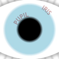
The text appears to wrap around a circle element, but since circles do not have logical start and end points, you need to use the rather complex A path command to draw two elliptical arc curves, each facing the other, originating and terminating at the left edge:
<path id="irisPath" d="M 60,100 A 40,40 0 0 1 140,100 A 40,40 0 0 1 60,100 "/>
<path id="pupilPath" d="M 78,100 A 22,22 0 0 1 122,100 A 22,22 0 0 1 78,100"/>
We’ll add a reference to a labels object along with other eyeball components:
<g id="eye">
  <use xlink:href="#eyelids" class="eyelashes" />
  <use xlink:href="#eyelids" class="eyelids"   />
  <use xlink:href="#eyeball" class="eyeball"   />
  <use xlink:href="#labels"/>
</g>
Its textPath diverts a portion of the text to display along the path:
<g id="labels">
  <text>
    <textPath xlink:href="#irisPath"> Iris </textPath>
  </text>
  <text>
    <textPath xlink:href="#pupilPath"> Pupil </textPath>
  </text>
</g>
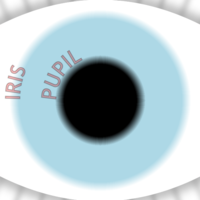
Ordinarily, you can increment the textPath's startOffset attribute in animations to push text along the path. As an alternative in this case, you can use CSS transforms to rotate the circular object:
#irisPath, #pupilPath {
    fill             : none;
    transform-origin : center         ; -webkit-transform-origin : center  ; -moz-transform-origin : center;
}
#irisPath {
    transform        : rotate(120deg) ; -webkit-transform : rotate(120deg) ; -moz-transform : rotate(120deg);
}
#pupilPath {
    transform        : rotate(20deg)  ; -webkit-transform : rotate(20deg)  ; -moz-transform : rotate(20deg);
}
By default, SVG transforms originate from an element’s top-left corner, so to spin the circle properly you need to explicitly set the transform-origin property to CSS’s own default 50% 50% value. And be careful when mixing transforms, since SVG’s get clobbered by CSS’s.
Finally, additional CSS specifies the appearance of the text labels, and displays contextually within the magnified zoom level. Transitions on the fill-opacity and stroke-opacity properties fade them in and out as the zoom animation executes:
text {
    font-size          : 10px;
    text-transform     : uppercase;
    stroke-width       : 0.5;
    stroke             : black;
    stroke-opacity     : 0;
    fill               : red;
    fill-opacity       : 0;
    /* transition to default zoom level lasts 2 seconds; no delay */
    transition         : all 2s;    -webkit-transition : all 2s;    -moz-transition    : all 2s;
}

svg.zoomIn text {
    fill-opacity       : 0.25;
    stroke-opacity     : 0.25;
    /* transition to magnified zoom level lasts 2 seconds, with 2 second delay */
    transition         : all 2s 2s;    -webkit-transition : all 2s 2s;    -moz-transition    : all 2s 2s;
}
Text letterforms behave just like paths, so the various and fill and stroke properties work the same way as for other shapes.
(See SVG text for details on text properties.)
Had enough?
See also
Related articles
Filters
SVG grand tour
Other articles
- svg/tutorials/smarter_svg_shapes (SVG basic shapes and text)
- svg/tutorials/smarter_svg_graphics (SVG graphic effects)
- svg/tutorials/smarter_svg_filters (SVG filters)
- svg/tutorials/smarter_svg_animation (SVG animation)
- svg/tutorials/smarter_svg_deploy (SVG deployment)