drop-shadow()
Summary
Applies a shadow to an element’s pixels, for use by the filter property. Accepts up to 3 distance measurements, representing x/y offset and blur radius, along with a color value.
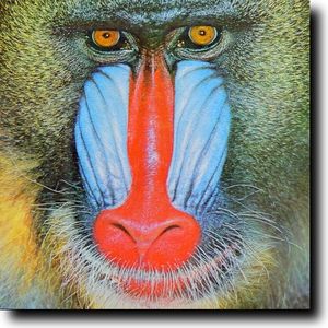
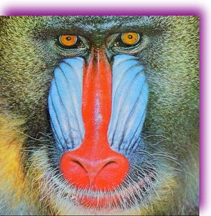
This CSS property value is reflected in the following images:
filter: drop-shadow(16px 16px 20px black);   /* left */
filter: drop-shadow(10px -16px 30px purple); /* right */
Setting offsets to 0 with a positive blur value produces a backlit halo effect. Setting blur to 0 and positive offset values produces a raised effect as if sunlight is falling on the element. The drop-shadow() function uses the same syntax as the text-shadow CSS property, and likewise allows for more than one set of shadow values, separated with commas. This example renders both of the shadows shown above:
filter: drop-shadow(16px 16px 20px black, 10px -16px 30px purple);
The filter affects the contours of image transparencies, which allows for more vivid shadow effects:
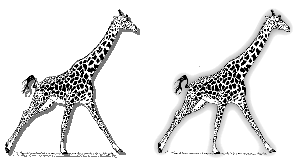
Examples
The below example shows the difference between the CSS box-shadow property and the drop-shadow filter function. Where the box-shadow property outlines the html box and the drop-shadow outlines the element parts.
<!DOCTYPE html>
<html>
  <head>
    <title>Filter example</title>
    <style>
      .foo {
        width: 100px;
        padding: 50px 0;
        margin: 100px;
        text-align: center;
        border: dashed 10px red;
        float: left;
      }

      .bar {
        box-shadow: 5px 5px 10px black;
      }

      .baz {
        -webkit-filter: drop-shadow(5px 5px 10px black);
      }
    </style>
  </head>
  <body>
    <div class="foo bar"></div>
    <div class="foo baz"></div>
  </body>
</html>
This example shows the difference when using png images with transparency.

<!DOCTYPE html>
<html>
  <head>
    <title>Filter example</title>
    <style>
      .foo {
        float: left;
      }

      .bar {
        box-shadow: 5px 5px 10px black;
      }

      .baz {
        -webkit-filter: drop-shadow(5px 5px 10px black);
      }
    </style>
  </head>
  <body>
    <img src="/logo/wplogo_transparent_xlg.png" class="foo" />
    <img src="/logo/wplogo_transparent_xlg.png" class="foo bar" />
  </body>
  </body>
</html>
Notes
The CSS filter corresponds to this SVG filter definition, based on variable offset-x, offset-y, blur radius, and color values passed to the function:
<filter id="drop-shadow">
  <feGaussianBlur in="[alpha-channel-of-input]" stdDeviation="[radius]"/>
  <feOffset dx="[offset-x]" dy="[offset-y]" result="offsetblur"/>
  <feFlood flood-color="[color]"/>
  <feComposite in2="offsetblur" operator="in"/>
  <feMerge>
    <feMergeNode/>
    <feMergeNode in="[input-image]"/>
  </feMerge>
</filter>
Related specifications
- Filter Effects 1.0
- Editor’s Draft
- Filter Effects 1.0
- Working Draft
See also
Related articles
Filters
drop-shadow()
External resources
- W3C editor’s draft: Filter Effects 1.0
- Interactive demonstration