filter
Summary
Applies various image processing effects. This property is largely unsupported. See Compatibility section for more information.
Overview table
- Initial value
none- Applies to
- All elements
- Inherited
- Yes
- Media
- visual
- Computed value
- as specified
- Animatable
- Yes
- CSS Object Model Property
filter
Syntax
filter: <function>filter: url(path/to/filter.svg#filterID)
Values
- <function>
- Any combination of built-in filter functions: blur(), brightness(), contrast(), custom(), drop-shadow(), grayscale(), hue-rotate(), invert(), opacity(), saturate(), and sepia()
- url(path/to/filter.svg#filterID)
- A reference to an SVG <filter> element
Examples
The example below shows the difference between the CSS box-shadow property and the drop-shadow filter function. The box-shadow property outlines the html box and the drop-shadow outlines the element parts.
<!DOCTYPE html>
<html>
  <head>
    <title>Filter example</title>
    <style>
      .foo {
        width: 100px;
        padding: 50px 0;
        margin: 100px;
        border: dashed 10px red;
        float: left;
      }

      .bar {
        box-shadow: 5px 5px 10px black;
      }

      .baz {
        -webkit-filter: drop-shadow(5px 5px 10px black);
      }
    </style>
  </head>
  <body>
    <div class="foo bar"></div>
    <div class="foo baz"></div>
  </body>
</html>
Usage
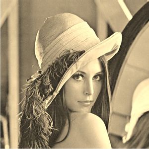
Filters apply any combination of image processing functions to
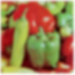
visual elements. This example shows how a combination of more than one filter function may affect an image:
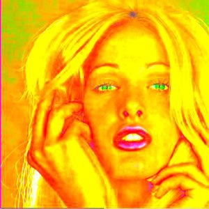
filter: grayscale(100%) sepia(100%);


Filters are applied to the image data in sequence, so the order in which functions are declared makes a difference. If the sepia() function were applied before the grayscale() in the example above, the image would appear completely gray rather than slightly yellowed.
Filters apply to any graphic effect the element renders, such as borders, background images, scrollbars, letterforms, text selections, even videos. Each filter also applies to the cumulative effect of previously declared filters (the same function may be applied repeatedly). Both the blur() and drop-shadow() filters may render pixels outside the original content box, and when paired with other CSS properties such as opacity, these pixels may become clipped.
Filter effects may be specified as part of dynamic transitions and keyframe animations. However, the number of functions in each set of style sheets must match, with no transitions allowed from implied default values. In addition, each style sheet must declare the exact same sequence of functions.
Built-in filter functions
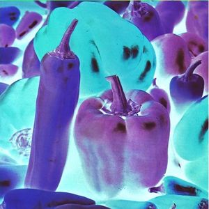
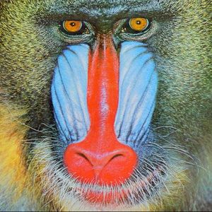
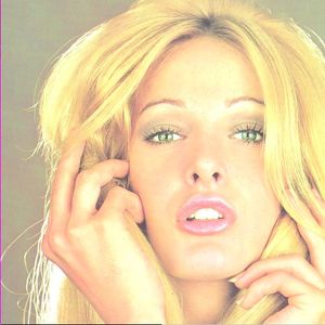
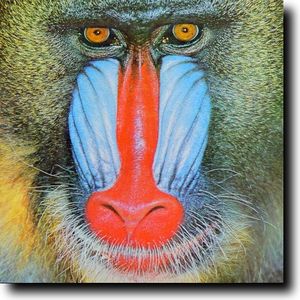
The following examples show the effect of each filter function applied in isolation. See each function for details on accepted parameters.

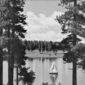
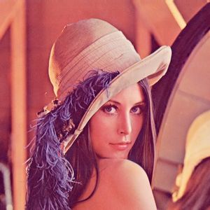

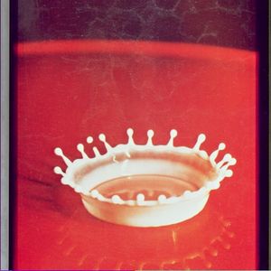
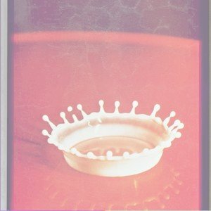

drop-shadow(16px 16px 20px black)
Related specifications
- Filter Effects 1.0
- Editor’s Draft
- Filter Effects 1.0
- Working Draft
See also
Related articles
Filters
filter