Dynamic visual effects with CSS3 transitions
By Mike Sierra
Summary
CSS transitions offer the easiest way to animate an interface. CSS is used everywhere to control how web pages appear, and shifts from one set of style sheets to another ordinarily occur abruptly. Adding transition properties allows most of those changes to occur gradually, for a more vibrant, fluid interface.
This tutorial introduces CSS’s various transition properties and shows you how to control how smoothly transitions execute. It shows you how to create sequences of more than one transition, but increasingly complex movements require keyframe animations, which work similarly. You should become familiar with what CSS transitions can do before mastering animations. Both kinds of CSS-based animation require none of the JavaScript timers traditionally used to move things around, and they execute much faster.
While transitions allow you to apply hover effects and other relatively marginal enhancements to traditional desktop interfaces, they are particularly useful for small-screen mobile interfaces in which displaying elements need to slide or fade out of view, or else collapse into icons. Abrupt transitions can be particularly disorienting on a small screen.
These key points serve as reference:
Transitions are simple animations that smooth shifts from one style sheet to another.
Set transition-property to specify which CSS property (or all) to animate between style sheets.
Properties that reference numeric measurements and color values can be transitioned.
The transition-duration property sets how much time the transition takes to run.
Use transition-delay to pause before executing a transition.
Use comma-delimited values to apply more than one transition to an element, useful in building sequences. Transitions can also execute concurrently when applied to different elements.
The transition-timing-function property allows you to control a transitions’s speed of progress. It accepts keywords: ease, ease-in, ease-out, ease-in-out, linear, or custom cubic-bezier() response curves.
The transition shorthand property can represent values from all other transition properties. If two time measurements are included, they are interpreted first as duration then as delay.
Specify a redundant set of property names prefixed -webkit-.
The transitionend event (or webkitTransitionEnd) fires at the end of a transition for each property that animates.
The transition property
For transitions to work, there need to be two sets of style sheets that might apply to any element as users interact with the page. In this case, tapping a small nav element expands it out to a wider navigation panel:
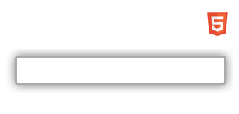
To achieve this effect, a default style sheet defines most of how it appears. A second style sheet changes how it appears when it is assigned the expanded class.
nav {
        /* transition applies to all varying elements */
    transition            : all 0.5s;
        /* dimensions and position (mostly outside view) */
    height                : 42px;
    width                 : 300px;
    position              : absolute;
    right                 : -260px;
    top                   : 10px;
    padding               : 2px;
    overflow              : hidden;
    box-sizing            : border-box;
        /* define icon */
    background-image      : url(html5.png);
    background-position-x : left;
    background-position-y : 50%;
    background-repeat     : no-repeat;
    background-size       : contain;
    background-color      : #fff;
        /* border and shadow hidden by default */
    border                : transparent solid medium;
    border-radius         : 4px;
    box-shadow            : 0 0 1em transparent;
}
nav.expanded  {
        /* transition applies to these varying elements */
    right                 : 10px;   /* bring panel into view */
    background-position-x : 400px;  /* icon out of view */
    border                : #aaa solid medium;
    box-shadow            : 0 0 1em #777;
}
The expanded class specifies a handful of CSS properties that override those that apply without the class. Adding the transition property makes those properties animate when toggling the class:
-moz-transition    : all 0.5s;
-o-transition      : all 0.5s;
-webkit-transition : all 0.5s;
transition         : all 0.5s;
Changes to the values of the right and background-position properties makes the element and its displaying icon slide in from the right. As it does, the border and shadow appear and get darker.
Note: Though transition properties were implemented recently enough, all browser engines but WebKit support them without vendor prefixessuch as -moz-, -o-, or -webkit- as shown above. Still, you need prefixes to support older browser versions. Further examples only show un-prefixed transition property names, but for widest support you should apply all of them.
The transition property specifies which properties to animate, all in this case, and the half second the animation takes to execute. It is shorthand for these separate properties:
transition-property : all;
transition-duration : 0.5s;
transition-duration : 500ms; /* same as above, but expressed as milliseconds */
To see the animation in action, all you need is a mechanism to apply the expanded class, in this case a click handler that also responds to touch input:
document.querySelector('nav').addEventListener('click', function(event) {
    event.currentTarget.classList.toggle('expanded');
});
You’ll notice that transitions respond very gracefully by reversing direction if you re-toggle the class while the animation is executing.
Parallel transitions
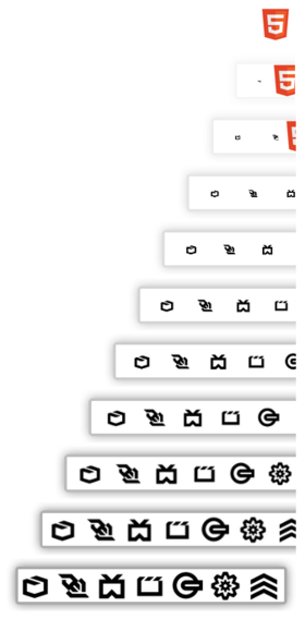
We want the panel to display a set of nested navigation icons, in this case a set of horizontal div elements. A second transition property animates these nested elements depending on the state of their parent nav element:
nav > div {
    transition        : all 0.5s;
    height            : 34px;
    width             : 34px;
    background-size   : contain;
    display           : inline-block; /* arranged horizontally */
    opacity           : 0;            /* faded */
    transform         : scale(0);     /* scaled down */
}
nav.expanded > div {
    opacity           : 1;
    transform         : scale(1);
}
The opacity property fades the icons, and transform grows or shrinks them down to a point. (See the tutorial on CSS transforms for details.) Combined, the two sets of transitions execute simultaneously:
For an element to be transitioned, it must specify a numeric value or percentage, such as a measurement or set of coordinates, or values that translate to numeric values, such as colors. Many keyword values work as well, such as the color red or center when used as a coordinate. But you cannot transition properties whose values specify a different kind of behavior. For example, you cannot transition between the display property’s block and none values, or use text-align to switch between left and right justification.
Note: Generated content can be transitioned, but only by separately styling the ::before and ::after selectors.
Sequential transitions
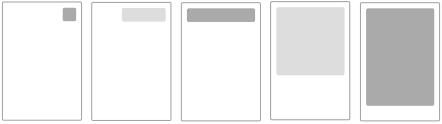
You are not limited to a single set of transitions to get from one set of style sheets to another. The panel in this example first grows to its full width, then lengthens. The sequence is then reversed when collapsing the panel back down to icon size:
Here is the relevant CSS:
div {
    width               : 56px;
    height              : 56px;
    transition-property : height , width;  /* collapse sequence */
    transition-duration : 0.5s   , 0.5s;
    transition-delay    : 0.0s   , 0.5s;   /* delay 2nd transition */
}
div.expanded {
    transition-property : width  , height; /* expand sequence */
    width               : 280px;
    height              : 400px;
}
Each transition property uses commas to delimit additional transitions that form the larger second-long sequence. In this case, the duration for each is the same: half a second. The transition-delay property specifies that the first executes immediately, and the second is delayed a half second, effectively waiting until the first transition has completed.
This example also specifies individual property names rather than all. When transitioning to the expanded class, the width animates before the height, and the sequence reverses in the other direction.
The transition shorthand property also accommodates additional transitions. Here is the same as above, but expressed more tersely:
div          { transition: height 0.5s 0.0s , width  0.5s 0.5s ; }
div.expanded { transition: width  0.5s 0.0s , height 0.5s 0.5s ; }
The first supplied time value is interpreted as the transition-duration, and the second as the transition-delay.
Note that with no delay specified, you can use more than one transition to animate selected properties simultaneously, which might be useful if you want to animate some properties but not all of them. You can also stagger the delays so that execution overlaps. In this example, a single transition specifies the transform property to move six cards to the right over the course of one second, but the delay for each is successively staggered up to half a second so that the overall sequence takes 1.5 seconds to execute:
section > div {
    transition: transform 1s;
    transform: translateX(0px);
    /* ^^^ this transform is optional; transition assumes default value */
}
section.deal > div {
    transform: translateX(300px); /* move to right */
}
section > div:nth-of-type(6) {
    transition-delay: 0.0s;
    background-image: url(QueenSpade.png);
}
section > div:nth-of-type(5) {
    transition-delay: 0.1s;
    background-image: url(KingClub.jpeg);
}
section > div:nth-of-type(4) {
    transition-delay: 0.2s;
    background-image: url(JackClub.jpeg);
}
section > div:nth-of-type(3) {
    transition-delay: 0.3s;
    background-image: url(AceSpade.jpeg);
}
section > div:nth-of-type(2) {
    transition-delay: 0.4s;
    background-image: url(JackSpade.jpeg);
}
section > div:nth-of-type(1) {
    transition-delay: 0.5s;
    background-image: url(JackHeart.jpeg);
}
The overall movement is staggered like this:

Timing functions
You may notice in the example above that the cards are not evenly spaced. That’s because transitions by default start out slowly, gather speed, then slow down again at the end. The transition-timing-function property specifies this behavior. By default it uses an ease value. If it were linear, they would all start and stop abruptly and move at the same speed:

Browsers represent these keywords as bezier curves, which makes their response easier to visualize. Here is the basic set of keyword values along with their alternate cubic-bezier() functions. The animation’s elapsed time and progress correspond to x and y axes, so the more the line curves vertically along the way, the faster the animation proceeds:
linear
cubic-bezier(0.0, 0.0, 1.0, 1.0) 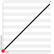
ease
cubic-bezier(0.25, 0.1, 0.25, 1.0) 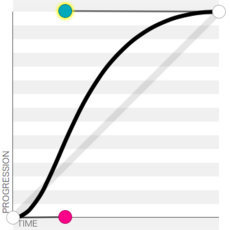
ease-in-out
cubic-bezier(0.42, 0, 0.58, 1.0) 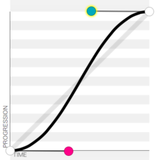
ease-in
cubic-bezier(0.42, 0, 1.0, 1.0) 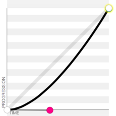
ease-out
cubic-bezier(0, 0, 0.58, 1.0) 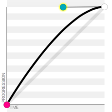
This useful cubic bezier function utility allows you to create your own custom curves and compare them with standard timing keyword values.
Timing functions can also be specified as part of the transition shorthand property. This example makes a sequence of two ease-in and ease-out transitions resemble the behavior of a single ease-in-out function:
div          { transition: height 0.5s 0.0s ease-in, width  0.5s 0.5s ease-out; }
div.expanded { transition: width  0.5s 0.0s ease-in, height 0.5s 0.5s ease-out; }
As an alternative to response curves, the steps() function specifies a series of distinct frames with no smoothing applied. This animates three interim steps that occur between the start and end points:
transition-timing-function : steps(5);
The transitionend event
The transitionend event allows an application to respond after a transition finishes executing. The event fires on the element that is being transitioned, once for each property, and only if the specified transition actually modifies content.
In this example, applying a display class makes an information panel appear:
The opacity property makes the element fade in, and is the only noticeable change to its appearance. A second transition executes over a longer span of time, and makes an imperceptible change to the background color. Here is the relevant CSS:
div {
    background-color : white;
    opacity          : 0;
    transition       : opacity 1s, background-color 5s;
}
div.display {
    opacity          : 1;
    background-color : rgba(100%, 100%, 100%, 0.95);
}
After 5 seconds, a transitionend handler removes the display class to revert the element back to its original state:
var panel = document.querySelector('.message');
panel.addEventListener('transitionend'       , timeoutDisplay); // Standard: Gecko, IE10, Opera 12.10+
panel.addEventListener('otransitionend'      , timeoutDisplay); // Old Opera
panel.addEventListener('webkitTransitionEnd' , timeoutDisplay); // WebKit

function timeoutDisplay(e) {
    // ignore irrelevant transitions:
    if (e.propertyName != 'background-color') return(false);
    // execute only after expanding panel:
    if (! e.currentTarget.classList.contains('display')) return(false);
    // collapse panel:
    e.currentTarget.classList.remove('display');
}
Note the various provisional names for the event: webkitTransitionEnd (WebKit), otransitionend (old Opera), along with the standard transitionend (Gecko, Opera 12.10+, Internet Explorer).
Advanced image transitions
While it’s pretty obvious which properties can be transitioned, some browsers are adding support for a couple of unusual ones. So far these non-standard features can only be found in Webkit browsers.
Transitions between two background-image files now results in a cross-fade effect. Changing style sheets such as the following can thus drive an image gallery interface:
div[data-img="4"] { background-image : url("Image04.jpg"); }
div[data-img="5"] { background-image : url("Image05.jpg"); }
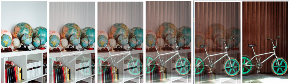
See the cross-fade() function for a way to mix images statically.
Note: As of this writing, there is no support for transitions between gradient background image values.
The filter property allows you to apply sequences of image processing functions to any kind of visual element, and these effects can also be transitioned. This more unusual example applies a transition to a video as it plays back, blurring it and distorting its colors in various ways while it rotates in space:
video {
  -webkit-filter: hue-rotate(0deg) saturate(1) blur(0);
  -webkit-transition: all 30s linear;
}
video.finished {
  -webkit-filter: hue-rotate(-180deg) saturate(10) blur(10px);
  -webkit-transform: translate(100px, 50px) rotateX(45deg) rotateY(-30deg) rotateZ(10deg);
}
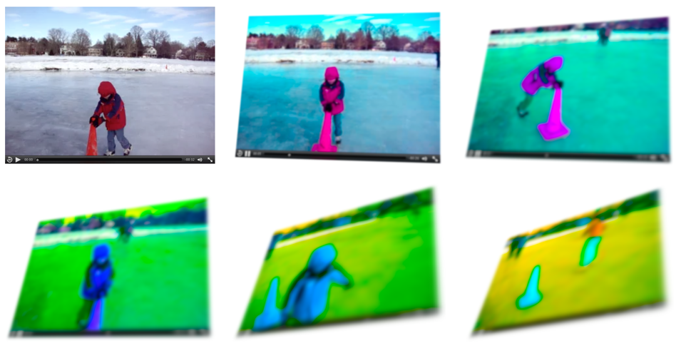
Unlike transform functions, filter functions must be explicitly declared in each style sheet in the exact same order if they are to transition.