transform
Summary
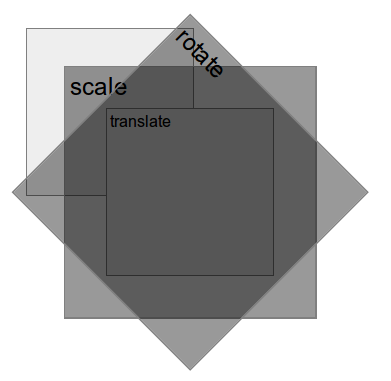
CSS transforms allow elements styled with CSS to be transformed in two-dimensional or three-dimensional space. Using this property, elements can be translated, rotated, scaled, and skewed. The value list may consist of 2D and/or 3D transform values.
Overview table
- Initial value
none- Applies to
- Transformable elements.
- Inherited
- No
- Media
- visual
- Computed value
- As specified, but with relative lengths converted into absolute lengths.
- Animatable
- Yes
- CSS Object Model Property
transform- Percentages
- Refer to the size of the element’s bounding box.
Syntax
transform: matrix(a, b, c, d, e, f)transform: matrix3d(a, b, c, d, e, f, g, h, i, j, k, l, m, n, o, p)transform: nonetransform: perspective(p)transform: rotate(a)transform: rotate3d(x, y, z, a)transform: rotateX(ax)transform: rotateY(ay)transform: rotateZ(az)transform: scale(sx, sy)transform: scale3d(sx, sy, sz)transform: scaleX(sx)transform: scaleY(sy)transform: scaleZ(sz)transform: skew(ax, ay)transform: skewX(ax)transform: skewY(ay)transform: translate(tx, ty)transform: translate3d(tx, ty, tz)transform: translateX(x)transform: translateY(y)transform: translateZ(tz)
Values
- none
- Specifies that no transform should be applied.
- matrix(a, b, c, d, e, f)
- Specifies a 2D transformation matrix in the form of a transformation matrix of the six values, a-f.
- translate(tx, ty)
- Specifies a 2D translation by the vector [tx, ty]. If ty is not specified, its value is assumed to be zero.
- translateX(x)
- Translates the element by the given amount along the X axis.
- translateY(y)
- Translates the element by the given amount along the Y axis.
- scale(sx, sy)
- Specifies a 2D scaling operation described by [sx, sy]. If sy is not specified, it is assumed to be equal to sx.
- scaleX(sx)
- Specifies a scale operation using the vector [sx, 1].
- scaleY(sy)
- Specifies a scale operation using the vector [1, sy].
- rotate(a)
- Specifies a 2D rotation by the specified angle around the origin of the element, as defined by the transform-origin property.
- skew(ax, ay)
- Specifies a 2D skew by [ax,ay] for X and Y. If the second parameter is not provided, it is assumed to be zero.
- skewX(ax)
- Specifies a 2D skew transformation along the X axis by the given angle.
- skewY(ay)
- Specifies a 2D skew transformation along the Y axis by the given angle.
- matrix3d(a, b, c, d, e, f, g, h, i, j, k, l, m, n, o, p)
- Specifies a 3D transformation as a 4x4 homogeneous matrix of 16 values in column-major order.
- translate3d(tx, ty, tz)
- Specifies a 3D translation by the vector [tx,ty,tz] in the X, Y, and Z directions.
- translateZ(tz)
- Specifies a 3D translation by the vector [0,0,tz] in the Z direction.
- scale3d(sx, sy, sz)
- Specifies a 3D scale operation by the [sx,sy,sz] scaling vector described by the three parameters.
- scaleZ(sz)
- Specifies a 3D scale operation by the scaling vector [1,1,sz].
- rotate3d(x, y, z, a)
- Specifies a 3D rotation by the angle specified in last parameter about the [x,y,z] direction vector described by the first three parameters.
- rotateX(ax)
- Specifies a 3D rotation by the angle specified in the X direction. Equivalent to
rotate3d(1, 0, 0, ax). - rotateY(ay)
- Specifies a 3D rotation by the angle specified in the Y direction. Equivalent to
rotate3d(0, 1, 0, ay). - rotateZ(az)
- Specifies a 3D rotation by the angle specified in the Z direction. Equivalent to
rotate3d(0, 0, 1, az). - perspective§
- Specifies a perspective projection matrix, which scales points in the X and Y directions based on their Z value. Thus, points with positive Z values are scaled away from the origin, and those with negative Z values are scaled toward the origin.
Examples
Translate the object by 150 pixels along the x and y axes.
.matrix {
    transform:  matrix(1, 0, 0, 1, 150, 150);

    width: 10em;
    height: 10em;
    background: #eee;
 }
Rotate the object by 40 degrees clockwise.
.rotate {
    transform: rotate(40deg);

    width: 10em;
    height: 10em;
    background-color: red;
}
Scale the element by the factor of 3 on the x axis and by the factor of 0.5 by the y axis.
.scale {
    transform: scale(3, 0.5);

    width: 10em;
    height: 10em;
    background: green;
}
3D rotate the object by 40 degrees clockwise around the X axis.
.rotateX {
    transform: rotateX(40deg);

    width: 10em;
    height: 10em;
    background-color: blue;
}
Notes
Any value other than “none” results in the creation of both a stacking context and a containing block. The containing block is for fixed positioned descendants.
Related specifications
- CSS Transforms Module Level 3
- W3C Working Draft
See also
External resources
Cross Browser CSS Transforms – Even in IE http://www.useragentman.com/blog/2010/03/09/cross-browser-css-transforms-even-in-ie/
Attributions
Mozilla Developer Network
 : transform Article