Making things move with CSS3 animations
By Mike Sierra
Summary
CSS animations allow you to build complex animated sequences. Like transitions, they manipulate the CSS properties that control how interface elements appear. Unlike transitions, they are not tied to shifts between style sheets that distinguish interface states. Keyframe animations can execute freely, and offer the best way to build complex effects into an interface.
To get the most from this tutorial, you should already be familiar with CSS transitions. Since they work similarly, the term CSS animations often serves as a shorthand to refer to transitions as well, but this tutorial only discusses keyframe animations.
These key points serve as reference:
The required animation-name property specifies the name of a keyframe animation, and must correspond to a @keyframes rule. Loading the CSS or applying a new name causes the animation to execute.
Use the required animation-duration property to set the overall amount of time over which the animation executes, either in seconds or milliseconds (1s == 1000ms).
The @keyframes rule declares the full sequence that corresponds to the animation-name. Within the block, keyframes such as 0%, 50%, and 100% behave as selectors that manipulate CSS properties over the duration of the animation.
Any CSS property that be transitioned can also be animated.
Use animation-delay to pause before executing an animation, using the same time values as for duration.
The animation-iteration-count property sets the number of times the animation plays, either as an integer or infinite.
The animation-direction property allows you to play the animation in normal’orreverse** order, or alternate between the two for even/odd iterations.
The animation-fill-mode property preserves an animation’s start state before a delayed animation executes (backwards)), its end state after its final iteration (forwards), or both.
Set animation-play-state to pause or running to stop and start animations.
The animation-timing-function property controls the speed of progression between each keyframe, and can be altered within an animation. It uses the same set of keywords as transitions: ease, ease-in, ease-out, ease-in-out, linear, or custom cubic-bezier() functions.
The animation shorthand property can represent values from all other animation properties. If two time measurements are included, they are interpreted first as duration then as delay.
Use standard property names along with -webkit- prefixes. Specify both the @keyframes rule and @-webkit-keyframes. From JavaScript, specify standard properties such as animationName along with WebkitAnimationName.
Use comma-separated property values to specify more than one animation. Animations that run concurrently cannot manipulate any of the same properties.
To modify @keyframes rules dynamically, inject CSS into a local style region, or use the CSSKeyframeRule interface.
Animation properties
To understand how animations work, start with an example of a pulsing icon, which may be used in a mobile interface to indicate what part of an application is selected. The animation continuously shrinks and grows one of the icons as it dims and brightens it. This simple example will illustrate several other features below:
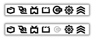
The animation CSS property specifies the name of an animation you will supply, pulse in this case, and its overall duration of 1 second. Both are required:
div.selected {
    animation : pulse 1s infinite;
}
The infinite keyword indicates that the animation repeats indefinitely. If not specified, the animation executes only once.
The animation property is a shorthand that combines the values of others:
div.selected {
    animation-name            : pulse;
    animation-duration        : 1s;
    animation-iteration-count : infinite;
}
Animation properties are standard in many browsers, but as of this writing require prefixes for all WebKit browsers and older versions of Gecko and Opera. For widest support, you should define animation properties redundantly:
div.selected {
    -webkit-animation : pulse 1s infinite;
    -moz-animation    : pulse 1s infinite;
    -o-animation      : pulse 1s infinite;
    animation         : pulse 1s infinite;
}
From here on, examples feature only the un-prefixed property names.
The @keyframes rule
The animation-name property specifies an animation named pulse. Use a @keyframes rule within the CSS to define each named animation sequence:
@keyframes pulse {
    from {
        transform : scale(1);
        opacity   : 1;
    }
    50% {
        transform : scale(0.75);
        opacity   : 0.25;
    }
    to {
        transform : scale(1);
        opacity   : 1;
    }
}
The entire sequence between from and to executes over the span of time defined by the animation-duration property. Each keyframe within the sequence behaves like a CSS selector, manipulating the values of individual properties. Shifts from one keyframe to another work the same as transitions, and the same set of properties that can be transitioned can also be manipulated in keyframes. In this case, opacity dims the icon and transform shrinks it. (See the tutorial on transforms for details on the transform property’s scale() function.)
As with animation properties, each @keyframes rule also needs to be prefixed redundantly to run on WebKit-based browsers such as Chrome and Safari. The transform properties below are also prefixed:
@-webkit-keyframes pulse {
   0%   { -webkit-transform: scale(1)   ; opacity: 1;    }
   50%  { -webkit-transform: scale(0.75); opacity: 0.25; }
   100% { -webkit-transform: scale(1)   ; opacity: 1;    }
}
This example also substitutes 0% and 100% for their synonymous keywords from and to. (If you don’t specify either, values transition from the next available keyframe in the series.)
Changing Direction
This simple animation can also be alternated to produce the same effect:
div.selected {
    animation-name            : pulse;
    animation-duration        : 0.5s;
    animation-iteration-count : infinite;
    animation-direction       : alternate;
}
The animation-duration is now half of its previous value. Setting animation-direction to alternate makes the animation execute in normal order (from/to), then in reverse order (to/from) for even-numbered iterations. This allows the animation’s start and end points to vary:
@keyframes pulse {
   from { transform: scale(1)   ; opacity: 1;    }
   to   { transform: scale(0.75); opacity: 0.25; }
}
(You can also set animation-direction to always reverse, or to reverse-alternate.)
Multiple animations
Animation properties accept more than one comma-delineated value, which allows you to chain together different animations or run them concurrently.
This variation on the pulsing icon uses two keyframes to manipulate the opacity and transform properties separately. In this case, setting different durations makes the two fade and shrink effects fall out of phase:
div.selected {
    animation: fade 0.5s infinite alternate, shrink 0.53s infinite alternate;
}
/* long form: */
div.selected {
    animation-name            : fade      , shrink    ;
    animation-duration        : 0.5s      , 0.53s     ;
    animation-iteration-count : infinite  , infinite  ;
    animation-direction       : alternate , alternate ;
}
@keyframes fade {
    from { opacity   : 1; }
    to   { opacity   : 0.25; }
}
@keyframes shrink {
    from { transform : scale(1); }
    to   { transform : scale(0.75); }
}
Make sure that any keyframes or transitions that execute concurrently don’t manipulate any of the same properties. This is not a problem for animations or transitions applied to different elements.
Setting a Delay
As with transitions, animations can be delayed before they execute. Use the animation-delay property to wait some time before pulsing the icon:
div.selected {
    animation-name            : pulse;
    animation-duration        : 0.5s;
    animation-iteration-count : 6;
    animation-direction       : alternate;
    animation-delay           : 3s;
}
(In this version, the icon pulses three times.)
Whenever two time measurements are specified in a shorthand property value, the second is interpreted as the delay:
div.selected {
    animation : pulse 0.5s 3s infinite alternate;
}
This more elaborate example shows a delayed animation within a mobile interface. After an initial pause, content shifts down to make room for a series of banner advertisements, which then continuously cycle horizontally and rewind to display the first:
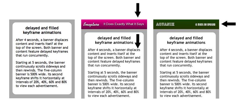
To achieve this effect, the animation-delay property makes content shift down after 4 seconds. Here is the relevant CSS:
article {
    animation-name            : displaceContent;
    animation-duration        : 1s;
    animation-delay           : 4s;
    animation-iteration-count : 1;
    animation-fill-mode       : forwards;
}
@keyframes displaceContent {
    from { transform : translateY(0em) }
    to   { transform : translateY(3em) } /* slide down to make room for advertisements */
}
The animation-iteration-count property makes the animation execute only once. (The next section explains the animation-fill-mode property.)
The banner’s first animation (insertBanner) closely mirrors that of the content (displaceContent) shown above. After 4 seconds, it slides into view from off the screen:
header {
    animation-name            : insertBanner , scrollBanner;
    animation-duration        : 1s           , 25s;
    animation-delay           : 4s           , 5s;
    animation-iteration-count : 1            , infinite;
    animation-fill-mode       : backwards    , none;
    width                     : 500%;        /* wide banner featuring 5 panels */
    column-count              : 5;
    column-gap                : 0;
}
@keyframes insertBanner {
    from { transform : translateY(-6em) } /* slide down from off-screen */
    to   { transform : translateY(0em) }
}
The banner’s second animation (scrollBanner) takes over at the 5-second mark, after the first has completed. Over the course of 25 seconds, it shifts the banner sideways to view each advertisement for nearly 5 seconds. After rewinding to its initial position 97% of the way through the keyframes, setting animation-iteration-count to infinite makes the animation replay indefinitely:
@keyframes scrollBanner {
    from { transform : translateX(0) }
    17%  { transform : translateX(0%) }
    20%  { transform : translateX(-20%) }
    37%  { transform : translateX(-20%) }
    40%  { transform : translateX(-40%) }
    57%  { transform : translateX(-40%) }
    60%  { transform : translateX(-60%) }
    77%  { transform : translateX(-60%) }
    80%  { transform : translateX(-80%) }
    97%  { transform : translateX(-80%) }
    to   { transform : translateX(0%) }
}
Fill mode
Each keyframe within an animation specifies CSS properties, just like regular CSS selectors. Properties manipulated by keyframes may vary from those defined or inherited by selectors. By default, after animations complete their series of iterations, these properties abruptly snap from the final keyframe’s value back to their original value. Likewise when animations are delayed, properties snap from their original values to that of the first keyframe’s value.
The animation-fill-mode property fixes this problem. Setting it to forwards makes the final keyframe’s property values persist after the animation completes. Setting it to backwards makes the first keyframe’s property override how the property would appear without the animation. Setting it to both makes the keyframe’s properties override the element’s default properties both before and after the animation executes. Setting it to the default value of none keeps all properties at their default values unless the animation is executing.
Note that none of these values make any difference for animations whose animation-delay is set to zero, and whose animation-iteration-count is infinite. Even then, they only make a difference for properties whose values specified at the start or end of the animation vary from how they are already specified by the element itself.
The banner animation shown above gives an example of how to use animation-fill-mode. By default, both the banner and the main content inhabit the same space at the top of the screen. The content’s displaceContent animation slides it out of its default position, and its fill-mode of forwards keeps it there after it is done sliding. If it didn’t, it would snap right back to the top of screen. Likewise, the banner’s insertBanner animation slides it from a position specified in the first keyframe, and its fill-mode of backwards keeps it there before the delayed animation starts to execute, and it slides down to its default position.
Fill mode can override not only an element’s underlying properties, but other animations as well. For the banner’s second animation, the animation-fill-mode is set to none. If it were set to both or backwards, the first animation would not execute. Since animations are interpreted in their order of declaration, and since both animations manipulate the transform property, specifying a fill-mode for the period before the second animation executes would override whatever the first animation does with the transform property:
header {
    /* both animations alter the 'transform' property: */
    animation-name            : insertBanner     , scrollBanner;
    /* animations execute in sequence: */
    animation-delay           : 4s               , 5s;
    animation-duration        : 1s               , 25s;
    animation-iteration-count : 1                , infinite;
    animation-fill-mode       : backwards        , none;
    /* 'none' does not clobber previous animation: ^^^^ */
}
Timing functions
The same set of timing functions that apply to transitions also apply to animations. (For details, see Timing Functions.) The animation-timing-function property allows you to control the response curve for each keyframe’s progress. It recognizes keyword values ease, ease-in, ease-out, ease-in-out, linear, along with cubic-bezier() functions for custom response curves.
By default, the ease value starts each keyframe slowly, builds speed, then slows at the end, which is not always appropriate behavior. In this example, a series of items, skewed to appear fast-moving, slide in haphazardly from the right edge of the screen, then hit a wall at the left edge and wobble to a stop:
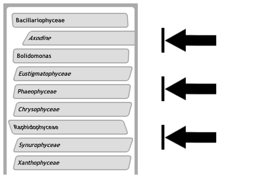
Setting the timing function to linear makes the shift from a moving to a stopped state as abrupt as possible. This occurs at the 70% keyframe:
div {
    animation-duration        : 0.5s;
    animation-fill-mode       : both;
    animation-iteration-count : 1;
    animation-name            : fastSlide;
    animation-timing-function : linear;
    transform-origin          : bottom;
}
@keyframes fastSlide {
    0%   { transform: translate(120%) skewX(-30deg) ; }
    70%  { transform: translate(0%)   skewX(-30deg) ; }
    80%  { transform: translate(0%)   skewX(20deg)  ; }
    95%  { transform: translate(0%)   skewX(-10deg) ; }
    100% { transform: translate(0%)   skewX(0deg)   ; }
}
For greater control, you can even manipulate the value of the animation-timing-function property within each keyframe, so that it changes over the course of the animation.
Dynamic animations
The example above uses JavaScript to assign random delays to stagger each animation’s execution. Any animation property can be set directly on an element’s style object, but as of this writing you also need to add alternative Webkit-prefixed property names:
window.onload = function() {
    var delay, divs = document.querySelectorAll('div');
    for (var i = 0, l = divs.length; i < l; i++) {
        // set delay up to 1 second:
        delay  = Math.round(Math.random() * 1000) + 'ms';
        divs[i].style.animationDelay = delay;
        divs[i].style.WebkitAnimationDelay = delay;
    }
}
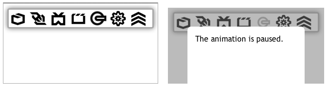
Once an animation starts to execute, setting the animation-play-state property to pause stops it, and a value of running resumes it.
As in the following example, you would typically want to pause an animation if it becomes part of an interface element that is no longer in an active state:
To dynamically initiate an animation, specify a different name. In this example, applying an animate class overrides the animation-name property’s default value, which is an empty string. The sequence animation executes each time the class is applied after having been absent:
div         { -webkit-animation-name: "";       }
div.animate { -webkit-animation-name: sequence; }
Once the animate class is applied, simply reapplying it has no effect, because the animation’s name has to actually change its value. The same is true when applying the property directly to the element. The first button below only works once, but the second can be repeated because it responds to asynchronous mouse or touch input:
 <div onclick="document.querySelector('#animation').style.WebkitAnimationName = 'sequence';">
 REPLAY</div>

 <div
    onmousedown='document.querySelector("#animation").style.WebkitAnimationName = "";'
    onmouseup='document.querySelector("#animation").style.WebkitAnimationName = "sequence";'
 >REPLAY</div>
As a workaround, you can inject CSS into a local style region. Re-interpreting the CSS causes the animation to re-execute:
 <style id="customCSS"></style>
 . . .
 <div onclick="replay()">REPLAY</div>
 . . .
 <script>
 function replay() {
     document.querySelector('#customCSS').textContent =
         "div { animation-name: 'sequence'; -webkit-animation-name: 'sequence' }";
 }
 </script>
Applying a @keyframes rule is a bit more complex than it is to set properties. Perhaps the easiest way is to inject the CSS into a style region in the same way as described above:
var css = document.querySelector('#customCSS')
css.textContent += "@keyframes pulse { ";
css.textContent += "0% {transform:scale(1);opacity:1;} ";
css.textContent += "100% {transform:scale(0.75);opacity:0.25;} ";
css.textContent += "}";
A more formal API is available, especially to modify existing rules. Briefly, suppose this is your first declared style:
@keyframes shiftColor {
   from { background-color: plum }
   to { background-color: #ddd }
}
Here is how you might change the initial color to a shade of gray:
var sources = document.styleSheets; // from link/style tags
var rules = sources[0].cssRules;    // list of all styles and at-rules
var rule = rules[0];                // get first
if( rule.type == rule.KEYFRAMES_RULE || rule.type == rule.WEBKIT_KEYFRAMES_RULE ) {
    console.log(rule.name);         // shiftColor
    console.log(rule[0].cssText);   // 0% { background-color: rgb(221, 160, 221); }
    if ( rule[0].keyText == '0%' )  // 'from' converts to '0%'
        rule[0].style.backgroundColor = '#aaa';
    console.log(rule[0].cssText);   // 0% { background-color: rgb(170, 170, 170); }
}
See CSSKeyframesRule, CSSKeyframeRule and CSSRule for details.