Understanding static and relative positioning
Summary
This article provides a guide to static and relative positioning.
Introduction
In this article we’ll start looking in depth at how you can use CSS to position HTML elements wherever you want on the page, using the position CSS property and some related properties.
The position property in CSS has four legal values (in addition to the ubiquitous inherit): static, relative, absolute and fixed. These values have a significant impact on how an element is rendered. The two values static and relative are closely related, and we’ll look into those in great detail in this article. The values absolute and fixed are also closely related, and I’ll save those for the next article in the series.
The wonderful world of rectangles
Now for a bit of a recap on CSS and HTML boxes, as discussed in the Floats and Clearing article. An HTML document consists of a number of elements interspersed with character data (text). When such a document is rendered on a computer screen or printed on paper, those elements generate rectangular boxes. Just as the set of HTML elements is divided into block-level elements and inline elements, boxes in CSS are essentially either block boxes or inline boxes.
By default, the built-in user agent style sheet in a browser makes block-level HTML elements such as p and div generate block boxes, while inline elements such as strong and span generate inline boxes. We can control the type of box that is generated using the display property.
The boxes generated by the elements in a document are laid out according to a clearly defined set of rules in the CSS2.1 specification. Those rules are written for the relatively few people who write browser software to learn how CSS works though, not for those of us who design web pages for a living — or a hobby. This is why this entire course exists! As a result, the specification can be a bit difficult to understand. In this article we’ll try to explain the basics in a way that is better suited for web designers and developers.
Static positioning
This is really a misnomer. Boxes with position:static are not really “positioned” at all in the CSS sense. They are simply laid out in the order they occur in the markup and take up as much room as they need—this is the default behavior you get when you don’t apply any CSS at all to your HTML.
There are fundamental differences in how block boxes are laid out compared to how inline boxes are laid out, so let’s examine the two types one at a time. I’ll start with block boxes, because they are simpler.
Block box layout
Unless we apply any specific CSS declarations, block boxes are laid out vertically from top to bottom in the order they occur in the markup. Each box is normally as wide as the document (the body element), but even if we make them narrower they will not be laid out side by side even if there’s room; they’ll still be laid out one below the other. You can think of it as if each block box had an implicit line break before and after it, to make sure it ends up on a “line” of its own.
The vertical distance between two block boxes is controlled by the margin-bottom property of the first box and the margin-top property of the second box (you’ve seen how to manipulate these earlier in the course). For boxes in the normal flow, ie boxes that aren’t floated or absolutely positioned, the vertical margins between two adjacent block boxes will collapse—overlap—so that the net result is not the sum of the two margins, but the greater of the two, as seen in Figure 1 below.
Consider the following HTML fragment:
<p style="margin-bottom:40px">This paragraph has a 40px bottom margin.</p>
<p style="margin-top:20px">This paragraph has a 20px top margin.</p>
When viewed in a browser, the margins collapse, as shown in Figure 1.
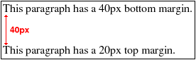
Figure 1: The margins collapse — the distance between the two is 40px, not 60px.
A block box will either contain only other block boxes or only inline boxes. If a block-level element contains a mix of block-level and inline children—which is permissible, although semantically questionable’so-called anonymous block boxes will be generated to encompass the inline child boxes, so that the parent only contains block boxes.
You can specify the dimensions of a block box using the width and height properties. You can also set both vertical and horizontal margins on them. The initial (default) value for width and height is auto, and the initial value for margin properties is . These factors in combination mean that a block box will by default be as wide as its parent, as illustrated in Figure 2.
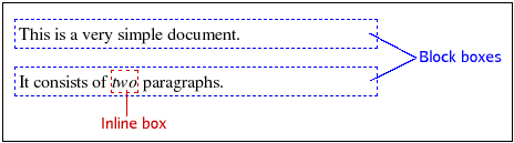
Figure 2: Block boxes are laid out vertically.
Inline box layout
This section may be difficult to understand if you’re new to CSS, but don’t despair if you don’t get it the first time you read it. Experimenting a little on your own is probably the best way to get a solid understanding of these issues—just make sure that you’re using a good, standards-compliant browser when testing, such as Opera or Firefox.
Inline boxes are generated by default by inline HTML elements, but there are also anonymous inline boxes generated to encompass the text content of elements. The inline boxes are laid out horizontally, one after the other, in the order in which they occur in the markup. Depending on the direction property, the inline boxes will either be laid out from left to right (direction:ltr ) or from right to left (direction:rtl ).
Left-to-right direction is used with, for instance, European languages, while right-to-left direction is used with languages such as Arabic and Hebrew. The set of inline boxes that make up one line on the screen (or paper) are enclosed in yet another rectangle, known as a line box. Line boxes are laid out vertically within their block-level parent, with no space between them. We can affect the height of line boxes through the line-height property.
For inline boxes we cannot specify any dimensions. We can specify horizontal margins, but not vertical margins. If necessary, an inline box will be split into several inline boxes, distributed over two or more line boxes. When such a split occurs, any horizontal margins and padding, and any vertical borders, will only apply before the first box and after the last box. Consider a document with the following rule for em elements:
em {
  margin: 0 2em;
  padding: 0 1em;
  border: 1px dotted blue;
}
This will give you a layout somewhat like that seen in Figure 3, when the styled elements are broken over multiple lines.
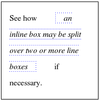
Figure 3: Margins, padding and border do not apply where breaks occur.
The vertical alignment of inline boxes within the encompassing line box is determined by the vertical-align property. The default value is baseline, which means that the inline boxes are aligned so that their text baselines line up. The baseline is the imaginary line on which letters without descenders stand. It is placed some distance above the bottom of the line box to leave room for the descenders of lowercase letters, as shown in Figure 4.
Figure 4: Letters stand on the imaginary baseline.
Note that the vertical-align property applies to inline boxes and table cells only, and it isn’t inherited. Figure 5 shows some small images with different vertical alignment.
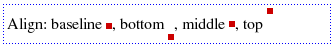
Figure 5: Images placed using settings of the vertical-align CSS property.
When the total width of the inline boxes within a line box is less than the width of the line box itself, the horizontal alignment is controlled by the text-align property. With text-align:justify, extra space is inserted between the inline boxes, if necessary, to make the content both left- and right-justified. This property applies to block boxes, table cells and inline blocks, and it is inherited—Figure 6 shows the result of applying different values of the text-align property to text inside table cells.
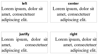
Figure 6: Controlling the alignment of text using the text-align property.
Relative positioning
Relative positioning is a positioning scheme in CSS, but it is more closely related to static “positioning” than with its cousins—absolute and fixed positioning. An element with position:relative is first laid out just like any static element; block-level or inline. But then something interesting happens: the generated box is shifted according to the top, bottom, left and right properties.
The thing to remember about relative positioning is that it’s only the generated box that is shifted. The element still remains where it was in the static document flow. That’s where it “takes up space” as far as other elements are concerned. This means that the shifted box may end up overlapping other elements’ boxes, because they still act like the relatively positioned element has remained where it should be, before the positioning was applied. As far as the document flow is concerned, the element has not moved—it is just the end visual result that shows the box being moved. Let’s look at it in practice.
Copy the HTML code below into a new document in your favourite text editor and save it as relative.html.
<!DOCTYPE html PUBLIC "-//W3C//DTD HTML 4.01//EN" "http://www.w3.org/TR/html4/strict.dtd">
 <html>
   <head>
     <meta http-equiv="Content-Type" content="text/html; charset=utf-8">
     <title>Relative Positioning</title>
   </head>
   <body>
     <p>Lorem ipsum dolor sit amet consectetuer adipiscing elit.
     Curabitur feugiat feugiat purus.
     Aenean eu metus. Nulla facilisi.
     Pellentesque quis justo vel massa suscipit sagittis.
     Class aptent taciti sociosqu ad litora torquent per conubia nostra, per inceptos hymenaeos.
     Quisque mollis, justo vel rhoncus aliquam, urna tortor varius lacus, ut tincidunt metus arcu vel lorem.
     Praesent metus orci, adipiscing eget, fermentum ut, pellentesque non, dui.
     Sed sagittis, metus a semper dictum, sem libero sagittis nunc, vitae adipiscing leo neque vitae tellus.
     Duis quis orci quis nisl nonummy dapibus.
     Etiam ante. Phasellus imperdiet arcu at odio.
     In hac habitasse platea dictumst. Aenean metus.
     Quisque a nibh. Morbi mattis ullamcorper ipsum.
     Nullam odio urna, feugiat sed, bibendum sed, vulputate in, magna.
     Nulla tortor justo, convallis iaculis, porta condimentum, interdum nec, arcu.
     Proin lectus purus, vehicula et, cursus ut, nonummy et, diam.</p>
   </body>
 </html>
Open the file in your web browser to see how it looks at this stage—you should just see a plain paragraph of text.
Create a new document in your editor, copy the CSS code below into it and save the file as style.css.
p {
  width: 20em;
}

span {
  background-color: lime;
}
Link the style sheet to the HTML document by inserting the following line just before the
</head>tag:<link rel="stylesheet" type="text/css" href="style.css">Save both files and reload the page in your browser. I have narrowed the paragraph to make the line breaks occur at the same position even in small browser windows. The
spanelement now has a migraine-inducing background colour to make it more visible.Next, let’s modify the style sheet by adding three declarations to the rule for the
spanelement:span { position: relative; top: 1em; left: 2em; background-color: lime; }Save and reload the page in the browser to see the effects of relative positioning. You have shifted the
spanelement both vertically and horizontally. Notice how it now overlaps the next line of text, and how there is an empty hole where it used to be. The way the generated box has been shifted may not be what you expected from the code. You specifiedtop:1em, but the box was shifted downward. Also, the box was shifted to the right, even though you specifiedleft:2em.
Why is this?
The key to understanding how these properties work with relative positioning is to realise that they specify the edge that the movement is applied to, not the direction of movement. In other words, the top property shifts the box relative to its top edge, the left property shifts the box relative to its left edge, and so on. The box is shifted away from the specified edge, so top:1em shifts the box 1em away from the top position—in other words, downwards. Negative numbers shift the box in the opposite direction, so bottom:-1em is the same as top:1em.
This leads us to another conclusion: it’s pointless to specify both the top property and the bottom property (or left and right) for the same element. The rules of CSS say that bottom should be ignored if top is specified. For horizontal movement it depends on the direction property. In a left-to-right environment right is ignored if both left and right are specified; in a right-to-left environment left is ignored.
The example we just looked at explains relative positioning, but it doesn’t seem very useful, does it? So what use is relative positioning? Let’s look at a more involved example.
Multi-column layout with source order requirements
A word of warning: this example is a bit complex. If you’re new to the world of CSS it may even appear a bit daunting, but we’ll go through it at a gentle pace and explain as we go along. If you haven’t yet read the Floats and Clearing article, now would be a good time to do so.
There’s one type of layout that is very common on web sites. It consists of a page header, often containing some masthead graphic, under which there are two or more “columns” side by side. Below all this there is often a full-width footer, perhaps with a copyright statement or contact information. Figure 7 shows an example of this type of layout.
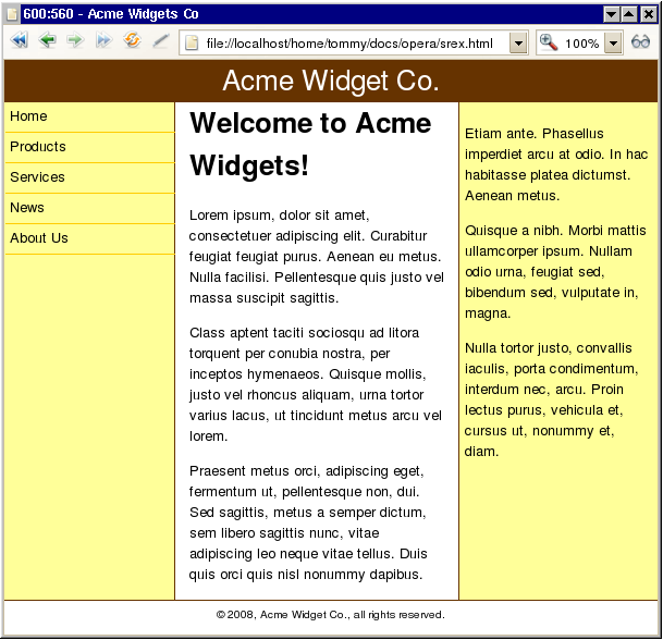
Figure 7: A typical multiple column layout, with columns sandwiched between a header and a footer.
This type of layout used to be created with layout tables back in the Dark Ages (the 1990s). That’s an abuse of HTML markup for presentational purposes, which is not advised, so therefore which we will not be teaching you about in this course. CSS offers ways to achieve the same thing using display:table-cell and similar, but there’s a major drawback to that solution: it’s not currently supported by any version of Internet Explorer, so we won’t look at that either. Only two options remain: floats or absolute positioning. Both methods have their advantages and drawbacks, but if you want a full-width footer and don’t know in advance which column will be the longest, then floats are necessary to ensure the integrity of your design.
The problem with floats is that they only shift to the left or right until they touch the edge of the parent block, or another float. That means floated columns have to appear in the right order in your markup. But sometimes it’s desirable to have a presentational order that is different from the source order. You may want to have the content before the navigation, for instance, to enhance usability for keyboard navigation and to improve search engine optimisation. This is possible to achieve, even with floats, with some judicious use of negative margins and relative positioning—let’s have a look at how to do this. Let’s begin with a skeleton, or wireframe, HTML document.
Copy the code below into your text editor and save the file as layout.html.
<!DOCTYPE html PUBLIC "-//W3C//DTD HTML 4.01//EN" "http://www.w3.org/TR/html4/strict.dtd">
 <html lang="en">
   <head>
     <meta http-equiv="Content-Type" content="text/html; charset=utf-8">
     <title>Static and Relative Positioning</title>
     <link rel="stylesheet" type="text/css" href="layout.css">
   </head>
   <body>
     <div id="header">Header</div>
     <div id="main">Main content</div>
     <div id="sidebar">Sidebar</div>
     <div id="nav">Navigation</div>
     <div id="footer">Footer</div>
   </body>
 </html>
Next, you’ll create the embryo of a style sheet. Copy the code below into your text editor and save the file as layout.css.
#header {
   background-color: #369;
   color: #fff;
 }

 #sidebar {
   background-color: #ff6;
 }

 #nav {
   background-color: #ddd;
 }

 #footer {
   border-top: 1px solid #369;
 }
Save both files and load the page in your browser. The five divisions appear in order, from top to bottom. Imagine your design department has specified that the navigation must be on the left and the sidebar on the right, with the main content column in the middle. The header and footer should extend across the whole page width and we don’t know which of the three columns in between will be the longest. The source order is mandated by your accessibility and usability experts and isn’t negotiable. How can you combine all those requirements into a working layout? You are going to have to add an extra element into the markup for this to work. It’s unavoidable, but one extra element is something you ought to be able to live with. You need an element that wraps around the three "columns".
Insert the two highlighted lines below into the HTML document:
<div id="header">Header</div>
   <div id="wrapper">
     <div id="main">Main content</div>
     <div id="sidebar">Sidebar</div>
     <div id="nav">Navigation</div>
   </div>
 <div id="footer">Footer</div>
The designers (who, fortunately, understand accessibility and device independence) have stipulated that the navigation needs to be 12em wide while the sidebar should be 14em. The main content column should have a fluid width, so that the layout adapts to different window sizes, since fixed-width layouts aren’t very user friendly. To prevent lines of text from being too long, impeding readability, you need to constrain the layout to a maximum width. In order to prevent overlap in extremely narrow windows you also need to constrain the layout to a minimum width. Within those constraints, the layout should be centred horizontally within the browser window.
Next, assign the widths to the navigation and the sidebar and set the width constraints and general centering by adding the following rules to the bottom of the CSS file:
body {
   margin: 0 auto;
   min-width: 40em;
   max-width: 56em;
 }

 #sidebar {
   width: 13em;
   padding: 0 0.5em;
   background-color: #ff6;
 }

 #nav {
   width: 11em;
   padding: 0 0.5em;
   background-color: #ddd;
 }
Save the files and reload—you should see that the yellow sidebar and the grey navigation elements have the widths you want. If your browser window is wide enough, you will also see that the whole page is constrained in width and is centred horizontally.
Try changing the window size and see how the layout adapts.
Note: if you are using Microsoft Internet Explorer version 6 or older, you won’t see the effects of any width constraints. That’s because those versions of IE don’t support minimum and maximum widths (or heights). We will look at a workaround for that at the end of the example. In fact, you will get odd results throughout this example, even with IE7, because Internet Explorer has many strange rendering bugs. I will focus on the standards-compliant way to do things in the example, and turn to workarounds at the end.
If you look closely at the code you’ll see that the widths were set to 13em and 11em instead of 14em and 12em. That’s because you need some horizontal padding; you don’t want the content of those columns to lie flush with the edges, because it doesn’t look very nice. Padding adds to the width, so 13em + 0.5em + 0.5em adds up to the 14em you want.
Making columns
Okay, you have your basic building blocks, but they just appear one after the other. You want three columns, so you need to start floating them.
Add the following rules to your CSS file:
#main {
   float: left;
 }

 #sidebar {
   float: left;
   width: 13em;
   padding: 0 0.5em;
   background-color: #ff6;
 }

 #nav {
   float: left;
   width: 11em;
   padding: 0 0.5em;
   background-color: #ddd;
 }
That floats them, all right, but they’re in the wrong order. Also, the main content column is too narrow. And what happened to our footer?
Let’s deal with the footer first. The problem is that the three columns are floated, which takes them out of the document flow. The footer is pushed up against the header and the line box containing the text is shortened so that the word “Footer” appears to the right of the floats. You can remedy this by making sure the footer is cleared from all the floated columns. Add the following rule to the CSS file:
#footer {
   clear: left;
   border-top: 1px solid #369;
 }
Now for the three columns. This will be done step by step, and it’s going to look rather ugly for a while, but don’t despair—It’ll be sorted out by the end. The key to this whole trick is the wrapper element. We will set a left and right margin on it that corresponds to the widths of your side columns (the navigation and the sidebar). The main content column will occupy the whole width of the wrapper, while the side columns will be shifted into the space vacated by the margins. Does that sound complicated? Don’t worry, I’ll take you through it in small increments.
First, set up the margins for the wrapper, by adding the following rule to the CSS file:
#wrapper {
   margin: 0 14em 0 12em;
   padding: 0 1em;
 }
Remember that the values in the
marginshorthand property are specified in TRouBLe order: top, right, bottom, left. We are setting the top and bottom margins to 0, the right margin to 14em (for the sidebar) and the left margin to 12em (for the navigation). You’ve also added 1em of horizontal padding, because you don’t want your content to be flush with the side columns; it needs to breathe.The next step is to make the main content column take up the full width of its wrapper parent; the code also sets a garish background colour to it, temporarily, so we’re doing:
#main {
   float: left;
   width: 100%;
   background-color: lime;
 }
Save and reload—you’ll see a bright lime green content column, with the sidebar and navigation below it. You’ll also notice that there is a lot of white space on both sides. The trick is to get our side columns to slip into that white space. Next I’ll move you on to the sidebar—it’s floated and it has the right width, but since the
#maincolumn is 100% wide, it pushes the sidebar down. How do you get it to go up and stay next to#main, although#mainoccupies the whole width? Let’s do it in two small steps: first, you’ll move it up; then you’ll shift it out into the margin.Here you’ll use a nifty trick to get the floated sidebar, which has been pushed down, to move back up again—make the following addition to the
#sidebarrule:#sidebar { float: left; width: 13em; padding: 0 0.5em; background-color: #ff6; margin-left: -14em; }</code>Save and reload, and you’ll see that the sidebar is now on the same vertical level as the content column. By setting a negative left margin equal to the width of the sidebar, we move the element back into the wrapper and it isn’t pushed down. The problem is that it overlaps the content.
You need to shift it out into the margin without making it drop down again, and this is where relative positioning—finally—comes in. It does precisely what we want: it shifts the generated box without moving the element itself. Add the highlighted properties below into the rule for
#sidebar:#sidebar { float: left; width: 13em; padding: 0 0.5em; background-color: #ff6; margin-left: -14em; position: relative; left: 15em; }Note that you had to shift it 15em, not 14em—that’s because there’s 1em of right padding on the wrapper that you need to get past. The sidebar is now where it belongs: out in the margin, next to the content column, lining up nicely with the right-hand edges of the header and the footer.
Now you need to do the same with the navigation this is done in a similar way, but it has a twist of its own. Moving and shifting the sidebar was easy, because the movements were essentially the same as the column’s width: 14em negative margin and a 14em+1em shift to the right. But the navigation column needs to be moved all the way across the content column and then be shifted even further out into the margin. Our friend here is percentages. A percentage value on the margins of the navigation column will be relative to the width of its parent, the wrapper. You want to move the column all the way across the wrapper—add the property highlighted below to the rule for
#nav:#nav { float: left; width: 11em; padding: 0 0.5em; background-color: #ddd; margin-left: -100%; }Hey presto! Save and reload again, and you should see the navigation overlapping the left-hand side of the content column. All you need to do now is to shift it out into the margin. Add the following highlighted properties to the rule for
#nav:#nav { float: left; width: 11em; padding: 0 0.5em; background-color: #ddd; margin-left: -100%; position: relative; right: 13em; }Again, the width of the navigation is 12em, but you have 1em of wrapper padding to get past so you need to shift the box 13em. You’re shifting it to the left, in other words from the right edge, which is why the
rightproperty is being used.Remove the lime green background from the content column, and you’re all set to go.
Working around quirks in Internet Explorer
There are two things about Internet Explorer that cause this layout that cause it to fail in that browser on Windows. One is that IE6 doesn’t support the min-width and max-width properties, the other is that IS is notoriously bad at percentages. You can use Microsoft’s proprietary expression() notation to emulate the width constraints. It takes a JScript expression as its argument and returns the return value of that expression. This can cause performance problems if the expression requires a lot of computing, since it is evaluated every time the browser needs to get the width of body. It also requires JScript to be enabled, but you can add graceful degradation, so that if say, JScript is not available, the design will falllback to something that is still usable. In this example, you’ll make the layout fully elastic instead of the constrained fluid design created above if JScript is disabled.
The recommended way of serving bug-fix style rules to Internet Explorer is to make use of "conditional comments". That’s a Microsoft-only feature that embeds conditional logic into HTML comments.
Add the following lines to your HTML code, just before the
</head>tag:<!--[if lte IE 6]> <link rel="stylesheet" type="text/css" href="layout-ie6.css"> <![endif]-->Next, create a new file named layout-ie6.css with the following content:
body {
   width: 50em;
   width: expression(w=document.documentElement.offsetWidth, em=document.getElementById("nav").offsetWidth/12, (w<40*em?"40em": (w>56*em?"56em":"auto")));
 }

 #wrapper {
   height: 1em;
 }

 #nav {
   margin-left: -22em;
   margin-left: expression((-(document.getElementById("wrapper").clientWidth))+"px");
   left: 13em;
 }
This sorts out the two problems in IE6. You’re using JScript expressions to emulate the min-width and max-width properties that IE6 doesn’t support, with an elastic fallback value of 50em. Then you use another JScript expression to set a left margin in pixels instead of percents, again with an elastic fallback. The height for #wrapper is just to trigger the Microsoft-specific hasLayout, which it needs to have for the relative positioning of the navigation element to work properly. Microsoft has documented hasLayout on MSDN, but it’s not all that easy to understand.
What about IE7 then? It does support min-width and max-width, but it still positions the navigation element wrong—it’s the same hasLayout bug as in IE6 rearing its ugly head again. You need to trigger hasLayout on the #wrapper element. Fortunately, you can do this in a way that doesn’t compromise standards-compliant browsers, so you don’t need to create a separate IE7 style sheet; you could just add the following rule to manipulate the wrapper:
#wrapper {
  margin: 0 14em 0 12em;
  padding: 0 1em;
  min-height: 1em;
}
Setting a minimum height triggers hasLayout and it causes no problem in other browsers, so it can go in your main style sheet.
These workarounds aren’t perfect; the layout will still do odd things in IE6 and IE7 if the browser window is resized to certain sizes, although if the page is then reloaded, the layout looks okay again.
Other uses for relative positioning
The most common use for relative positioning doesn’t involve shifting the generated box at all. This may sound strange: why should you want to use relative positioning without shifting the box? The reason will be revealed in the next article, because it involves absolute positioning. Stay tuned!
Setting position:relative (without shifting the box) also helps with some of the strange rendering bugs in Internet Explorer. It sets the infamous hasLayout internal property, which has a profound impact on how Internet Explorer renders elements.
See also
Exercise questions
- What happens when two adjacent margins in a static formatting context collapse and one of the margins—or both—is negative?
- Add a vertical border between each of the side columns and the main content column. Remember that all three columns are floated, so the wrapper element’s height has collapsed to zero.
- How can you make all the columns have the same height (or at least appear to), so that the background colours extend down to the footer, no matter which column is the longest? (Hint: search for “faux columns” in your favourite search engine.)