Page layout with floats and clearing
Summary
In this article you will get acquainted with floating and clearing — two must-have tools for web page layout.
What are float and clear for?
If you look in a typical magazine you’ll see images illustrating the articles, with the text flowing around them. The float property in CSS was created to allow this style of layout on web pages. Floating an image—or any other element for that matter—pushes it to one side and lets the text flow on the other side. Clearing a floated element means pushing it down, if necessary, to prevent it from appearing next to the float.
Although floating was intended for use with any elements, designers most commmonly use it to achieve multi-column layouts without having to abuse table markup.
Some boring theory
In order to explain how floating works, you need to peek under the bonnet and look at how a web browser renders an HTML/CSS document. Don’t worry, I’ll be brief.
Each visible HTML element generates a box which is then rendered. If you’re viewing the document on a computer screen or a mobile phone, the boxes are rendered on the display. If you’re printing the document, the boxes are rendered on paper. If you’re using a screen reader, the content of the boxes is rendered aurally, as speech.
Just as there are block-level and inline elements in HTML, there are block-level and inline boxes in CSS. By default, block-level elements generate block-level boxes and inline elements generate inline boxes. There will also be some generated boxes in addition to the ones generated by elements, for instance, for the text content of the document. Block boxes are normally laid out in the order the elements appear in the markup, from top to bottom. Block boxes cannot appear side-by-side unless we apply some CSS. Inline boxes are laid out horizontally. The direction property determines if they’re laid out from left to right or from right to left (the default is left to right, if this is not specified)
This is known as the document flow: inline boxes flow horizontally within their parent block boxes, and block boxes flow vertically. The boxes occur in the same order as the elements in the HTML markup.
Consider the following simple HTML document (I’ve only included the part inside the body element):
<p>This is a very simple document.</p>
<p>It consists of <em>two</em> paragraphs.</p>
Figure 1 shows a screen shot of that document with an overlay that shows the two block boxes generated by the p elements and the inline box generated by the em element.
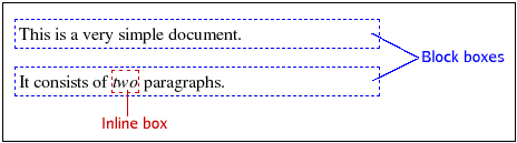
Figure 1: A demonstration of block boxes generated by the p elements, and an inline box generated by the em element.
All the inline boxes that make up one “line” on the output device are enclosed in imaginary rectangles known as line boxes. Line boxes are always laid out from the top down with no space between them, as illustrated in Figure 2.
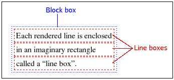
Figure 2: Each rendered line is enclosed in a separate line box.
How does floating work?
OK! Now that we’ve gone through all the boring theoretical stuff, let’s move on to look at the syntax of floats and clearing, and check out some examples.
The float property has four valid values: left, right, none and inherit. The first two are by far the most commonly used and will cause a box to be floated to the left or to the right. The declaration float:none, which is the default, is normally only declared to “undo” a declaration in some other rule. The use of float:inherit is probably very rare—I’ve never seen it used in the wild—and exists probably just for the sake of consistency. It would make the element inherit the float value from its parent element.
A floated box is taken out of the document flow and shifted as far as possible to the left or to the right, depending on the specified floating direction. “As far as possible” usually means until the outer edge of the float touches the edge of the containing block (the inside of its padding, if any). Thus, for float:left the box is moved to the left until the left margin of the float touches the left edge of the parent.
The alert reader may have noticed that I said “usually” above. If there is already a box floated to the left when we float another box in the same direction, the second box will stop when it touches the first box. In other words, floats don’t climb on top of one another.
It’s time to look at floating in action, so get your text editor ready.
Create a new file, copy the code below into it, and save the document as float.html.
<!DOCTYPE html>
   <html>
     <head>
       <meta http-equiv="Content-Type" content="text/html; charset=utf-8">
       <title>Floating</title>
     </head>
     <body>
       <p id="p1"><span id="span-a">Lorem ipsum</span>
       <span id="span-b">dolor sit amet</span>
       <span id="span-c">consectetuer</span> adipiscing elit.
       Curabitur feugiat feugiat purus.
       Aenean eu metus. Nulla facilisi.
       Pellentesque quis justo vel massa suscipit sagittis.
       Class aptent taciti sociosqu ad litora torquent per conubia nostra, per inceptos hymenaeos.
       Quisque mollis, justo vel rhoncus aliquam, urna tortor varius lacus, ut tincidunt metus arcu vel lorem.
       Praesent metus orci, adipiscing eget, fermentum ut, pellentesque non, dui.
       Sed sagittis, metus a semper dictum, sem libero sagittis nunc, vitae adipiscing leo neque vitae tellus.
       Duis quis orci quis nisl nonummy dapibus.
       Etiam ante. Phasellus imperdiet arcu at odio.
       In hac habitasse platea dictumst. Aenean metus.
       Quisque a nibh. Morbi mattis ullamcorper ipsum.
       Nullam odio urna, feugiat sed, bibendum sed, vulputate in, magna.
       Nulla tortor justo, convallis iaculis, porta condimentum, interdum nec, arcu.
       Proin lectus purus, vehicula et, cursus ut, nonummy et, diam.</p>

       <p id="p2">Nunc ac elit. Vestibulum placerat dictum nibh. Proin massa.
       Curabitur at lectus egestas quam interdum mollis.
       Cras id velit a lacus sollicitudin faucibus.
       Proin at ante id nisi porttitor scelerisque.
       In metus. Aenean nonummy semper enim.
       Aenean tristique neque quis arcu tincidunt auctor.
       Fusce consequat auctor ligula.
       Fusce nulla lorem, sagittis a, lacinia et, nonummy in, eros.
       In nisi augue, aliquam eget, convallis vel, malesuada quis, libero.</p>

       <p id="p3">Hello, World!</p>
     </body>
  </html>
That’s a lot of content, but we need some to show how this works.
Open the document in your web browser to see how it looks. Boring, isn’t it?
Create another document in your text editor, populate it with the code below, and save it as style.css in the same directory as the HTML file from Step 1.
#span-a {
   float: left;
   background-color: #cfc;
   color: #030;
 }
Link the style sheet to the HTML document by inserting the following line just before the
</head>tag:<link rel="stylesheet" type="text/css" href="style.css">Save and refresh the page in your browser. You’ll now see the
spanelement containing the words “Lorem ipsum” floated to the left. I’ve also given it a light green background, to make it stand out a bit.It’s still not easy to see what’s happening here, so let’s make our float a little larger. Add the following declaration to your style sheet:
#span-a {
   float: left;
   background-color: #cfc;
   color: #030;
   padding: 1em;
 }
Save and refresh, and you’ll see that the green area is now larger, since we’ve added a bit of padding on all four sides of the box. The float is as tall as three lines of text and we can clearly see that the other text is flowing around the float.
The minutiae
Now I’ll analyse what’s happening here in further detail. The floated box generated by the first span element has been shifted to the left, all the way to the edge of the document, and the line boxes adjacent to it have been shortened.
Although it’s not readily visible yet, the block box generated by the paragraph that contains the float is not affected. Let’s highlight the paragraph to make this clearer.
Add another CSS rule to the style sheet, as follows:
p {
   border: 1px solid #f00;
 }
Again, save the CSS file and to refresh the browser. You should now see a red border around each paragraph—notice that the float resides inside one of the paragraphs.
Let’s modify the last rule, to verify that floats stop at the inner edge of the parent’s padding area:
p {
   border: 1px solid #f00;
   padding: 1em; background-color: #ff9;
}
Save and refresh, and you’ll see proof of what I said earlier: the floated box is shifted to the edge of its containing block, while the parent’s padding lies outside it. You’ll also see that the yellow background of the paragraph extends underneath the floated box. Floating a child box clearly isn’t affecting the paragraph box, only the line boxes within.
Let’s experiment some more—what happens if the float is taller than its parent? Modify the rule for the float as follows:
#span-a {
   float: left;
   background-color: #cfc;
   color: #030;
   padding: 1em 1em 10em;
 }
Note: If you’ve got a narrow browser window you may need to use a larger value than 10em for the bottom padding to get the green area to extend past the bottom border of the paragraph. You will now see something interesting: the floated box protrudes outside the parent block; the parent box does not expand to contain its floating child box. You can also see (if you’ve used a large enough bottom padding) that the line boxes adjacent to the float in the second paragraph are shortened.
More floats
Let’s create another float to see what happens when two elements are floated in the same direction.
Add a new rule to your style sheet and save and refresh as before:
#span-b {
   float: left;
   background-color: #ccf;
   color: #003;
   padding: 1em;
 }
Now the
spanelement containing the words “dolor sit amet” are also floated to the left. You will see that it’s shifted to the left until it touches the first float; in other words, “as far as possible”.Why stop at two floats? Let’s make a third—add the following rule to your style sheet:
 #span-c {
   float: left;
   background-color: #fcc;
   color: #300;
   padding:2em 1em;
 }
I also want you to add a temporary rule to see an example of what happens when there isn’t enough room for a float on a line. Add the following rule at the end of the style sheet:
 span {
   width: 34%;
 }
As before, save your style sheet and refresh the document in the browser—you’ll see something like the output shown in Figure 3.
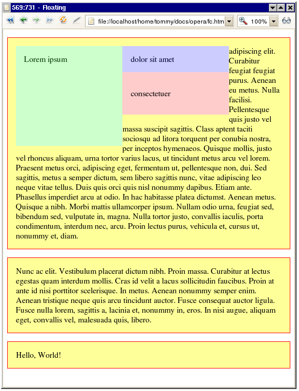
Figure 3: Not quite what you expected?

Whoa! What just happened? The third float now appears below the second one! (And Internet Explorer 6 does some other strange things, which we’ll ignore for now.) Since the width of each span element is 34% of the paragraph’s width (as specified by the rule added in Step 3), plus some padding, there isn’t room for all three of them side-by-side (3 x 34% = 102%). The first two floats fit on the same line, but the third one does not and is shifted down. The important thing is that it’s only shifted down as far as it needs to be, to fit within the line. It’s not shifted down below the first, tall, float since there’s room to the right of it.
Another interesting thing to note here is that you’ve assigned a width to the span elements. This shouldn’t make any difference since span is an inline element type. Floating a box, however, automatically makes it a block-level box, which means we can assign dimensions and vertical margins to it.
Margins on floats
Now we’ll explore what you can do with margins on floats.
First, remove the temporary rule for
spanelements that you added earlier, and then save and refresh, so that our three floats exist side-by-side again. In other words, delete this rule:span { width: 34%; }Now the floats are stacked tightly together and the adjacent text starts immediately after the last float (unless you are using Microsoft Internet Explorer 6 or older, in which case there’s a 3-pixel gap on the right due to the three pixel jog bug). How can you make some space around a floated box? The answer is margins!
Let’s try this on the middle float—change the CSS rule for the middle float as followes, then save and refresh:
#span-b {
   float: left;
   background-color: #ccf;
   color: #003;
   padding: 1em;
   margin-left: 1em; margin-right: 1em;
 }
Yep, now there’s some space on both sides of the middle float.
You can also set vertical margins on a floated box—make the following changes to the rule for the third float, then save and refresh.
 #span-c {
   float: left;
   background-color: #fcc;
   color: #300;
   padding:2em 1em;
   margin-top: 2em; margin-bottom: 2em;
 }
This makes the third float move down and there’s also some extra space below it.
Since we’re in an adventurous mood, let’s see what happens if we start playing with negative margins! Make the following changes to the rule for the third float, then save and refresh:
 #span-c {
   float: left;
   background-color: #fcc;
   color: #300;
   padding:2em 1em;
   margin-top: 2em;
   margin-bottom: 2em;
   margin-left: -4em;
 }
You’ll now see the output shown in Figure 4.
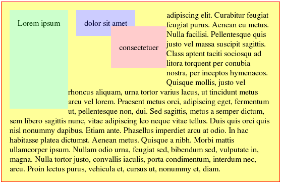
Figure 4: You’ll now see floats on top of one another!

How about that, eh? Who said floats can’t appear on top of other floats? Note how the negative left margin moves the entire float to the left.
Using negative margins on floats can be very useful in certain types of multi-column layouts.
Clearing
Now that I’ve covered the basics of floating, I’ll move on to the closely related topic of clearing.
As you have seen in the examples throughout this article, text will flow around a floated element, and block boxes aren’t affected by floats. Sometimes it’s desirable to make sure that an element doesn’t end up adjacent to a float. For instance, a heading that introduces a new section of an article shouldn’t appear next to an image from the previous section. You’d much rather have the heading appear below the image, even if the image protrudes below the last paragraph. The only way to do that is to use the clear property on the heading.
Another example is the ubiquitous three-column layout with a full-width footer. If the columns are floated, you use the clear property on the footer to ensure that it appears below all the columns—no matter which column happens to be the longest.
The clear property has three useful values: left, right and both. The values none (default) and inherit are also valid.
Using clear:left on an element means that its generated box is guaranteed to appear below any previously floated boxes on the left side. If you use clear:both it will appear below all previous floats on either side.
Clearing is achieved by shifting the element down (white space is added above its top margin) if necessary, until its top edge is below the bottom edges of all floated boxes in the specified direction(s). Let’s look at an example to illustrate it further.
Before you try this, let’s clean up your style sheet. Remove the rules for
#span-band#span-cso that you only have the green float left. Make sure that its bottom padding is large enough that it extends into the second paragraph.Add the following rule for the second paragraph, then save and refresh:
 #p2 {
   clear: left;
 }
Observe! The second paragraph is shifted down until it clears free of the float, as seen in Figure 5.
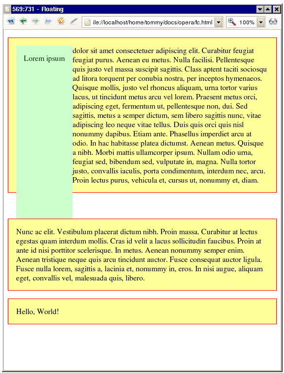
Figure 5: The second paragraph is now cleared below the first one.
To make things really complicated we can use
floatandclearon the same element.Add a rule for the second float and let it clear the first float, then save and refresh:
#span-b {
   float: left;
   clear: left;
   padding: 1em;
   background-color: #ccf;
   color: #003;
 }
The blue float now appears below the green float, entirely outside the parent paragraph. Since it’s also floated to the left, the second paragraph is shifted down even further to clear it.

Containing floats
As you’ve seen above, the parent box doesn’t normally expand to contain floated children. This can often cause confusion, for example when all children of an element are floated when you make a horizontal menu out of an unordered list by floating all the li elements. Since floated boxes are taken out of the flow and don’t affect the parent box, floating all the children effectively makes the parent empty and it will collapse to zero height. Sometimes this is undesirable, for instance if you want to set a background on the parent. If the parent has zero height, no background will be visible.
It’s obvious that we need some mechanism for making a parent box expand to enclose its floated children. The traditional method was to include an extra element in the markup, just before the parent’s closing tag, and setting clear:both on it. That works, but it’s rather unpalatable since it involves introducing extra unnecessary, unsemantic markup. Fortunately, there are other ways, which I’ll discuss now.
The first method is simply to float the parent, too. Floated boxes will always expand to enclose their floated children.
To try it in our example document, remove the rule for
#span-bagain, and float the first paragraph like so, before saving and refreshing:#p1 { float: left; }The paragraph now expands until it encompasses the green float. This is all well and good, but sometimes floating the parent isn’t an option. Another way that avoids floating the parent is to set the
overflowproperty of the parent to something other thanvisible. If you set it tohiddenand don’t specify a height, the parent will enclose floated children.Replace the last rule with this, then save and refresh:
 #p1 {
   overflow: hidden;
 }
Note that the latter method doesn’t work in Internet Explorer 6 or older.
Shrink-wrapping
I mentioned earlier that floating an inline box caused it to become block-level, thus allowing us to specify dimensions and vertical margins for it. Floating a block box also has a surprising consequence: if no width is specified the box will “shrink-wrap” to fit its content. This wasn’t visible in the example document when you floated the first paragraph, because it had enough content to fill the whole window (unless you have a really wide monitor).
Let’s float the last paragraph to see the effect. In fact, just to have some variation, let’s go really wild and float this one to the right!
Add the following rule to the style sheet:
 #p3 {
  float: right;
 }
Now save and refresh; the paragraph that says “Hello, World!” will now be floated to the right and is only as wide as the text plus some padding that you specified in a previous rule for all paragraphs.
Centering Floats
Sometimes you will want to float an element—perhaps to make it enclose floated children—while having it horizontally centred within its parent. There is a problem here: you can’t use the usual trick of setting the left and right margins to auto for floats, and there is no such value as float:center. Isn’t there some way to work around this?
There is, as a matter of fact. CSS guru Paul O’Brien explains how in his article When is a float not a float?. It involves an extra wrapper element, but you can live with that. By shifting the wrapper element to the right, then shifting the float back to the left, you can actually center a shrink-wrapped float of unknown width! (You can use this to impress your partner on the next date. It never fails.)
Let’s try it. In the following example you’ll add a horizontal menu bar to your page, based on an unordered list with floating items.
Insert the following markup just after the
<body>tag in your HTML document:<div class="wrap"> <ul id="menu"> <li><a href="#">Home</a></li> <li><a href="#">News</a></li> <li><a href="#">Products</a></li> <li><a href="#">Services</a></li> </ul> </div> <!--Internet Explorer needs this--> <div class="clear"></div>Add the following CSS rules to your style sheet, to style the menu:
 #menu {
   margin: 0;
   padding: 0.5em;
   font-family: Verdana,sans-serif;
 }

 #menu li {
   float: left;
   list-style-type: none;
   margin: 0 0 0 0.5em;
   padding: 0.25em;
   background-color: #600;
   color: #ff9;
   border: 2px solid #f00;
 }

 #menu a {
   color: #ff9;
   text-decoration: none;
 }

 .wrap {
   float: left;
   margin-bottom: 2em;
 }

 .clear {
   clear: left;
   height: 1px;
   margin-top: -1px;
 }
Save both files and refresh the browser. You’ll see your menu in the top left-hand corner. Let’s make it horizontally centred.
Shift the wrapper element halfway across the page, by modifying the rule for
.wrapas shown below:.wrap { float: left; margin-bottom: 2em; position: relative; left: 50%; }</li>
<p>Save and refresh. Your menu will start at the horizontal centre of the page, but that’s not what we wanted—it’s too far to the right, so you need to shift it back a bit to the left. Since you have floated the wrapper, it’s shrink-wrapped to fit the list. You want to move the list a distance that equals half of its width, which also means half the width of the wrapper, so you shift it by -50%.
Modify the
#menurule as follows:#menu { margin: 0; padding: 0.5em; font-family: Verdana, sans-serif; position: relative; left: -50%; }Save and refresh again. The menu is now centred; the only problem is that you may have a horizontal scroll bar, depending on the width of the list and the browser window. This is because you have shifted the wrapper element halfway across the screen; if the list is wider than half the window, part of it will end up off-screen.
You can get rid of that by setting
overflow:hiddenon a suitable parent element, to make the overflow hidden. In this case the parent of the wrapper is thebody. Sometimes it’s not feasible to hide overflow on thebodyelement, in which case you’ll need a wrapper for the wrapper; in this case, however, it’s fine. Add the following rule to your style sheet:body { overflow: hidden; }Actually, there is one more problem. If you look at this in Internet Explorer you’ll see that it still isn’t working properly. The workaround is to float the list itself, but only in Internet Explorer, since it breaks other browsers. You can get round this by using a little hack that ensures that only Internet Explorer applies the rule. Add the following rule to your style sheet:
 * html #menu {
   float: left;
 }
Bugs!
Floating and clearing is very useful, but unfortunately most—if not all—browsers have buggy implementations of these properties. Internet Explorer 6 boasts an astounding array of odd behaviour with floats, including disappearing content, doubled margins and the infamous 3-pixel jog. But not even Firefox and Opera are completely bug-free when it comes to floating and clearing. Position Is Everything is an invaluable resource where these bugs are documented—along with workarounds in most cases.
Summary
Floating a box shifts it as far as it can go to the left or to the right inside its parent element. A floated box is taken out of the document flow and doesn’t affect the parent box or subsequent block-level boxes, although adjacent line boxes are shortened. When there isn’t room for a floated box on a line because of previous floats, it is shifted down until it fits (or until there are no other floats).
When an inline box is floated it becomes a block-level box. When a block-level box is floated and no explicit width is specified, it will shrink-wrap to fit its content. Clearing floats entails shifting content down, if necessary, until the top edge of the content is below the bottom edges of all floating boxes in the specified direction(s).
Centering a shrink-wrapped floating box is possible by adding a wrapper element and some judicious use of relative positioning.
See also
Exercise questions
- What happens if you float an element in the middle of a paragraph; ie, if there is text before the float? Make sure to try this in different browsers, because they behave differently. Opera and Safari get it right, while Firefox and Internet Explorer don’t.
- How can floats be used to display image thumbnails in a gallery of equally sized “cells” without using a layout table?
- How can you have a vertical navigation menu on the left-hand side of the page and a content column on the right, without the content text wrapping under the menu?
- A very common web site layout consists of a full-width header, below which there are three content columns and then a full-width footer at the bottom. How can you achieve such a layout with floating and clearing?