"Mobifying" your HTML5 site
By Eric Bidelman
Originally published March 3, 2011
Summary
An introduction to HTML5 enhancement techniques for mobile devices.
Introduction
Developing for the mobile web is a hot topic these days. In 2011, for the first time ever, smart phones out-sold PCs. More and more users are using a mobile device to traverse the web, which means it’s becoming critical for developers to optimize their sites for mobile browsers.
The mobile battlefield is still uncharted waters for a large number of developers. Many folks have existing legacy sites that neglect mobile users altogether. Instead, the sites are designed primarily for desktop browsing and degrade poorly in mobile browsers. The site HTML5Rocks! is no exception. At launch, the developers put little effort into a mobile version of the site.
Creating a mobile-friendly html5rocks.com
As an exercise I thought it would be interesting to take HTML5Rocks!, already an HTML5 site, and augment it with a mobile-friendly version. I was mainly concerned with the minimum amount of work required to target smart phones. The goal of my exercise was not to create an entirely new mobile site and maintain two codebases. That would take forever and be a huge waste of time. We had already defined the site’s structure (markup). We had a look and feel (CSS). The core functionality (JS) was there. The point is, many sites are in the same boat.
This article examines how we created a mobile version of HTML5Rocks! optimized for Android and iOS devices. Just load html5rocks.com on a device that supports one of those OSs to see the difference. There are no redirects to a specific mobile version such as “m.html5rocks.com” or other tomfoolery. You get HTML5Rocks! as is… with the added benefit of something that looks great and works well on a mobile device.
html5rocks.com on desktop (left) and mobile (right) 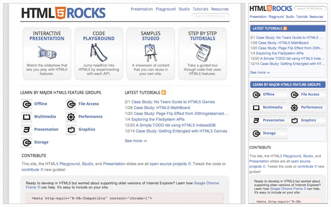
CSS3 Media queries
HTML4 and CSS2 have supported media-dependent style sheets for some time. For example:
<link rel="stylesheet" media="print" href="printer.css">
This stylesheet reference targets print devices and provides specific styling for the page content when it is printed. CSS3 takes the idea of media types one step further and enhances their functionality with media queries. Media queries extend the usefulness of media types by allowing more precise labeling of style sheets. This enables the content’s presentation to be customized to a specific range of output devices without having to change the content. Sounds perfect for an existing layout that needs modifying!
You can use media queries in the media attribute of your external stylesheets to target screen width, device width, orientation, etc. For the full list, see the W3C media query specification.
Targeting screen sizes
In the following example, phone.css would apply to devices that the browser considers “handheld” or devices with screen widths no more than 320px.
 <link rel="stylesheet"
   media="handheld, only screen and (max-device-width: 320px)" href="phone.css">
Prefixing media queries with the "only" keyword causes non-CSS3-compliant browsers to ignore the rule.
The following targets screen widths between 641px and 800px:
 <link rel="stylesheet"
   media="only screen and (min-width: 641px) and (max-width: 800px)" href="ipad.css">
Media queries can also appear within inline <style> tags. The following targets all media types when in a portrait orientation:
 <style>
   @media only all and (orientation: portrait) { ... }
 </style>
media="handheld"
We need to stop for a minute and discuss media="handheld". The fact is, Android and iOS ignore media="handheld". The claim is that users will miss the high-end content provided by stylesheets targeting media="screen", and that developers are less likely to maintain a lower-quality media="handheld" version. So, as part of their “full web” motto, most modern smart phone browsers simply ignore handheld style sheets.
It would be ideal to use this feature to target mobile devices, but various browsers have implemented it in different ways:
- Some read only the handheld style sheet.
- Some read only the handheld style sheet if there is one, but default to the screen style sheet otherwise.
- Some read both the handheld style sheet and the screen style sheet.
- Some read only the screen style sheet.
Opera Mini, for example, does not ignore media="handheld". The trick to getting Windows Mobile to recognize media="handheld" is to capitalize on the media attribute value for the screen stylesheet:
 <!-- media="handheld" trick for Windows Mobile -->
 <link rel="stylesheet" href="screen.css" media="screen">
 <link rel="stylesheet" href="mobile.css" media="handheld">
How html5rocks.com uses media queries
Media queries are used heavily throughout mobile HTML5Rocks!. They allow us tweak the layout without having to make significant changes to our Django template markup—a real lifesaver! In addition, their support across the various browsers is pretty good. (See the compatibility tables at the end of this article for specific information.)
In the <head> of each page you’ll see the following stylesheets:
 <link rel="stylesheet"
   media="all" href="/static/css/base.min.css" />
 <link rel="stylesheet"
   media="only screen and (max-width: 800px)" href="/static/css/mobile.min.css" />
base.css has always defined the main look and feel of html5rocks.com, but now we’re applying new styles (in mobile.css) for screen widths under 800px. Its media query covers smart phones (~320px) and the iPad (~768px). The effect: we’re incrementally overriding styles in base.css only as necessary to make things look better in mobile.
Some of the styling changes that mobile.css enforces are:
- Reduces extra whitespace/padding across the site. Small screens mean space is at a premium!
- Removes
:hoverstates. They’ll never been seen on touch devices. - Adjusts the layout to be single-column. More on this later.
- Removes the
box-shadowaround the site’s main container div. Large box shadows reduce page performance. - Uses CSS flex box model
box-ordinal-groupto change the ordering of each section on the homepage. You’ll notice that “LEARN BY MAJOR HTML5 FEATURE GROUPS” comes before the “TUTORIALS” section on the homepage but after it on the mobile version. This ordering made more sense for mobile and didn’t require markup changes. CSS flexbox FTW! - Removes
opacitychanges. Changing alpha values is a performance hit on mobile.
Mobile meta tags
Some mobile operators try to change/minify/compress content as it gets sent to the handheld device to save on bandwidth across the mobile network. This can happen with Javascript and images requested from a server with certain network operators, this can break javascript libraries and code. To stop the network operators from doing this, send the following meta tag down with your content or setup your web server to send the header on certain file types.
<meta http-equiv="cache-control" content="no-transform">
Mobile WebKit supports a few goodies that give users a better browsing experience on certain devices.
Viewport settings
The first meta setting (and one that you’ll use most often) is the viewport property. Setting a viewport tells the browser how content should fit on the device’s screen and informs the browser that the site is optimized for mobile. For example:
<meta name="viewport" content="width=device-width, initial-scale=1.0, user-scalable=yes">
tells the browser to set the viewport to the width of the device with an initial scale of 1. This example also allows zooming, something that may be desirable for a web site but not a web app. We could prevent zooming with user-scalable=no or we could cap the scaling to a certain level:
 <meta name=viewport
   content="width=device-width, initial-scale=1.0, minimum-scale=0.5 maximum-scale=1.0">
Note: width can also take a pixel value. Setting width=320 would achieve the same result as width=device-width on the iPhone and a few other smart phones. Keep in mind that not all phones have this exact width, so it’s best to stick with device-width and let the browser figure out the rest.
Android extends the viewport meta tag by allowing developers to to specify which screen resolution the site has been developed for:
<meta name="viewport" content="target-densitydpi=device-dpi">
Possible values for target-densitydpi are device-dpi, high-dpi, medium-dpi, and low-dpi.
If you want to modify your web page for different screen densities, use the -webkit-device-pixel-ratio CSS media query and/or the window.devicePixelRatio property in JavaScript, then set the target-densitydpi meta property to device-dpi. This stops Android from performing scaling in your web page and allows you to make the necessary adjustments for each density via CSS and JavaScript.
See Android’s WebView documentation for more information on targeting device resolutions.
Full-screen browsing
There are two other meta values that are iOS-specific. apple-mobile-web-app-capable and apple-mobile-web-app-status-bar-style will render page content in an app-like full screen mode and make the status bar translucent:
 <meta name="apple-mobile-web-app-capable" content="yes">
 <meta name="apple-mobile-web-app-status-bar-style" content="black-translucent">
For more information on all of the available meta options, see the Safari reference documentation.
Home screen icons
iOS and Android devices also accept rel="apple-touch-icon" (iOS) and rel="apple-touch-icon-precomposed" (Android) for links. These create a flashy app-like icon on the user’s home screen when they bookmark your site:
 <link rel="apple-touch-icon"
       href="/static/images/identity/HTML5_Badge_64.png" />
 <link rel="apple-touch-icon-precomposed"
       href="/static/images/identity/HTML5_Badge_64.png" />
How html5rocks uses mobile meta tags
Putting everything together, here is a snippet from the <head> section of html5rocks.com:
 <head>
   ...
   <meta name="viewport"
         content="width=device-width, initial-scale=1.0, minimum-scale=1.0" />

   <link rel="apple-touch-icon"
         href="/static/images/identity/HTML5_Badge_64.png" />
   <link rel="apple-touch-icon-precomposed"
         href="/static/images/identity/HTML5_Badge_64.png" />
   ...
 </head>
Vertical layout
On smaller screens, it is far more convenient to scroll vertically than horizontally. Keeping content in a single-column, vertical layout is preferred for mobile. For html5rocks.com, we used CSS3 media queries to create such a layout. Again, this was done without changing markup.
Single-column vertical layout throughout the site 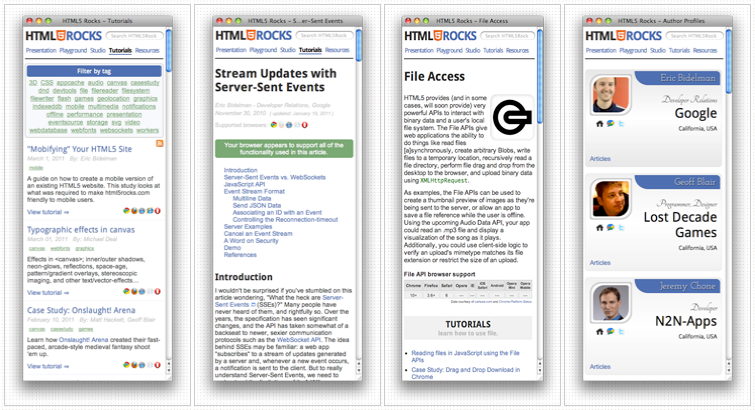
Mobile optimizations
Most of the optimizations that we made are things that should have been done in the first place, such as reducing the number of network requests, JS/CSS compression, gzipping (comes free on App Engine), and minimizing DOM manipulations. These techniques are common best practices but are occasionally overlooked when rushing a site out the door.
Auto-hide address bar
Mobile browsers lack the screen real estate of their desktop counterparts. To make things worst, on different platforms, you sometimes end up with a big ol’ address bar at the top of the screen… even after the page is done loading.
One easy way to deal with that is to scroll the page using JavaScript. Even doing so by one pixel will take care of the pesky address bar. To force-hide the address bar on html5rocks.com, I attached an onload event handler to the window object and scrolled the page vertically by one pixel:
Ugly address bar takes up screen real estate 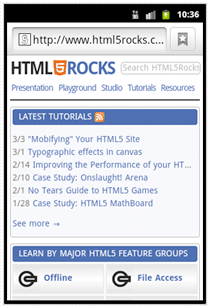
Here is the code to fix that:
 {% if is_mobile % }
   // Hides mobile browser's address bar when page is done loading.
   window.addEventListener('load', function(e) {
     setTimeout(function() { window.scrollTo(0, 1); }, 1);
   }, false);
 {% endif % }
As you can see, we wrapped this listener in our is_mobile template variable since it’s not needed on the desktop.
Reduce network requests, save bandwidth
It’s a known fact that reducing the number of HTTP requests can greatly improve performance. Mobile devices further limit the number of concurrent connections the browser can make, so mobile sites will benefit even more from reducing these extraneous requests. Furthermore, shaving off every byte is critical because bandwidth is often limited on phones. You may be costing users money!
The following are some of the approaches we took to minimize network requests and reduce bandwidth on html5rocks.com.
Remove iframes — iframes are slow! A large amount of our latency came from 3rd-party sharing widgets (Buzz, Google Friend Connect, Twitter, Facebook) on tutorial pages. These APIs were included via
<script>tags and created iframes that diminish the speed of the page. The widgets were removed for mobile.display:none— In certain cases, we were hiding markup if it didn’t fit the mobile profile. A good example were the four rounded boxes at the top of the homepage:
Box buttons on homepage
They’re missing from the mobile site. It’s important to remember that the browser still makes a request for each icon, despite their container being hidden withdisplay:none. Therefore, it wasn’t sufficient to simply hide these buttons. Not only would that be wasting bandwidth, but the user wouldn’t even see the fruits of that wasted bandwidth! The solution was to create an “is_mobile” boolean in our Django template to conditionally omit sections of HTML. When the user is viewing the site on a smart device, the buttons are left out.
Application Cache — Not only does this give us offline support, but it also creates a faster startup.
CSS/JS compression — We’re using YUI compressor instead of Closure compiler mainly because it handles both CSS and JS. One issue that we ran into was that inline media queries (media queries that appear inside a stylesheet) barfed in YUI compressor 2.4.2 (see this issue). Using YUI Compressor 2.4.4+ fixed the problem.
Used CSS image sprites where possible.
Used pngcrush for image compression.
Used dataURIs for small images. Base64 encoding adds ~30%+ to the image size but saves the network request.
Auto-loaded Google Custom Search using a single script tag rather than dynamically loading it with
google.load(). The latter makes an extra request.<script src="//www.google.com/jsapi?autoload={"modules":[{"name":"search","version":"1"}]}"></script>Our code pretty printer and Modernizr were being included on every page, even if they were never used. Modernizr is great, but it runs a bunch of tests on every load. Some of those tests make costly modifications to the DOM and slow down page load. Now, we’re only including these libraries on pages where they’re actually needed. -2 requests :)

Additional performance tweaks:
- Moved JS to the bottom of the page where possible.
- Removed inline
<style>tags. - Cached DOM lookups and minimized DOM manipulations — Every time you touch the DOM the browser performs a reflow. Reflows are even more costly on a mobile device.
- Elements with fixed widths were replaced with fluid
width:100%orwidth:auto. - Offloaded wasteful client-side code to the server. Specifically, the check to set the navigation styling of the current page:
 var lis = document.querySelectorAll('header nav li');
 var i = lis.length;
 while (i--) {
   var a = lis[i].querySelector('a');
   var section = a.getAttribute("data-section");
   if (new RegExp(section).test(document.location.href)) {
     a.className = 'current';
   }
 }
Application Cache
The mobile version of html5rocks.com uses Application Cache to speed up initial load and allows users to read content offline.
When implementing AppCache on your site, it’s very important that you don’t cache your manifest file (either explicitly in the manifest file itself or implicitly with heavy cache control headers). If your manifest gets cached by the browser it’s a nightmare to debug. iOS and Android do a particularly good job of caching this file but don’t provide a convenient way to flush the cache as desktop browsers do.
To prevent caching for our site, we first set App Engine to never cache manifest files:
 - url: /(.*\.(appcache|manifest))
   expiration: "0s"
Second, we used the JS API to inform the user when a new manifest has finished downloading_ They’re prompted to refresh the page:
 window_applicationCache_addEventListener('updateready', function(e) {
   if (window_applicationCache_status== window.applicationCache.UPDATEREADY) {
     window.applicationCache.swapCache();
     if (confirm('A new version of this site is available. Load it?')) {
       window.location.reload();
     }
   }
 }, false);
To save network traffic, keep your manifest simple. That is, don’t call out every page on your site. Just list the important images, CSS, and JavaScript files. The last thing you want to do is force the mobile browser to download a large number of assets on every appcache update. Instead, remember that the browser will implicitly cache an html page when the user visits it (and if it includes a <html manifest="..."> attribute).
Attributions
Portions of this content come from HTML5Rocks! article