Web typography
Summary
What is typography? Put simply, it is the art, design, and arrangement of text (referred to as type)—a concept borrowed from traditional print design. It is as much about what you don’t do with your type as what you do. On the web, typography often gets very little attention, and there are certain technological limitations that can cause web typography to suffer when compared to print typography. However, with the tools available to you, there’s no reason why type cannot be presented on the web in a wide variety of stylish and beautiful forms.
In this Web Standards Curriculum article, I’ll look at exactly why typography is limited on the web (compared to print design) and present some tips to follow for good web typography, along with an example web page that demonstrates some of these tips. Don’t worry if you don’t understand the CSS and HTML code at this stage—the point here is to make you think about design. While you are going through the article, it might be an idea to have a pen(cil) and paper by your side so you can start to sketch ideas about text layout. The table of contents for this article looks like so:
Note that this article does not contain code syntax examples showing how to implement different fonts and text effects. These can all be found in the article Text styling with CSS
Design Consideration Using Typography on the Web
When it comes to typography on web, the old adage “less is more” very much proves the point. In general, limiting only one or two font families in a single site result in a cleaner look. You can develop the look and feel, and styling of text and headlines by adjusting font size, thickness (bold, semi-bold, etc), italicizing, kerning and spacing instead of using variety of type faces. An important point to remember is the organization of hierarchy of information. For example, using larger size and bold of font style for the headline and then smaller size of same font style for subheading, then using book or regular font for the main text and so forth. In another word, make a clean delineation of information with sizes and boldness of same typeface for consistency rather than employing different type faces.
Limitations of typography on the web to consider:
- A limited selection of fonts
- No hyphenation, making full justification look ugly when a column of text gets narrow
- Poor control over kerning (ie, the spacing between the letters)
- A lack of control over how the work is viewed—designers must account for a wide variety of screen sizes, resolutions and environments
Let’s look at these points in a bit more depth.
Reduced selection of fonts
The reduced selection of fonts is often the first thing you will run up against when styling your text. Although you can specify any font you like in your CSS, visitors to your sites will only see your text displayed in that font if they happen to have it installed on their own computer—if they don’t, their browser will either use an alternative font that you’ve specified in your CSS, or resort to the browser default (usually Times New Roman). So, you may like to see all your body text displayed with special fonts like Trump Medieval or Avant Garde, but unless your target audience is heavily biased towards designers your viewers likely aren’t going to get the benefit. For this reason, most web designers limit themselves to the most commonly-available fonts across all systems, which are usually limited to the following:
- Andale Mono
- Times New Roman
- Georgia
- Verdana
- Arial/Arial Black
- Courier/Courier New
- Trebuchet MS
- Comic Sans (this is an unprofessional, many would say ugly font—don’t use this, except perhaps sparingly on sites aimed at children)
- Impact
These look like Figure 1:
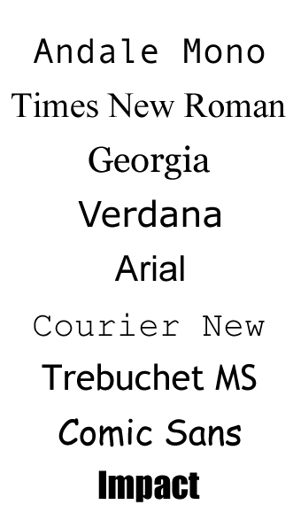
Figure 1: The most commonly available fonts across all systems are limited to the above.
Specifying any of the above fonts means you’re reasonably likely to be picking a font that most of your visitors will also have. Microsoft also introduced six new fonts designed for screen use in Windows Vista and XP, and, oddly, chose to begin all their names with the letter C. If you want to use them, they are Cambria, Calibri, Candara, Consolas, Constantia and Corbel. I’d advise against using these, however, because they are not likely to be available on the Mac or Linux platforms.
So, compared to the thousands of typefaces available to print designers, web designers can reliably choose from just over a dozen. But is this a serious limitation? Typography is about far more than simply selecting an attractive font, it’s about line lengths and kerning and white space as well—remember that typographers pre-dating electronic fonts would have faced similar limitations.
Hyphenation
When it comes to aligning your text within its container, there are four options: left-aligned, right-aligned, centre-aligned and fully-justified. Fully-justified text, where both the left and right edges of the block are aligned to the vertical sides of their container, can look more attractive than text with a “ragged” edge, and you’ll see it a lot in magazines and books. On the web, however, it’s problematic due to the lack of automatic hyphenation, which breaks words at appropriate points to better fit them in the line. To fully justify the block of text, all the browser can do is adjust the spacing between the words, which can lead to “rivers of white space” running vertically through the block—this usually happens when the line length within the block is too short and there aren’t enough spaces to adjust subtly, as shown in Figure 2.
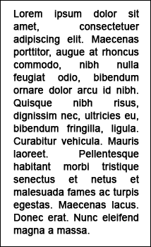
Figure 2: Rivers of whitespace can spoil justified text blocks.
As you can see in this screenshot, the lack of hyphenation to break words at natural points has caused the spacing between certain words to grow to unacceptable sizes. To avoid this, you should use left-aligned text for the most part on the Web.
Kerning
Kerning is the process of adjusting the spacing between particular pairs of letters when the font in use is a proportional one (such as Times New Roman, where the space between each character varies from character to character) rather than a monospaced one (such as Courier, where the space between each character is the same each time). It’s used in print to tighten up the space between letters that align naturally, such as a W followed by an A, and can give a more professional look and feel to the text. Most professional fonts come with kerning instructions built in, to provide spacing information to the type renderer. See Figure 3 for an illustration of the difference kerning makes.
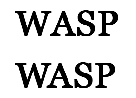
Figure 3: Kerning can certainly improve the look of text.
In the above screenshot, the first word has not been kerned. The second word, though, has had the spacing between the W and the A reduced, whilst the space between the A and the S has been increased a touch.
On the web, kerning with this level of precision is effectively unavailable. The only thing we have that comes close to it is the ability to use tracking, which in the print world means adjusting the space between characters throughout the copy, no matter what those characters are—so, you could decrease the space between your W and your A, but you’ll also be affecting the space between every other letter. On the web, tracking is better known as letter spacing, and is controlled with CSS—this is illustrated in Figure 4.

Figure 4: Proper kerning is not available on the Web; the closest we have available is more general letter spacing.
In the above screenshot, the spacing between each character has been increased by the same amount. Whilst this has helped separate the A and the S, the space between the W and A is now too much. Letter spacing with CSS is a difficult property to use effectively due to this all-or-nothing nature, and for this reason it is best used sparingly.
A lack of control
With all this talk of the print world, there’s something very important worth bearing in mind, and that is that the web is not print. So where the print designer doesn’t have to worry about the end viewer resizing the text, or not having the desired set of fonts, or not having aliasing enabled, we do, and there’s often a temptation to try and force a particular design upon the viewer—fixing a rigid text size for instance, or placing text in fixed-width and fixed-height containers, or even replacing whole chunks of text with images.
This lack of control needn’t be a problem however—you just have to get used to the idea that people will want to read your content on a variety of devices in a variety of environments in a variety of ways. You shouldn’t try to stop them, or make it difficult for them—if they want to read your content then it should be as easy to do so as possible. They may wish to read it on their mobile device during their commute home; they may prefer to print everything out and read it on paper instead of a screen; they may be visually impaired and need to increase the font size somewhat. This is why, when you style your text on the web, what you’re really doing is providing a guide to all the different browsing devices as to how you’d prefer that text be seen. Devices are free to ignore everything you say, of course, but that’s ok—what matters is that you’re not trying to force your design decisions on your entire audience.
How is typography done on the web?
Typography on the web is controlled entirely with CSS, and by using CSS you gain a lot of control: not just over the size, colour and typeface selection but also over the line height, the letter spacing, the level of capitalisation (all caps, initial caps, small-caps or no capitalisation at all) and even control over how the first letter or first line of your text is styled.
By styling the text’s containing block, you also have control over the level of justification of the text and the line length. Not only that, you also only have to create your style rules in one location—your stylesheet—to have those rules apply to all of your text, across your whole website (or you can be specific and target particular paragraphs, or areas on the page). Furthermore, if you ever find yourself needing to increase your website text size, or change the body font, you only have to change the value in your stylesheet.
Quick tips
Here are some quick tips to help you out with typography on the Web.
Select a range of fonts
It’s good practice to include back-up selections when specifying your preferred display font. So, rather than simply specifying “Georgia”, you could specify “Georgia, Cambria, "Times New Roman", Times, serif”. So, first the browser will attempt to use a font named Georgia, but if this font isn’t installed it will try for Cambria, then Times New Roman, followed by Times, followed by whatever the operating system has assigned to the “serif” keyword.
Bear in mind also that some fonts work better as headings, and some work better as body text. It is really up to you to experiment and see what works for you, but in general, sans-serif fonts such as Arial, Impact and Helvetica work better as headings, while serif fonts such as Georgia and Times New Roman work better as body text. These rules have been broken however, in many places. Specialist fonts should be used sparingly, eg Courier New for code or typewriter text and Comic Sans for chalkboard or child-like writing.
Line length
To aid readability, the average length of a line of text within your containing block should be around 40–60 characters per line, though this should vary depending on your audience (children prefer shorter line lengths, adults prefer longer). An ideal line length is shown in Figure 5:
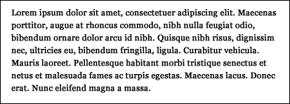
Figure 5: 60 characters per line—the ideal line length.
The text in the screenshot is about 60 characters per line. Any more than this and the reader may have to start moving their eyes—or even their head—in order to follow the text, which can increase eye-strain and makes the text harder to take in.
Line height
Line height refers to the vertical space between your lines, and you can make your type more readable by increasing it a little above the browser default (which also allows more space for subscript and superscript characters)—see the difference between the two paragraphs in Figure 6:
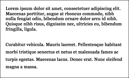
Figure 6: Line height can make a big difference to the look and feel of text.
The first paragraph in the above screenshot has a default line height, and can feel a little cramped. The second paragraph has had its line height increased, and the text has a bit more room to breathe, making it a bit more readable. Too much line height, though, and you make the text harder to read again, so be careful.
Drop caps
By targeting the first-letter pseudo-element with something like p:first--letter { }, you can style the first letter of a line differently from the rest—such styling is usually known as a drop cap, where the first letter takes up about 3–4 lines of text—see Figure 7.
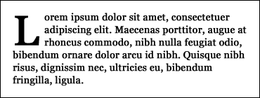
Figure 7: A typical drop cap.
Small caps
Often, fonts come with a small-caps variation—a set of capitalised letters that are uppercased but approximately the size of the lowercase variant. This is useful for when you want to capitalise something but don’t want to draw too much attention to it, so it can be used for abbreviations, for example. Even if the system doesn’t have a small-cap variant of the specified font, that’s ok—the browser will generate its own version by using full capitalisation and then shrinking the characters to around 70% of their normal size. Figure 8 shows small caps in action.
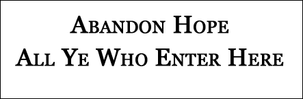
Figure 8: Small caps in action.
Hanging punctuation
A good typographical effect can be used if your sentence starts with quote marks. Using the text-indent CSS property combined with a negative value—either a value in ems (-10em), points (-10pt), pixels (-10px) or percent (-10%)—allows you to shunt the quote mark out into the left, maintaining the left vertical line of your block of text, as shown in Figure 9:
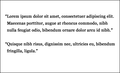
Figure 9: Hanging punctuation.
Typographically-correct punctuation and other entities
You can make your text look more professional and elegant by using the wide variety of typographic HTML entities that are available such as “smart” or “curly” quotes and en– and em—dashes. A lot of blogging and word processing software will automatically do this for you as you type, turning your regular straight quotes into the typographically-correct curly variety, and turning strings of dashes into en and em dashes. See Figure 10 for examples of typographically-correct punctuation.
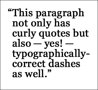
Figure 10: Typographically-correct punctuation
Once you start peppering your copy with smart punctuation, your text can look far more elegant and professional—more like something from a magazine or a book than from online. Bear in mind though that this sort of punctuation can look a little pixellated for people with older screens or with aliasing disabled, so use with caution.
Then there’s entities—bits of special HTML that you can insert into your copy to generate special characters not easily available from your keyboard. Figure 11 contains a number of entities:
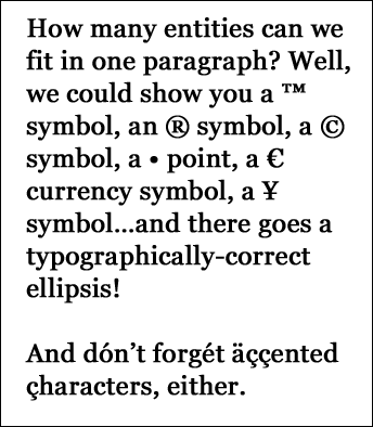
Figure 11: HTML entities
These can be typed in by hand, but a lot of content management software can convert or insert these for you with ease.
Pull-quotes
A pull-quote is a short extract from your text that appears elsewhere on your page with a larger text size, and sometimes a different font, to draw attention to it. You’ll have seen them in almost every magazine you’ve ever read, and they’re an effective way of breaking up your text and highlighting key quotes or phrases—and they’re also easy to do on the web with some simple markup and styling. Just make the text larger, perhaps set it in a different font, position it so that the regular text wraps around it and you’re done. There are also some more advanced solutions that involve JavaScript picking out selected text and automatically populating a pull quote from it, which can save you having to write the same text twice in your markup.
Summary
So that’s typography, and typography on the web; hopefully you can see that text online needn’t be limited to Verdana, small, #333333—there is a wide range of typographic tricks and tips that can help make your text stand out from the rest of the crowd. For most websites, the reason people will be visiting is to read what you or your authors have written; it makes sense, then, to make that reading as pleasurable as possible.
See also
Exercise Questions
- What’s the difference between kerning and tracking, and which one is available to the web designer?
- How can you avoid “rivers of white space” running through your text?
- Name the four different types of capitalisation available through CSS.
- What’s a good line length for body content, and what factors can affect it?
- What’s the difference between a serif font and a sans-serif font? Give an example of each.
- How does hanging punctuation differ from regular punctuation?
- If you want to insert a copyright symbol into your copy, you use an HTML entity. Have a look on the internet and see if you can find all the other HTML entities. There’s about 250 of them!