Using Multiple Backgrounds
By Konstantin Kichinsky
Originally published 27 February 2012
Summary
This article focuses on an interesting CSS feature — how to use multiple backgrounds with CSS3.
Backgrounds composition
There are many reasons why you may need to create a composition of multiple images to build you background. These are some of the most important:
- to reduce the bandwidth usage if the sum of sizes of separate images is less than the size of an image with merged layers (especially if your image contains repeating patterns), and
- to provide a way for independent manipulations on different layers (for example if you are going to implement some parallax effect).
There are other reasonable cases that call for background composition.
Classic approach
So we need to build a multi-layered background by placing some images on top of others. How this problem is usually solved? It is really easy: just create a container (like a div element) for each of the images you have and add a background for it using a CSS rule. Next you insert one container into another or place them in a row and apply corresponding positioning CSS rules.
Here is a simple sample:
<div class="sample1">
    <div class="sea">
        <div class="mermaid"><div class="fishing"></div></div>
        <div class="fish"></div>
    </div>
</div>
The “fishing” class is inside of the “mermaid” class only for demo purposes.
And here we have some CSS styles:
.sample1 .sea, .sample1 .mermaid, .sample1 .fishing {
    height:300px;
    width:480px;
    position: relative;
}

.sample1 .sea {
    background: url(media/sea.png) repeat-x top left;
}

.sample1 .mermaid {
    background: url(media/mermaid.svg) repeat-x bottom left;
}

.sample1 .fish {
    background: url(media/fish.svg) no-repeat;
    height:70px;
    width:100px;
    left: 30px;
    top: 90px;
    position: absolute;
}

.sample1 .fishing {
    background: url(media/fishing.svg) no-repeat top right 10px;
}
This is the result:
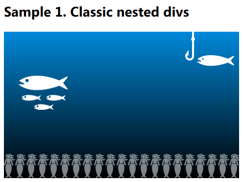
In this sample there are three nested divs with background and one more neighbor “fish”-div. You may imagine that the fish can be animated using javascript or CSS3 transitions or animations.
Note, for the “fishing” class we used the new background positioning syntax, also defined in CSS3.
Let’s continue. Is it possible to simplify this composition? This is when the multiple backgrounds come to the scene.
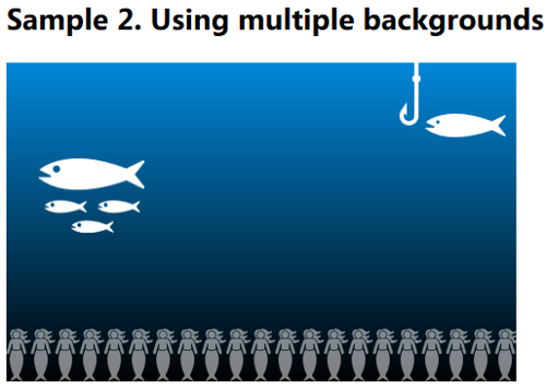
Multiple backgrounds
This feature allows you to add more than one background at once and to the same element. Here is how it looks like:
<div class="sample2">
    <div class="sea">
        <div class="fish"></div>
    </div>
</div>
And styles:
.sample2 .sea {
    height:300px;
    width:480px;
    position: relative;
    background-image:  url("media/fishing.svg"), url("media/mermaid.svg"), url("media/sea.png");
    background-position: top right 10px, bottom left, top left;
    background-repeat: no-repeat, repeat-x, repeat-x ;
}

.sample2 .fish {
    background: url("media/fish.svg") no-repeat;
    height:70px;
    width:100px;
    left: 30px;
    top: 90px;
    position: absolute;
}
To define multiple backgrounds you should use the background-image property by enumerating your images comma-separated. You may also use other rules to set a position, repeating mode, and other attributes to each of the images — just write up them also using a comma-separated list for the corresponding rule. Note the order of images: they are listed left to right starting with the uppermost one and ending with the lowest one.
The result is 100% identical:
In one rule
If you don’t need your fish to swim in an independent block, the whole background can be written in one simple rule:
<div class="sample3">
    <div class="sea"></div>
</div>
Styles:
.sample3 .sea {
    height:300px;
    width:480px;
    position: relative;
    background-image:  url("media/fishing.svg"), url("media/mermaid.svg"), url("media/fish.svg"), url("media/sea.png");
    background-position: top right 10px, bottom left,  30px 90px, top left;
    background-repeat: no-repeat, repeat-x ;
}
The result is equal to the two images above, we just got there in a different way.
Let’s look at the styles one more time, especially on the background-repeat rule. According to the spec if a part of the list is omitted UA (browser) should repeat present list to fill the rest.
In our case it equal to the following definition:
background-repeat: no-repeat, repeat-x, no-repeat, repeat-x;
Shorter version
If you remember the CSS 2.1 it is possible to describe a background image in a one short “background”-rule. What about multiple backgrounds? Actually you also can use the “background”-rule for multiple backgrounds:
.sample4 .sea {
    height:300px;
    width:480px;
    position: relative;
    background: url("media/fishing.svg") top right 10px no-repeat,
                url("media/mermaid.svg") bottom left repeat-x,
                url("media/fish.svg") 30px 90px no-repeat,
                url("media/sea.png") repeat-x;
            }
But note that you can’t easily omit arguments unless the values are equal to the default ones. Also if you would like to define the color of background you should do it in the latest layer.
Dynamic images
Here is what we already know: if you background is mostly static — it may depend on the container size (i.e. if you are using % length so that some layers will shift on resizing window) — than the magic of multiple backgrounds seems to be useful as it really simplifies the page structure. But what if you need to animate some of the layers using javascript (move, rotate and so on)?
How can we make our multiple backgrounds more dynamic? Internally the browser parses every “background” rule into separate “background-*” rules for each of the attributes. It is very useful if you need to change only one of the attributes. For example you can use background-position property to shift your images, but there are some penalties while dealing with multiple backgrounds: if you are going to move only one layer you still need to rewrite this rule for all layers.
To animate our sea background we can use the following js-code:
$(document).ready(function() {
    var sea = $(".sample5 .sea")[0];
    var fishesX = 30;
    var fishesY = 90;
    var fishX = 0;
    var fishY = 0;
    var mermaidX = 0;
    var t = 0;

    function animationLoop() {
        fishesY = 90 + Math.floor(30 * Math.sin(t++ / 180.0));
        if(--fishesX < 0) fishesX = 480;
        mermaidX += 0.5;
        if(mermaidX > 480) mermaidX = 0;
        fishY = -10 + (10 * Math.cos(t * 0.091));
        fishX = 10 + (5 * Math.sin(t * 0.07));

        sea.style.backgroundPosition = "top " + fishY + "px right " + fishX + "px, " + mermaidX + "px bottom," + fishesX + "px " + fishesY + "px, top left";

        window.requestAnimFrame(animationLoop);
    }
    animationLoop();
});
where
window.requestAnimFrame = (function() {
    return
        window.requestAnimationFrame ||
        window.msRequestAnimationFrame ||
        window.mozRequestAnimationFrame ||
        window.oRequestAnimationFrame ||
        window.webkitRequestAnimationFrame ||
        (function(callback) { window.setTimeout(callback, 1000 / 60); });
})();
Result: Video of the resulting animation
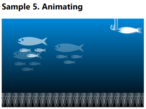
You may also use CSS3 Transitions or Animations but it is a good topic for separate discussion.
Parallax and interactivity
Finally using similar technics you can easily add some parallax effects or other interaction effects for you background:
Video showing parallax interactivity
Multiple backgrounds are useful in such scenarios and while we are talking only about backgrounds, not the content, using them is definitely a good way to not pollute the html-code with complex unnecessary elements. But as I said there are some penalties if you need to build a complex and dynamic background: you cannot access a separate layer by id, class or any other parameter. You should remember the order of layers in your code and to change an attribute for just one layer you will need to build a string describing this attribute for all the layers you have. To update one layer you need to update the whole composition:
sea.style.backgroundPosition = "top " + fishY + "px right " + fishX + "px, " + mermaidX + "px bottom," + fishesX + "px " + fishesY + "px, top left";
I’m sure it is possible to build a nice and useful js-library which will virtualize all these layers and provide easy way to change attributes for a separate layer keeping clean your html-code and the DOM.
Compatibility
All modern browsers including IE10 and 9 support multiple backgrounds. You may also use some tools like Modernizr to provide some level of compatibility for older browsers, i.e. by providing alternate background. As Chris Coyier wrote in his article on the stacking order of multiple backgrounds you can use the following approach:
.multiplebgs body {
   /* Awesome multiple BG declarations that transcend reality and impress chicks */
}
.no-multiplebgs body {
  /* laaaaaame fallback */
}
If you are confused with using javascript to provide backward compatibility for the new CSS3 rules you can just define background property twice (but this approach may result unnecessary downloads in modern browsers depending on how they process such rules):
/* multiple bg fallback */
background: #000 url(...) ...;
/* Awesome multiple BG declarations that transcend reality and impress chicks */
background url(...), url(...), url(...), #000 url(...);
And finally if you wish to know it: yes you can use multiple backgrounds in you Windows 8 metro style apps built with html and javascript. p.s. Check also this phenomenal article about the Cicada Principle by Alex Walker.
Note CSS properties discussed in this article are defined in the CSS3 Backgrounds and Borders module.
About the Author Konstantin Kichinsky is a developer evangelist focusing on HTML5 and CSS3 web development at Microsoft. Tweet him @kichinsky or read his blog.