SVG gradients
Summary
This article looks at filling SVG shapes with linear and radial gradients.
So, perhaps more exciting than just fills and strokes, you can also create and apply gradients as either fills or strokes.
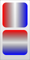
There are two types of gradients allowed, linear and radial ones. Linear gradients change along a straight line. To insert one, you create a <linearGradient> node inside the definitions section of your SVG file. You must give the gradient an id attribute, otherwise it can’t be referenced by other elements inside the file, and it basically becomes a waste of space.
<?xml version="1.0" standalone="no"?>

<svg width="120" height="240" version="1.1" xmlns="http://www.w3.org/2000/svg">
  <defs>
      <linearGradient id="Gradient1">
        <stop class="stop1" offset="0%"/>
        <stop class="stop2" offset="50%"/>
        <stop class="stop3" offset="100%"/>
      </linearGradient>
      <linearGradient id="Gradient2" x1="0" x2="0" y1="0" y2="1">
        <stop offset="0%" stop-color="red"/>
        <stop offset="50%" stop-color="black" stop-opacity="0"/>
        <stop offset="100%" stop-color="blue"/>
      </linearGradient>
      <style type="text/css"><![CDATA[
        #rect1 { fill: url(#Gradient1); }
        .stop1 { stop-color: red; }
        .stop2 { stop-color: black; stop-opacity: 0; }
        .stop3 { stop-color: blue; }
      ]]></style>
  </defs>

  <rect id="rect1" x="10" y="10" rx="15" ry="15" width="100" height="100"/>
  <rect x="10" y="120" rx="15" ry="15" width="100" height="100" fill="url(#Gradient2)"/>

</svg>
Above is an example of a linear gradient being applied to a <rect> element. Inside the linear gradient are several [[<stop>]] nodes. These nodes tell the gradient what color it should be at certain positions by specifying an offset attribute for the position, and a stop-color attribute. This can be assigned directly or through CSS. I’ve intermixed the two for the purposes of an example. For instance, this one tells the gradient to start at the color red, change to transparent-black in the middle, and end at the color blue. You can insert as many stop colors as you like to create a blend that’s as beautiful or hideous as you need, but the offsets should always increase from 0% (or 0 if you want to drop the % sign) to 100% (or 1). Duplicate values will use the stop that is assigned furthest down the XML tree. Also, like with fill and stroke, you can specify a stop-opacity attribute to set the opacity at that position (again, in FF3 you can also use rgba values to do this).
<stop offset="100%" stop-color="yellow" stop-opacity="0.5"/>
To use a gradient, we have to reference it from an objects fill or stroke attributes. This is done the same way you reference elements in CSS, using a url. In this case, the url is just a reference to our gradient, which I’ve given the creative ID, "Gradient". So to attach it we just set the fill to url(#Gradient), and voila, our object is now multicolored. You can do the same with stroke.
The <linearGradient> element also takes several other attributes which specify the size and appearance of the gradient. The orientation of the gradient is controlled by two "points", designated by the attributes x1, x2, y1, and y2. These attributes define a line along which the gradient travels. The gradient defaults to a horizontal orientation, but it can be rotated by changing these. Gradient2 in the above example is designed to create a vertical gradient.
<linearGradient id="Gradient2" x1="0" x2="0" y1="0" y2="1">

 Note: You can also use the xlink:href attribute on gradients too. When it is used, attributes and stops from one gradient can be included on another. In the above example, you wouldn't have to recreate all the stops in Gradient2.


<linearGradient id="Gradient1">
   <stop id="stop1" offset="0%"/>
   <stop id="stop2" offset="50%"/>
   <stop id="stop3" offset="100%"/>
 </linearGradient>
 <linearGradient id="Gradient2" x1="0" x2="0" y1="0" y2="1"
    xmlns:xlink="[[http://www.w3.org/1999/xlink]]" xlink:href="#Gradient1"/>
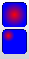
I’ve included the xlink namespace here directly on the node, although usually you would define it at the top of your document. More on that when we talk about images. Radial gradients are similar to linear ones but draw a gradient that radiates out from a point. To create one you add a [[<radialGradient>]] element to the definitions section of your document.
<?xml version="1.0" standalone="no"?>

<svg width="120" height="240" version="1.1"
  xmlns="http://www.w3.org/2000/svg">
  <defs>
      <radialGradient id="Gradient1">
        <stop offset="0%" stop-color="red"/>
        <stop offset="100%" stop-color="blue"/>
      </radialGradient>
      <radialGradient id="Gradient2" cx="0.25" cy="0.25" r="0.25">
        <stop offset="0%" stop-color="red"/>
        <stop offset="100%" stop-color="blue"/>
      </radialGradient>
  </defs>

  <rect x="10" y="10" rx="15" ry="15" width="100" height="100" fill="url(#Gradient1)"/>
  <rect x="10" y="120" rx="15" ry="15" width="100" height="100" fill="url(#Gradient2)"/>

</svg>
The stops used here are the same as before, but now the object will be red in the center, and in all directions gradually change to blue at the edge. Like linear gradients, the <radialGradient> node can take several attributes to describe its position and orientation. However, unlike linear gradients, its a bit more complex. The radial gradient, is again defined by two points, which determine where its edges are. The first of these defines a circle around which the gradient ends. It requires a center point, designated by the cx and cy attributes, and a radius, r. Setting these three attributes will allow you to move the gradient around and change its size, as shown in the second rect above.
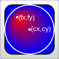
The second point is called the focal point and is defined by the fx and fy attributes. While the first point described where the edges of the gradient were, the focal point describes where its middle is. This is easier to see with an example.
<?xml version="1.0" standalone="no"?>

<svg width="120" height="120" version="1.1"
  xmlns="http://www.w3.org/2000/svg">
  <defs>
      <radialGradient id="Gradient"
            cx="0.5" cy="0.5" r="0.5" fx="0.25" fy="0.25">
        <stop offset="0%" stop-color="red"/>
        <stop offset="100%" stop-color="blue"/>
      </radialGradient>
  </defs>

  <rect x="10" y="10" rx="15" ry="15" width="100" height="100"
        fill="url(#Gradient)" stroke="black" stroke-width="2"/>

  <circle cx="60" cy="60" r="50" fill="transparent" stroke="white" stroke-width="2"/>
  <circle cx="35" cy="35" r="2" fill="white" stroke="white"/>
  <circle cx="60" cy="60" r="2" fill="white" stroke="white"/>
  <text x="38" y="40" fill="white" font-family="sans-serif" font-size="10pt">(fx,fy)</text>
  <text x="63" y="63" fill="white" font-family="sans-serif" font-size="10pt">(cx,cy)</text>

</svg>
If the focal point is moved outside the circle described earlier, its impossible for the gradient to be rendered correctly, so the spot will be assumed to be on the edge of the circle. If the focal point isn’t given at all, its assumed to be at the same place as the center point.
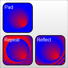
Both gradients also take a few other attributes to describe transformations and whatnot on them. The only other one I want to mention here is the spreadMethod attribute. This attribute controls what happens when the gradient reaches its end, but the object isn’t filled yet. It can take on one of three values, "pad", "reflect", or "repeat". “Pad” is what you have seen so far. When the gradient reaches its end, the final offset color is just used to fill the rest of the object. “reflect” causes the gradient to continue on, but this take backwards, starting with the color offset at 100% and moving back to the offset at 0%, and then back up again. “Repeat” also lets the gradient keep moving, but instead of going backwards, it just jumps back to the beginning and runs again.
<?xml version="1.0" standalone="no"?>

<svg width="220" height="220" version="1.1" xmlns="http://www.w3.org/2000/svg">
  <defs>
      <radialGradient id="Gradient"
            cx="0.5" cy="0.5" r="0.25" fx=".25" fy=".25"
            spreadMethod="repeat">
        <stop offset="0%" stop-color="red"/>
        <stop offset="100%" stop-color="blue"/>
      </radialGradient>
  </defs>
  <rect x="50" y="50" rx="15" ry="15" width="100" height="100"
       fill="url(#Gradient)"/>
</svg>
As a bit of another aside here, both gradients also have an attribute named gradientUnits that describes the unit system you’re going to use when you describe the size or orientation of the gradient. There are two possible values to use here: userSpaceOnUse or objectBoundingBox. objectBoundingBox is the default so that’s what I’ve shown so far. It essentially scales the gradient to the size of your object, so you only have to specify coordinates in values from zero to one, and they’re scaled to the size of your object automatically for you. userSpaceOnUse essentially takes in absolute units. So you have to know where your object is, and place the gradient at the same place. The radialGradient above would be rewritten:
<radialGradient id="Gradient" cx="60" cy="60" r="50" fx="35" fy="35" gradientUnits="userSpaceOnUse">
You can also then apply another transformation to the gradient by using the gradientTransform attribute, but since we haven’t introduced transforms yet, I’ll leave that for later.
There are some other caveats for dealing with gradientUnits="objectBoundingBox" when the object bounding box isn’t square, but they’re fairly complex and will have to wait for someone more in-the-know to explain them.
Attributions
This article contains content originally from external sources, including ones licensed under the CC-BY-SA license.

Portions of this content copyright 2012 Mozilla Contributors. This article contains work licensed under the Creative Commons Attribution-Sharealike License v2.5 or later. The original work is available at Mozilla Developer Network: Article