Styling SVG with CSS
Summary
This article covers the basics of styling SVG content with CSS.
Information: SVG
SVG (Scalable Vector Graphics) is an XML-based language for creating graphics. It can be used for static images, and also for animations and user interfaces.
Like other XML-based languages, SVG supports CSS stylesheets so that you can separate the style of a graphic from its content.
Also, stylesheets that you use with other document markup languages can specify the URL of an SVG graphic where an image is required. For example, a stylesheet that you use with an HTML document can specify the URL of an SVG graphic in the value of a background property.
More details
At the time of writing (mid 2011), most modern browsers have basic support for SVG, including Internet Explorer 9 or later. Some SVG features are supported only partially or not at all on some browsers. See the SVG tables on caniuse.com for an overview of SVG support, or the compatibility info in the SVG element reference for support of specific items.
You can add SVG support to other versions by installing a plugin such as the one provided by Adobe.
Action: An SVG demonstration
Make a new SVG document as a plain text file,
doc8.svg. Copy and paste the content from here, making sure that you scroll to get all of it:<?xml version="1.0" standalone="no"?> <?xml-stylesheet type="text/css" href="style8.css"?> <!DOCTYPE svg PUBLIC "-//W3C//DTD SVG 1.1//EN" "http://www.w3.org/Graphics/SVG/1.1/DTD/svg11.dtd"> <svg width="600px" height="600px" viewBox="-300 -300 600 600" xmlns="http://www.w3.org/2000/svg" version="1.1" xmlns:xlink="http://www.w3.org/1999/xlink"> <title>SVG demonstration</title> <desc>Mozilla CSS Getting Started - SVG demonstration</desc> <defs> <g id="segment" class="segment"> <path class="segment-fill" d="M0,0 v-200 a40,40 0 0,0 -62,10 z"/> <path class="segment-edge" d="M0,-200 a40,40 0 0,0 -62,10"/> </g> <g id="quadrant"> <use xlink:href="#segment"/> <use xlink:href="#segment" transform="rotate(18)"/> <use xlink:href="#segment" transform="rotate(36)"/> <use xlink:href="#segment" transform="rotate(54)"/> <use xlink:href="#segment" transform="rotate(72)"/> </g> <g id="petals"> <use xlink:href="#quadrant"/> <use xlink:href="#quadrant" transform="rotate(90)"/> <use xlink:href="#quadrant" transform="rotate(180)"/> <use xlink:href="#quadrant" transform="rotate(270)"/> </g> <radialGradient id="fade" cx="0" cy="0" r="200" gradientUnits="userSpaceOnUse"> <stop id="fade-stop-1" offset="33%"/> <stop id="fade-stop-2" offset="95%"/> </radialGradient> </defs> <text id="heading" x="-280" y="-270"> SVG demonstration</text> <text id="caption" x="-280" y="-250"> Move your mouse pointer over the flower.</text> <g id="flower"> <circle id="overlay" cx="0" cy="0" r="200" stroke="none" fill="url(#fade)"/> <use id="outer-petals" xlink:href="#petals"/> <use id="inner-petals" xlink:href="#petals" transform="rotate(9) scale(0.33)"/> </g> </svg>Make a new CSS file,
style8.css. Copy and paste the content from here, making sure that you scroll to get all of it:/*** SVG demonstration ***/ /* page */ svg { background-color: beige; } #heading { font-size: 24px; font-weight: bold; } #caption { font-size: 12px; } /* flower */ #flower:hover { cursor: crosshair; } /* gradient */ #fade-stop-1 { stop-color: blue; } #fade-stop-2 { stop-color: white; } /* outer petals */ #outer-petals { opacity: .75; } #outer-petals .segment-fill { fill: azure; stroke: lightsteelblue; stroke-width: 1; } #outer-petals .segment-edge { fill: none; stroke: deepskyblue; stroke-width: 3; } #outer-petals .segment:hover > .segment-fill { fill: plum; stroke: none; } #outer-petals .segment:hover > .segment-edge { stroke: slateblue; } /* inner petals */ #inner-petals .segment-fill { fill: yellow; stroke: yellowgreen; stroke-width: 1; } #inner-petals .segment-edge { fill: none; stroke: yellowgreen; stroke-width: 9; } #inner-petals .segment:hover > .segment-fill { fill: darkseagreen; stroke: none; } #inner-petals .segment:hover > .segment-edge { stroke: green; }Open
doc8.svgin your SVG-enabled browser. Put your mouse pointer over the graphic and move it about the inner and outer petals to see the effect.
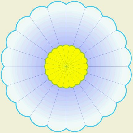
Figure 1. The SVG flower before mouseover.
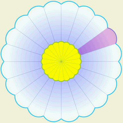
Figure 2. The SVG flower with mouseover on an outer petal.
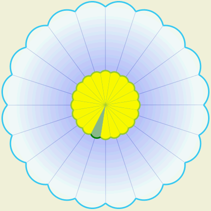
Figure 3. The SVG flower with mouseover on an inner petal.
Notes:
- The SVG document links the styesheet in the usual way.
- SVG has its own CSS properties and values. Some of them are similar to CSS properties for HTML.
See also
Exercise question
Change the stylesheet so that the inner petals all turn pink when the mouse pointer is over any one of them, without changing the way the outer petals work.
Attributions
This article contains content originally from external sources, including ones licensed under the CC-BY-SA license.

Portions of this content copyright 2012 Mozilla Contributors. This article contains work licensed under the Creative Commons Attribution-Sharealike License v2.5 or later. The original work is available at Mozilla Developer Network: Article