Exploring the CSS layout model
Summary
This article describes some fundamental ways to adjust the layout of your document, using padding, floats, and more.
Information: Layout
You can use CSS to specify various visual effects that change the layout of your document. When you design a layout to look similar in many browsers, your stylesheet interacts with the browser’s default stylesheet and layout engine in ways that can be complex. Some of the techniques for specifying layout are beyond the scope of this basic tutorial, but here we describe some simple techniques that you can try.
Document structure
If you want to control the layout of your document, then you might have to change its structure. Your document’s markup language might have general-purpose tags for creating structure. For example, in HTML you can use the div element to create structure.
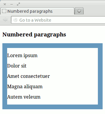
Div usage example
In your sample document, the numbered paragraphs under the second heading do not have a container of their own. Your stylesheet cannot draw a border around those paragraphs, because there is no element to specify in the selector.
To fix this structural problem, you can add a div tag around the paragraphs. This tag is unique, so it can by identified by an id attribute:
<h3>Numbered paragraphs</h3>
<div id="numbered">
  <p>Lorem ipsum</p>
  <p>Dolor sit</p>
  <p>Amet consectetuer</p>
  <p>Magna aliquam</p>
  <p>Autem veleum</p>
</div>
Now your stylesheet can use one rule to specify borders around both lists:
ul, #numbered {
  border: 1em solid #69b;
  padding-right:1em;
}
The result looks like:
Size units
So far in this tutorial, you have specified sizes in pixels (px). These are appropriate for some purposes on a display device like a computer screen. But when the user changes the font size, your layout can look wrong.
For many purposes it is better to specify sizes as a percentage or in ems (em). An em is nominally the size of the current font (the width of a letter m). When the user changes the font size, your layout adjusts automatically.
Sizing example
The border on the left of this text has its size specified in pixels. The border on the right has its size specified in ems. In your sample CSS file, change the size of the font to see how the border on the right adjusts but the border on the left does not.
For other devices, other length units are appropriate. There is more information about this in a later page of this tutorial. For full details of the values and units that you can use, see “Values” in the CSS Specification.
Text layout
Two properties specify how the content of an element is aligned. You can use them for simple layout adjustments:
text-align aligns the content. Use one of these values: left, right, center, justify. text-indent indents the content by an amount that you specify.
These properties apply to any text-like content in the element, not only to actual text. Remember that they are inherited by the element’s children, so you might have to explicitly turn them off in the children to avoid surprising results.
Text align example
To center headings:
h3 {
  border-top: 1px solid gray;
  text-align: center;
}
In an HTML document, the content that you see below a heading is not structurally contained by the heading. So when you align a heading like this, the tags below the heading do not inherit the style.
Floats
The flost property forces an element to the left or right. This is a simple way to control its position and size.
The rest of the document’s content normally flows around the floated element. You can control this by using the clear property on other elements to make them stay clear of floats.
Floats example
In your sample document, the lists stretch across the window. You can prevent this by floating them to the left. To keep the headings in place, you must also specify that they stay clear of floats on their left:
ul, #numbered {float: left;}
h3 {clear: left;}
(A little padding is needed on the right of the boxes, where the border is too close to the text.)
Positioning
You can specify an element’s position in four ways by specifying the position property and one of the following values.
These are advanced properties. It is possible to use them in simple ways — that is why they are mentioned in this basic tutorial. But using them for complex layouts can be difficult.
relativeThe element’s position is shifted relative to its normal position. Use this to shift an element by a specified amount. You can sometimes use the element’s margin to achieve the same effect.
fixedThe element’s position is fixed. Specify the element’s position relative to the document window. Even if the rest of the document scrolls, the element remains fixed.
absoluteThe element’s position is fixed relative to a parent element. Only a parent that is itself positioned with
relative,fixedorabsolutewill do. You can make any parent element suitable by specifyingposition: relative;for it without specifying any shift.staticThe default. Use this value if you need to turn positioning off explicitly.
Along with these values of the position property (except for static), specify one or more of the properties: top, right, bottom, left, width, height to identify where you want the element to appear, and perhaps also its size.
Positioning example
To position two elements on top of each other, create a parent container in your document with the two elements inside it:
<div id="parent-div">
  <p id="forward">/</p>
  <p id="back">\</p>
</div>
In your stylesheet, make the parent’s position relative. There is no need to specify any actual shift. Make the children’s position absolute:
#parent-div {
  position: relative;
  font: bold 200% sans-serif;
}

#forward, #back {
  position: absolute;
  margin:0px; /* no margin around the elements */
  top: 0px; /* distance from top */
  left: 0px; /* distance from left */
}

#forward {
  color: blue;
}

#back {
  color: red;
}
The result places the backslash on top of the forward slash.
More details
The full story on positioning takes up two complex chapters in the CSS Specification: “Visual formatting model” and "Visual formatting model details".
If you are designing stylesheets to work in many browsers, then you also need to take into account differences in the way browsers interpret the standard, and perhaps bugs in particular versions of particular browsers.
Action: Specifying layout
Change your sample document,
doc2.html, and stylesheet,style2.css, using the examples above in the sections “Document structure” and "Floats".In the “Floats” example, add padding to separate the text from the right border by 0.5 em.
See also
Exercise questions
Change your sample document,
doc2.html, adding this tag to it near the end, just before</body>.<img id="fixed-pin" src="Yellow-pin.png" alt="Yellow map pin">If you did not download the image file earlier in this tutorial, download it now, and place it in the same directory as the other sample files:
Predict where the image will appear in your document. Then refresh your browser to see if you were correct.
Add a rule to your stylesheet that places the image in the top right of your document.
Refresh your browser and make the window small. Check that the image stays in the top right even when you scroll your document
Attributions
This article contains content originally from external sources, including ones licensed under the CC-BY-SA license.

Portions of this content copyright 2012 Mozilla Contributors. This article contains work licensed under the Creative Commons Attribution-Sharealike License v2.5 or later. The original work is available at Mozilla Developer Network: Article