Advanced layouts with absolute and fixed positioning
Summary
This article covers absolute and fixed positioning.
Introduction
Now it’s time to turn your attention to the second pair of position property values—absolute and fixed. The first pair of values—static and relative—is closely related, and we looked into those in great detail in the previous article.
Absolutely positioned elements are removed entirely from the document flow. That means they have no effect at all on their parent element or on the elements that occur after them in the source code. An absolutely positioned element will therefore overlap other content unless you take action to prevent it. Sometimes, of course, this overlap is exactly what you desire, but you should be aware of it, to make sure you are getting the layout you want!
Fixed positioning is really just a specialized form of absolute positioning; elements with fixed positioning are fixed relative to the viewport/browser window rather than the containing element; even if the page is scrolled, they stay in exactly the same position inside the browser window.
In this article we’ll see some practical examples of using both absolute and fixed positioning, look at some browser support quirks, and explore the concept of z-index.
Before all that, though, let’s cover an essential prerequisite concept—containing blocks.
Containing blocks
An essential concept when it comes to absolute positioning is the containing block: the block box that the position and dimensions of the absolutely positioned box are relative to. For static boxes and relatively positioned boxes the containing block is the nearest block-level ancestor—the parent element in other words. For absolutely positioned elements however it’s a little more complicated. In this case the containing block is the nearest positioned ancestor. By “positioned” we mean an element whose position property is set to relative, absolute or fixed—in other words, anything except normal static elements.
So, by setting position:relative for an element you make it the containing block for any absolutely positioned descendant (child elements), whether they appear immediately below the relatively positioned element in the hierarchy, or further down the hierarchy.
If an absolutely positioned element has no positioned ancestor, then the containing block is something called the “initial containing block,” which in practice equates to the html element. If you are looking at the web page on screen, this means the browser window; if you are printing the page, it means the page boundary.
Elements with fixed positioning differ from this slightly—they always have the initial containing block as their containing block.
So, let’s summarize this in a set of easy steps—to find the containing block for an element with position:absolute , this is what you need to do:
- Look at the parent element of the absolutely positioned element—does that element’s
positionproperty have one of the valuesrelative,absoluteorfixed? - If so, you’ve found the containing block.
- If not, move to the parent’s parent element and repeat from step 1 until you find the containing block or run out of ancestors.
- If you’ve reached the
htmlelement without finding a positioned ancestor, then the containing block is thehtmlelement.
Absolute positioning
Fixed positioning is a special form of absolute positioning, so we’ll study that later, and concentrate on the more generalized case here. Unless otherwise stated, when I use the term “absolutely positioned” from now until the end of the article, I’ll be referring both to elements with position:fixed and elements with position:absolute .
Specifying the position
With relative positioning, you learned that the top, right, bottom and left properties could be used to specify the position of the box. You use the same properties to specify the position of an absolutely positioned box, but the way you use them is quite different.
For a relatively positioned element, the four properties specify the relative distance to shift the generated box. Remember that in the case of relative positioning they complement one another, so that top:1em and bottom:-1em means the same, and it’s not meaningful to specify both top and bottom (or left and right) for the same element, because one of the values will be ignored.
These points are not true in the case of absolute positioning. Here, all four properties can be used at the same time, to specify the distance from each edge of the positioned element to the corresponding edge of the containing block. You can also specify the position of one of the corners of the absolutely positioned box—say by using top and left—and then specify the dimensions of the box using width and height (or just use no width and height if you want to let it shrink-wrap to fit its contents).
Microsoft Internet Explorer version 6 and older don’t support the method of specifying all four edges, but they do support the method of specifying one corner plus the dimensions.
/* This method works in IE6 */
#foo {
  position: absolute;
  top: 3em;
  left: 0;
  width: 30em;
  height: 20em;
}

/* This method doesn't work in IE6 */
#foo {
  position: absolute;
  top: 3em;
  right: 0;
  bottom: 3em;
  left: 0;
}
The thing to remember here is that the values you set for the top, right, bottom and left properties specify the distances from the element’s edges to their corresponding containing block edges. It’s not like in a co-ordinate system where each value is relative to one point of origin. For instance, right:2em means that the right edge of the absolutely positioned box will be 2em from the right edge of the containing block.
It’s absolutely crucial to know what your containing block is when you’re using absolute positioning. That’s why setting position:relative on your containing block is so useful, even if you are not actually shifting the position of the box. It allows you to make an element the containing block for its absolutely positioned descendants—it gives you control.
Let’s try an example out to see how it works.
Copy the code below into your text editor and save the document as absolute.html.
<!DOCTYPE html PUBLIC "-//W3C//DTD HTML 4.01//EN" "http://www.w3.org/TR/html4/strict.dtd">
 <html>
   <head>
     <meta http-equiv="Content-Type" content="text/html; charset=utf-8">
     <title>Absolute Positioning</title>
     <link rel="stylesheet" type="text/css" href="absolute.css">
   </head>
   <body>
     <div id="outer">
       <div id="inner"></div>
     </div>
   </body>
 </html>
Next, copy the following code into a new file and save it as absolute.css.
html, body {
   margin: 0;
   padding: 0;
 }

 #outer {
   margin: 5em;
   border: 1px solid #f00;
 }

 #inner {
   width: 6em;
   height: 4em;
   background-color: #999;
 }
Save both files and load the HTML document into your browser. You will see a gray rectangle surrounded by a somewhat wider red border.
The
#innerelement has a specified width and height and a gray background color. The#outerelement, which is the structural parent of#inner, has a red border. It also has a 5em margin all around, to shift it away from the edges of the browser window and let us see more clearly what is going on. Nothing surprising so far, right? The height of the#outerelement is given by its child element (#inner) and the width by the horizontal margins.Now watch what happens if you make
#innerabsolutely positioned! Add the following highlighted declaration to the#innerrule:#inner { width: 6em; height: 4em; background-color: #999; position: absolute; }Save and reload. Instead of a red border around the gray rectangle, there is now what looks like a thicker top border only. And the gray box didn’t move at all! Did you expect that?
There are two interesting things happening here.
First of all, making #inner absolutely positioned removed it entirely from the document flow. That means its parent, #outer, now has no children that are in the normal flow, so therefore its height collapses to zero. What looks like a 2px-thick red line is actually a 1px border around an element with zero height—you’re seeing the top and bottom borders with nothing in between.
The second interesting thing is that the absolutely positioned box didn’t move. The default value for the top, right, bottom and left properties is auto, which means the absolutely positioned box will appear exactly where it would have if it wasn’t positioned. Since it’s removed from the flow it will overlap any elements in the normal flow that follow it, though. This is actually very useful—you can rely on this if you only want to move a generated box in one dimension. For instance, in a CSS-driven drop-down menu, the “drop-down” panes can be absolutely positioned with only the top property specified. They will then appear at the expected co-ordinate along the X axis (the same as their parent), automatically.
Next, let’s set a height for the
#outerelement so that it looks like a rectangle again, and move#innersideways. Add the following highlighted lines to your CSS rules:#outer { margin: 5em; border: 1px solid #f00; height: 4em; } #inner { width: 6em; height: 4em; background-color: #999; position: absolute; left: 1em; }Save and reload, and you’ll see some changes. The
#outerelement is now a rectangle again, since you set a height for it. The#innerelement has shifted sideways, but not to where you might have expected it to go. It’s not 1em from the left border of its parent, but 1em from the left edge of the window! The reason is that, as explained above,#innerhas no positioned ancestor, so its containing block is the initial containing block. If you specify a position other thanauto, it’s relative to the corresponding edge of the containing block. When you setleft:1em, the left edge of#innerended up 1em from the left edge of the window.- Save and reload—lo and behold! The gray rectangle is now 1em from the left border of the parent element. Setting
position:relativeon the#outerrule has made it positioned and set it as the containing block for any absolutely positioned descendants it might have. Theleft:1emyou set for#innernow counts from the left edge of#outer, not the left edge of the browser window.
- Save and reload—lo and behold! The gray rectangle is now 1em from the left border of the parent element. Setting
Specifying dimensions
Absolutely positioned elements will shrink-wrap to fit their contents unless you specify their dimensions. You can specify the width by setting the left and right properties, or by setting the width property. You can specify the height by setting the top and bottom properties, or by setting the height property.
Any of these six properties can be specified as a percentage. Percentages are, by their very nature, relative to something else. In this case they are relative to the dimensions of the containing block.
For an absolutely positioned element, percentage values for the left, right and width properties are relative to the width of the containing block. Percentage values for the top, bottom and height properties are relative to the height of the containing block.
Internet Explorer 6 and older, and also Opera 8 and older, got this entirely wrong and used the dimensions of the parent block instead. Let’s experiment with another example to see how that can make a big difference.
Begin by specifying the dimensions of
#innerusing percentage values—make the following changes to the#innerrule:#inner { width: 50%; height: 50%; background-color: #999; position: absolute; left: 1em; }Save and reload, and you’ll see that the gray rectangle becomes wider and shorter (at least if you’re using a modern browser).The containing block is still
#outer, since it hasposition:relative. The#innerelement’s width is now half that of#outer, and its height is half the height of#outer.Let’s make the viewport the containing block again, to see the difference! Make the following change to
#outer:#outer { margin: 5em; border: 1px solid #f00; height: 4em; position: static; }Save and reload—quite a difference, eh? The gray box is now half as wide and half as tall as the browser window. As you can see, knowing your containing blocks is absolutely essential!
The third dimension—z-index
It’s natural to regard a web page as two-dimensional. Technology hasn’t evolved far enough that 3D displays are commonplace, so we have to be content with width and height and fake 3D effects. But CSS rendering actually happens in three dimensions! That doesn’t mean you can make an element hover in front of the monitor—yet—but you can do some other useful things with positioned elements.
The two main axes in a web page are the horizontal X axis and the vertical Y axis. The origin of this co-ordinate system is in the upper left-hand corner of the viewport, ie where both the X and Y values are 0. But there is also a Z axis, which we can imagine as running perpendicular to the monitor’s surface (or to the paper, when printing). Higher Z values indicate a position “in front of” lower Z values. Z values can also be negative, which indicate a position “behind” some point of reference (I’ll explain this point of reference in a minute).
Before we continue, be warned that this is one of the most complicated topics within CSS, so don’t get disheartened if you don’t understand it on your first read.
Positioned elements (including relatively positioned elements) are rendered within something known as a stacking context. Elements within a stacking context have the same point of reference along the Z axis. I’ll explain more about this below. You can change the Z position (also called the stack level) of a positioned element using the z-index property. The value can be an integer number (which may be negative) or one of the keywords auto or inherit. The default value is auto, which means the element has the same stack level as its parent.
You should note that you can only specify an index position along the Z axis. You can’t make one element appear 19 pixels behind or 5 centimetres in front of another. Think of it like a deck of cards: you can stack the cards and decide that the ace of spades should be on top of the three of diamonds—each card has its stack level, or Z index.
If you specify the z-index as a positive integer, you assign it a stack level “in front of” other elements within the same stacking context that have a lower stack level. A z-index of 0 (zero) means the same as auto, but there is a difference to which I will come back in a minute. A negative integer value for z-index assigns a stack level “behind” the parent’s stack level.
When two elements in the same stacking context have the same stack level, the one that occurs later in the source code will appear on top of its preceding siblings.
There can in fact be no less than seven layers in one stacking context, and any number of elements in those layers, but don’t worry—you are unlikely to have to deal with seven layers in a stacking context. The order in which the elements (all elements, not only the positioned ones) within one stacking context are rendered, from back to front is as follows:
- The background and borders of the elements that form the stacking context
- Positioned descendants with negative stack levels
- Block-level descendants in the normal flow
- Floated descendants
- Inline-level descendants in the normal flow
- Positioned descendants with the stack level set as
autoor (zero) - Positioned descendants with positive stack levels
The highlighted entries are the elements whose stack level we can change using the z-index property.
This whole thing can be rather difficult to imagine, so let’s do some practical experiments to illustrate Z-index.
Begin by adding the following highlighted line to your little sample document:
<body>
   <div id="outer">
     <div id="inner"></div>
     <div id="second"></div>
   </div>
 </body>
Next, I’ll get you to restore your CSS so that
#outeris the containing block and set non-percentage dimensions of#inner. Let’s make#outera little taller, too, to give you more room to experiment. Make the following highlighted changes to the two rules:#outer { margin: 5em; border: 1px solid #f00; height: 8em; position: relative; } #inner { width: 5em; height: 5em; background-color: #999; position: absolute; left: 1em; }Add a rule for the
#secondelement, too:#second { width: 5em; height: 5em; background-color: #00f; position: absolute; top: 1em; left: 2em; }Save and reload, and you’ll see a bright blue box overlapping a gray one. Both boxes have the same stack level (
auto, the initial value, which means stack level 0) but the blue box is rendered in front of the gray box, because it appears later in the source code. You can make the gray box appear in front by giving it a positive stack level. You only have to set it larger than 0—there’s no need to go overboard and use a value like 10000. Add the following highlighted line to the#innerrule:#inner { width: 5em; height: 5em; background-color: #999; position: absolute; left: 1em; z-index: 1; }Save and reload, and you will now see the gray box appear in front of the blue box.
Local stacking contexts
The rest of this section discusses local stacking contexts. This probably isn’t something you will encounter in your normal design work unless you attempt to do some really advanced things with absolute positioning, but I thought I’d include it for completeness. You can elect to skip this if you wish.
Every element whose z-index is specified as an integer establishes a new, “local”, stacking context in which the element itself has stack level 0. This is the difference I mentioned before between z-index: auto and z-index: 0. The former doesn’t establish a new stacking context, but the latter does.
When an element establishes a local stacking context, the stack levels of its positioned descendants apply within this local context only. These descendants can be re-stacked with respect to one another, and with respect to their parent, but not with respect to the parent’s siblings. It’s like the parent forms a “cage” around its descendants, so that they cannot escape from it. The descendants may be moved up and down within this cage, but they can’t get out of the cage. The parent and its descendants will form an indivisible unit within the stacking context that surrounds the parent.
Imagine you’re sorting out your paperwork before delivering it to the accountant who does your taxes. You have expense reports, receipts, order confirmations and whatnot, and you stack one paper on top of another—to make life easier for your accountant, you insert types of papers that belong together in different envelopes.
A local stacking context is analogous to such an envelope. It keeps related elements together and prevents other elements from being inserted between them. You can sort the contents within each envelope as you like, but that sort order only applies within that envelope and has no bearing on the stack of papers as a whole. Your stack now contains a mix of loose papers (elements with stack level auto), and envelopes (elements with an integer stack level). Envelopes with positive stack levels lie on top of the loose papers, while envelopes with negative stack levels appear at the bottom of the pile.
Each time you assign an integer value to the z-index property for an element, you create an “envelope” that contains that element and its descendants.
Let’s look at how those local stacking contexts work. It may look confusing, but it’s really not much different from what you’ve already seen. If you follow the examples, you should be able to get a feel for how things work.
Begin by adding some content to your two inner elements—add the highlighted lines to your HTML document:
<div id="inner">

 </div>
 <div id="second">

 </div>
Add a CSS rule that will apply to both those
spanelements:span { position: absolute; top: 2em; left: 2em; width: 3em; height: 3em; }This makes the
spanelements absolutely positioned and sets their positions and dimensions. Wait a second though—spanelements are inline—how can you specify dimensions for inline elements? The answer is that absolutely positioned elements, like floated elements, automatically generate block boxes. The positions you specify will apply relative to eachspan’s containing block. Since bothspanelements have an absolutely positioneddivas a parent, those parents take on the role of containing blocks.Let’s now add some color to the
spanelements so you can see where they appear. Add the following rules to your style sheet:#inner span { background-color: #ff0; } #second span { background-color: #0ff; }Save and reload, and you should see a yellow square in the bottom right-hand corner of the larger gray square, and a cyan-colored square in the bottom right-hand corner of the larger blue square. The gray and yellow squares appear in front of the blue and cyan squares, since the gray square has
z-index:1.What if you want the cyan square in front of all the other squares? All you need to do is to give it a higher stack level than the gray square. Actually, it’s enough to give it the same stack level as the gray square, since the cyan square appears later in the markup. Let’s try that—make the following change to your CSS:
#second span {
   background-color: #0ff;
   z-index: 1;
 }
Save and reload. If your browser supports the CSS recommendation properly, the cyan square should now be at the front. The gray square has
z-index:1, which means it establishes a local stacking context. In other words, you’ve created one of those “envelopes” and put the gray square and its yellow child square inside.
Confused yet? The next experiment should make things clearer.
Set a high stack level for the yellow square to bring it to the front—make the following change to your CSS:
#inner span {
   background-color: #ff0;
   z-index: 4;
}
If you save and reload you’ll see…no change at all! The stack level we specified for the yellow square applies within the local stacking context established by the gray square—the yellow square is inside an envelope together with its gray parent. You could move the cyan square to the front because its parent (the blue square) doesn’t establish a local stacking context—it has an implied
z-index:auto. The blue square is a loose paper in the stack. The yellow and cyan squares are actually in little envelopes all by themselves (they have an integer stack level and establish local stacking contexts of their own).If you make the blue square establish a local stacking context, you won’t be able to move the cyan square to the front unless you also bring its parent (the blue square) to the front. Let’s try it—make the following changes to your CSS:
#inner {

   ...

   z-index: 2;
 }

 #second {

   ...

   z-index: 1;
 }

 #second span {

   ...

   z-index: 3;
 }
Save and reload. Now both the gray square and the blue square establish local stacking contexts, giving us two envelopes. At the bottom of the stack is an envelope with stack level 1, containing two inner envelopes (the blue square and the cyan square). At the top of the stack is an envelope with stack level 2, containing two inner envelopes (the gray square and the yellow square). In the first envelope, the blue square has local stack level 0 so therefore appears behind the cyan square, which has local stack level 3. In the second envelope, the gray square has local stack level 0 so therefore appears behind the yellow square with local stack level 4. Figure 1 shows the four boxes and the two local stacking contexts from the side, along the Z axis.
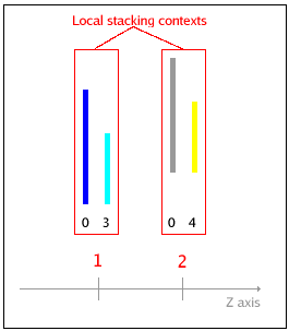
Figure 1: Illustration of different stacking contexts.
The elements appearing inside “2” will always appear in front of all of the elements inside "1". Then within each stacking context, elements with a higher z-index number appear in front of elements with a small z-index number. If two elements have the same z-index number, the one appearing later in the markup will appear in front.
This part was probably quite confusing, especially if you’re new to CSS. The point is that you need to know your stacking contexts if you’re trying to change the stack levels of different elements. If an element belongs to a local stacking context you can only change its position along the Z axis within that local context. An element in one local stacking context cannot slide in between two elements in another local stacking context.
The good news is that you’ll most likely never encounter these problems. Changes in z-index are not very common in good layouts, and if they occur at all it is usually within one stacking context.
Fixed positioning
An element with position:fixed is fixed with respect to the viewport. It stays where it is, even if the document is scrolled. For media="print" a fixed element will be repeated on each printed page.
Note that Internet Explorer versions 6 and older do not support fixed positioning at all. If you use one of those browsers you will not be able to see the results of the examples in this section.
Whereas the position and dimensions of an element with position:absolute are relative to its containing block, the position and dimensions of an element with position:fixed are always relative to the initial containing block. This is normally the viewport: the browser window or the paper’s page box. To demonstrate this, in the example below you will make one of your elements fixed. You will make the other one very tall in order to cause a scrollbar, to make it easier to see the effect it has.
Make the following changes to your CSS code:
#inner {
   width: 5em;
   height: 5em;
   background-color: #999;
   position: fixed; top: 1em;
   left: 1em;
 }

 #second {
   width: 5em;
   height: 150em;
   background-color: #00f;
   position: absolute;
   top: 1em;
   left: 2em;
 }
Save and reload. If you don’t get a vertical scrollbar, increase the
heightvalue for#second. (What kind of giant monitor do you have, anyway?) The tall blue element extends beyond the bottom of the window. Scroll the page downward, and keep an eye on the gray square in the top left-hand corner.#inneris now fixed in position 1em from the top of the window and 1em from the left side; therefore as you scroll, the gray box stays in the same place on the screen.
Conclusion
Absolutely positioned elements are removed entirely from the document flow. They will overlap other content unless you make room for them. If all child elements of a container are absolutely positioned, the parent’s height will collapse to zero. Absolutely positioned elements are positioned with respect to a containing block, which is the nearest positioned ancestor. If there is no positioned ancestor, the viewport will be the containing block.
Elements with fixed positioning are fixed with respect to the viewport—the viewport is always their containing block. They always appear at the same place inside the browser window when viewed on screen; when printed, they will appear on each page. The positions of each edge of an absolutely positioned element can be specified with the top, right, bottom and left properties. The value of each property specifies the distance of that edge to the corresponding edge of the element’s containing block.
All positioned elements are rendered at a certain stack level within a stacking context. You can change the stack level of a positioned element using the z-index property. When z-index is specified as an integer value, the element establishes a local stacking context for its descendants.
See also
Exercise questions
- Undo the changes from the fixed positioning example and then change the stacking order between the four absolutely positioned squares so that the gray square is at the back, followed by the blue, yellow and cyan squares in that order. (Tip: remove all
z-indexdeclarations and start over.) - Move the yellow square up and to the right by setting
top:-1emandleft:8em. Then make it appear behind the#outerelement, so that the red border appears across the yellow square. - Replicate the three-column layout we created in the static and relative positioning article using absolute positioning instead. Since it will be impossible to have a full-width footer, you can remove the
#footerelement, but you are not allowed to change anything else in the markup (other than the link to the style sheet). - Modify the layout from the previous exercise to make the navigation use fixed positioning. You’ll have to remove the automatic horizontal margins on the
bodyelement to make this possible. Add enough content to the main column and/or the sidebar to make a scrollbar appear, so that you can verify that it works.