CSS background images
Introduction
Admit it! Since the first article in the Web Standards Curriculum, you’ve been itching to learn how to make your site look fierce and fabulous. Maybe you even skipped ahead to this section?
Background images are all about making your site look sexy, but you might be surprised how closely they build upon the fundamental concepts you have already learned.
As you already learned earlier on in the course, one of the most important changes that comes with CSS was the ability to separate presentation, or the way things look, from semantics, or what things mean. The CSS background image is among the most important tools you have at your disposal, because it lets you apply decorative images to particular parts of your HTML without adding any extra weight to your HTML. Previously, authors (that’s you!) were forced to fill their code with img tags.
CSS and in particular the background property keep your HTML free from presentational clutter. Redesigns and other transitions, in the life of sites built with modern methods, can then be completed much more smoothly. You’ll be able to update your entire site by changing only the style sheet, rather than recoding every HTML page. Depending on the size of your site, this can be a substantial saving.
In this article I’ll show the basics of how CSS background images work, including applying a background image via CSS, adjusting its placement, tiling it vertically or horizontally and combining background images using CSS Sprites to improve site performance.
How does it work?
The CSS for backgrounds is split into several different properties. Using these properties, such as position and color, you can begin to control the look and feel of your page. In this article, you will go through CSS background images in detail, building an alert message as an example, step by step.
First, let’s learn a little more about the different properties at our disposal.
Background Properties
| Property | Definition | Description |
|---|---|---|
background-color |
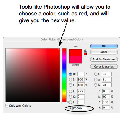
Sets the background colour of the HTML element. | There are several ways to indicate Many colour picker tools will help you find the hexadecimal notation of a given colour. Pure red, for example would be #FF0000.
Valid values include a |
image |
Indicates the pathor URL of the background image. | Set the Valid values include a |
repeat |
Indicates in which direction the background image should be tiled. |
Valid values include |
attachment |
Sets the behaviour of the background image when the user scrolls. | Images can either scroll with their content, or stay fixed in place in the view screen. Valid values include |
position |
Tells the browser where to position the background image. | Images can be displayed anywhere within the borders of the HTML element on which they are applied. Use There are many useful ways to indicate background position, keywords and numeric values. Keywords (such as When percentages and pixels are used, the starting point is always the top left corner of the HTML element, although the way image positioning works with pixels and percentages is rather different. Pixels always move the image a set number of pixels towards the bottom and right of the containing box (or towards the top and left if they are negative values), regardless of the size of the image and the containing box. Percentages on the other hand move the image a percentage of the difference between the containing box size, and the image size. If the image and the containing box are the same size, percentages won’t move the image at all. Valid values include |
background |
The shorthand property that can be used to describe all the other properties in one line. | Shorthand properties are very nifty indeed. Most developers use them to keep the CSS as lean as possible and group related properties. You can write a general rule using shorthand, and then override it as needed with specific properties. The properties should always be indicated in the same order, to allow browsers to easily interpret the intended styles:
An example of this shorthand with all the properties used (except
|
Building an Alert message
Now I’ve gone through the basic syntax involved, I’ll walk you through building up a complete alert box example, which will demonstrate all the aspects of background images.
The design
Let’s say a graphic designer has provided a visual mock-up of the alert message you want to create for your web site. Looking at the alert you see that the background is light orange, setting it off from the surrounding paragraphs. It also has an alert icon ten pixels from the top left corner.
Note that the mockup has one line of text, but it might contain more in the future. One of the most important skills of the web developer is to anticipate how a design will evolve. Part of respecting the artistic vision for a site is thinking about consistency from launch to redesign. So the alert message could contain more than one line of text, or even multiple paragraphs, lists, or other HTML elements. You should try to be as element agnostic as possible. This will increase the likelihood of code reuse, and set up the site to be as fast and efficient as it can be. The mockup looks like Figure 1.

Figure 1: The graphic designer’s mockup of our alert box.
The designer has also provided the icon we are meant to use, as shown in Figure 2.

Figure 2: The alert icon.
The code
Based on what you have learned about CSS backgrounds in the first part of this article, you may already be thinking about how to build this alert message. I’d like to encourage you to have a go at it now, and then compare your work against my example.
Ok—had a try? Now let’s go through it step by step. Each screen shot links to code examples, so you can check out the source at each stage. Experiment with the code, increase or decrease values, and try out alternatives. You may also want to follow along, writing each new line of code in a tool such as Opera Dragonfly or Firebug, so you can immediately see the results of each step.
Creating the CSS hook, or selector.
First you need to create a class alert, for the CSS to hook on to. Create new CSS and HTML skeleton files, link the CSS to the HTML file, and add the following code to them:
The CSS:
.alert { ... }
The HTML:
<p class="alert">
  <strong>Alert!</strong> The text of our alert message goes here.
</p>
Here I am styling the alert with a class, rather than an id, because I could have more than one alert in the page, for example a form element with several errors. You want to make your CSS as flexible as possible and constrain things to correspond to the design when building the HTML.
Ok, so you’ve put a solid foundation in place, but it still looks like an ordinary paragraph because you haven’t yet added any styles. Lets do that next.
Note: I have intentionally chosen not to limit the class alert to paragraphs; alert boxes could easily contain other elements as well. You should leave as much flexibility as you can within your CSS.
Adding the background colour
You already learned about using background colour in text treatments in Text styling with CSS. The same principles apply to any HTML element and can be combined with background images to create visual effects. If the background colour has neither been set nor inherited, it is, by default, transparent.
Let’s add the light orange background colour to the alert box to make it stand out from the text around it. You don’t want it to be too dark because it is important that you keep a reasonable level of contrast between the text and the background colour. Add the following property inside your CSS rule
.alert{'''background-color: #FFFFCC;'''}
The Alert box should now look more like Figure 3.
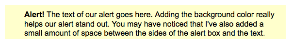
Figure 3: An alert box with background colour added.
Applying the background image
Now let’s add the image to the alert. The path to the background image needs to be wrapped in url(), as shown in the code below. Add the highlighted line to the CSS rule.
.alert{
  background-color: #FFFFCC;
  '''background-image: url(alert.png);'''
}
The alert box will now look like Figure 4.
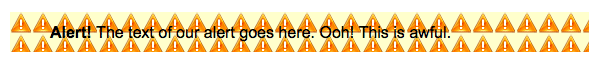
Figure 4: The background image has been added, but the tiling looks awful.
Remember that each background property has a default value—if you haven’t specified a value, the default will be applied. Of course, you will have noticed that the image is tiling over our entire alert, much like mosaic tiles on a kitchen floor. What is the takeaway? Background images are set to repeat both horizontally and vertically by default. Repeating backgrounds are particularly useful for gradients and patterns that fill the screen or a particular HTML element, but that effect is not desired in this case.
Controlling background repeat
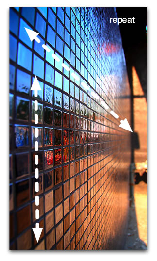
Figure 5: Much like our background image, these tiles repeat both horizontally and vertically.
Reading specifications can certainly be intimidating, but the specification is a really good place to figure out how CSS is supposed to work before you delve into the myriad browser differences. Go take a look at the colors and backgrounds portion of the W3C Specification and try to find the keyword to use when you don’t want a background image to be repeated. We’ll use that in our example below.
Found it? Note that there is a section for each background property including background-repeat. Under Value, you’ll see all the possible choices including; repeat, repeat-x, repeat-y, no-repeat, and inherit. By default (initial) background images are set to repeat. No direction is specified, which means that that the image will tile both horizontally and vertically. You have most likely guessed that no-repeat is the value you are looking for to prevent the image from tiling in either direction. Add the following highlighted line to the CSS rule.
.alert{
  background-color: #FFFFCC;
  background-image: url(alert.png);
  '''background-repeat: no-repeat;'''
}
The alert box will now look like Figure 6.
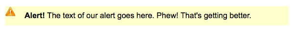
Figure 6: The alert box, with a single copy of the background image (no tiling.)
Additionally, you can choose to repeat in both directions (like kitchen tiles) or neither direction. Gradients often repeat horizontally or vertically (see Figure 7). You don’t need to know the size of the HTML element; you simply cut a slice from your gradient and set it to repeat in the direction you want; either x for horizontal, or y for vertical. Patterns often repeat in both directions, and icons usually do not repeat. You will explore background-repeat further in a later example.
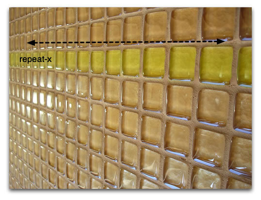
Figure 7: The greenish yellow tiles in this example repeat only horizontally.
Let’s take a look at a practical example from my website—look at Figure 8.
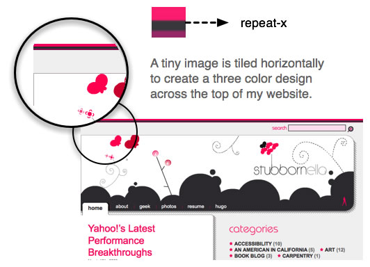
Figure 8: A repeating example from my own web site.
The CSS I used to add this decorative effect is relatively simple. I made the background repeat horizontally using repeat-x:
body{background-repeat: '''repeat-x'''}
Attachment
attachment allows you to specify how the background behaves when the user scrolls down the page. The default behaviour is scroll, which causes the background image to scroll along with the content.
On the other hand, setting background-attachment to fixed causes the element to be stuck to the browser window, so it stays in the same place when the content inside the element it is attached to is scrolled. This creates some odd effects, which will only be apparent when you scroll over the HTML element it is attached to. The W3C uses it to mark the status of their specifications, for example the “W3C Candidate Recommendation” image at top left. Scroll down the page and the image stays top left. It is attached to the body element, so it is always visible.
This step will have no effect on our display, because browsers set background images to scroll by default, but let’s add it to the code anyway so that you can see how the property is used. Add the highlighted line to the CSS rule:
.alert{
  background-color: #FFFFCC;
  background-image: url(alert.png);
  background-repeat: no-repeat;
  '''background-attachment: scroll;'''
}
As shown in Figure 9, the visual display of the alert box is not much different to how it was before.
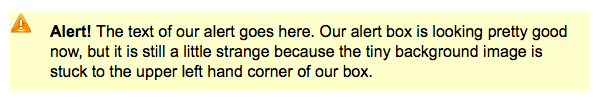
Figure 9: Not much different here.
Positioning the image
Positioning is the fine tuning that lets you place your background image exactly where you want it to be, both horizontally and vertically, within the HTML element. This property takes keyword and number values such astop, center, right, 100%, -10%, 50px and -30em.
Figure 10 shows the values you might use to place your background images in different positions.
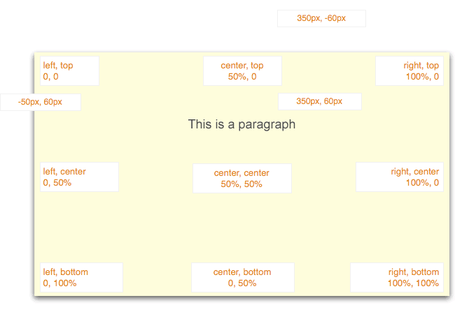
Figure 10: Various examples of background position using keywords, percentages, and pixels.
So let’s position the background image. You want it to be in the top left corner, but not touching the sides, so you need to offset it by 10 pixels from both the top and left—this can be done by adding the following highlighted line to the CSS rule. Do this now.
.alert{
  background-color: #FFFFCC;
  background-image: url(alert.png);
  background-repeat: no-repeat;
  background-attachment: scroll;
  '''background-position: 10px 10px;'''
}
The first value is the horizontal offset, the second is the vertical. In this case they are the same. Your alert box should now look like Figure 11.
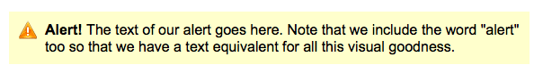
Figure 11: Using positioning to place the background image.
Tip: Stick to either keywords or number values—older browsers may ignore your declaration if you use both at once. Using right and bottom will achieve the same thing as 100% horizontally or vertically, respectively.
Using shorthand to pull the whole thing together like a pro
As you have already seen, certain CSS properties can be grouped together. Background and all of its sub properties are among them. The CSS code we’ve written so far can be rewritten in shortened form, as follows:
.alert{'''background: #FFFFCC url(alert.png) no-repeat scroll 10px 10px''';}
Tip: When grouping sub properties of background, always put the properties in the following order—this is important for both cross browser compatibility and stylesheet organisation and maintenance:
colorimagerepeatattachmenthorizontalpositionverticalposition
Try replacing the old CSS with the shorthand shown above, and your example should look exactly the same—see Figure 12.
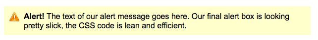
Figure 12: The shorthand works like a charm!
Experimenting with the code
The best way to remember all the nuances of CSS is to try out the options yourself—try changing some of the properties in the example, and see how that affects it. Set the background-position to 100% 100%, and notice that it gives the same result as using the right and bottom keywords. What about if you change it to -5px 0? Why do you think you now can’t see part of the image?
Testing for quality
Testing is extremely important to providing a good user experience. Just because the site looks good on your machine with your specific configuration doesn’t mean that it will look good for everyone. You should follow these basic minimum steps when testing your alert box.
- Increase or decrease the amount of text inside the alert.
- Increase the text size in your browser at least two levels. Would it have been better to use ems to position our image? Then what happens when you increase the text size?
- Apply the
classalert to other elements such asdiv,p,ul,strong, orem. What do you need to change to make the class agnostic? - Include several paragraphs and a list inside an alert
div—does the code still work? - Verify the alert visually in the Grade 1 browsers (also known as A-grade). My advice is to write for good browsers and adapt for Internet Explorer once the code works.
Rigorous testing is part of learning to write CSS. The more careful you are while learning, the faster you will become.
Sprites
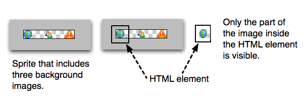
Users want it all. They want your site to be glamorous, interactive, and also fast, however including large numbers of CSS background images can slow your site down considerably—the more HTTP requests you make, the slower your site will be (an HTTP request is when your computer is accessing a web site and needs to ask the server to send it another asset that makes up the site, such as a CSS file or image - each additional request means a longer loading time for the site). To get around this limitation, you can combine related icons into a single image, known as CSS Sprites. The background-position property allows you to then place the image in the appropriate positions so the icons display through the window of the HTML element the CSS sprites are attached to.
For example in Figure 13, you will see that to display the earth icon through the HTML window you can place the image using left top. To move the position of the image so the alert icon is displayed, the background position needs to be changed to -80px 0. The negative horizontal value pulls the image to the left.
Figure 13: Using CSS Sprites to reduce HTTP requests.
Note: If you use negative background positions, Safari will repeat your image, even if you’ve specified no-repeat. This is something to keep in mind as you start playing with background images to create more complicated layouts.
A complex sprite and background image example
Let’s have a look at how CSS sprites can be used to good effect. Suppose our friendly designer sent us an new mockup. This one is for a list of links on the landing page of a blog. It points to the bloggers’ LinkedIn profile, RSS feed, Flickr photos, and bookmarks. Looking at each link, we realize that there is a gradient starting in the center as white and going to gray at the top and bottom of the link, and to further complicate things the designer asked if we could make each link plain white with no curve when visitors hover over the link—check out Figure 14.
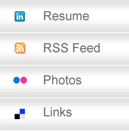
Figure 14: The new design mockup.
The logos could be included using img elements in the markup, however using CSS sprites is a much better way to go—the sprites load faster as only one image needs to be loaded (not four), and it declutters your HTML, reducing the amount of markup needed.
Creating the Sprite
The first step is to cut out the four logos and create the sprite set, as seen in Figure 15.
Figure 15: The sprite set.
You also need to cut out a 1 pixel wide slice of our gradient. For the sake of visibility, I have cut out a slightly larger slice, but you only need one pixel—see Figure 16.
Figure 16: The slice for our gradient background.
The HTML for the list is an unordered list containing links. Note the empty span elements inside the links. It is very important not to have fixed height and width on elements that contain text—after all, you have no idea how large the text will be. What happens if the site gets translated to German? You can use these extra spans to display the logos. As an alternative, you may decide that you don’t want to have extraneous non-semantic markup cluttering up your HTML. In this case you will need to use a larger sprite and leave white space between the icons. Keep in mind that this will be slower for users on slow connections, especially those on mobile phones. The code for the list looks like so—add this to an HTML template:
<ul class="navigation">
  <li id="resume">
    <a href="#">Resume</a>
  </li>
  <li id="rss">
    <a href="#">RSS Feed</a>
  </li>
  <li id="photos">
    <a href="#">Photos</a>
  </li><br>
  <li id="links">
    <a href="#">Links</a>
  </li>
</ul>
The CSS makes use of both background images. First, take a look at the gradient background image. There are three interesting things to note about it:
- The first is that the image repeats horizontally (
repeat-x.) This is how we are able to make such a small image spread across the entire list. - The second is that the image is centred vertically. You want the round bit of the image to appear in the middle of the list item, so you should use a background position of
left center. - Finally, in the CSS I’ve applied a background colour that is the same grey as the grey in our gradient image. In this way, if the element grows, it won’t look broken. For more information about this kind of technique I recommend Bulletproof Web Design by Dan Cederholm.
Add the following CSS to a new CSS file, and link it to the HTML file:
.navigation, .navigation li {
  margin:0;
  padding:0;
}

.navigation li {
  border-top: 1px solid white;
  list-style-type:none;
}

.navigation li a {
  background: '''#E2E2E2''' url(sprite_gradient_bkg.jpg) '''repeat-x''' left center;
  padding:20px;
  display:block ;
  font-family: Arial, Helvetica, sans-serif;
  color:#333;
  font-size:18px;
  text-decoration:none;
}

/* hover effects */

.navigation li a:hover,, .navigation li a:focus {
  '''background: transparent none;'''
}
The last line means that the element should have no background colour or image when the user hovers using the mouse, or focuses using the keyboard. Perhaps you are wondering why I applied the background properties to the link rather than the list item? The answer is that Internet Explorer 6 and earlier do not support pseudo classes like hover on elements other than links. I’ve made the adjustment to accommodate this constraint.
Next you can create the CSS for the little logos. As usual, you can start by defining the most general case for all span elements within your navigation module. It is here that you define the image to be used by all spans, the repeat, and the background position (each is different, so lets use the first). You can use shorthand for this rule. Note that I’m using CSS comments to divide sections of our code into manageable chunks. Add the following code to the bottom of the CSS file:
/* general case */

.navigation span {
  '''background:url (sprite_logo.gif) no-repeat left top;'''
  height:15px;
  width: 15px;
  margin-right:20px;
  display:-moz-inline-box;
  display:inline--block;
  vertical-align: middle;
}
With the general case well in hand, you can now define the exceptions, or what is different about each specific logo. In this case, the only CSS that changes is the background-position. Each respective list item needs to have the image pulled 15 pixels more to the left, because each of the logos are 15 pixels wide. Add the following to the bottom of the CSS file:
/* exceptions */

#rss span {
  '''background-position: -15px 0;'''
}

#photos span {
  '''background-position: -30px 0;'''
}

#links span {
  '''background-position: -45px 0;'''
}
This example might seem intimidating at first. Keep your focus on the background images. In this case, I’ve used negative pixel values to pull the background image left so that the relevant part of the image is seen. Positive values push the background image down and right, negative values pull the image up and left.
Play with the background position values in the finished example, to better understand how to adjust sprite positioning.
Summary
You should now understand CSS background images, and what’s more, you are becoming more comfortable reading specifications, so if you have doubts about a particular property, you should know how to go look it up. This article covered background colour, image, repeat, attachment, and position. You also learned why developers use CSS Sprites, and how to use this advanced technique.
Image credits
- The Tiles, by DimsumDarren
- little glass tiles, by emdot
Exercise Questions
A paragraph is 40px by 180px and your background image is 60px by 200px. Will you see the entire image or only part of it? Why?
You want an image to be positioned in the bottom left corner of the
blockquoteelement—please fill in the correct values.blockquote{background: yellow url(quote.png) no-repeat scroll ____ ____ ;}Say you wanted each
h2in your document with aclassof “question” to have a gradient pattern applied. Would you userepeat-x,repeat-y,no-repeat, orrepeatto achieve something similar to the example below? Why?

- What would be the background position of the example in question number 3? How could you creatively use a background colour to be sure the background could expand to any height? Why is this important?
- What shorthand can you use to remove all background properties?
- What is the purpose of CSS sprites?
Further reading
- Performance and HTTP requests on YDN
- CSS2 Specification—Colors and Backgrounds
- CSS Sprites—Image Slicing’s Kiss of Death
- Bulletproof Web Design—My favourite book
Note: This material was originally published as part of the Opera Web Standards Curriculum, available as 31: CSS background images, written by Nicole Sullivan. Like the original, it is published under the Creative Commons Attribution, Non Commercial - Share Alike 2.5 license.