The CSS layout model: borders, boxes, margins and padding
Summary
This article covers the CSS layout model in some detail, including box model, borders, margin and padding, and how they all work.
Introduction
At first glance, the CSS layout model is a straightforward affair. Boxes, borders, and margins are fairly simple objects, and CSS syntax provides a simple way to describe their characteristics.
However, browser rendering engines follow a long list of rules laid down in the CSS 2.1 Recommendation, and a few of their own. For this reason, there are a lot of details that need to be understood before advanced techniques can be added to a stylist's repertoire.
In this article we introduce the CSS properties that manipulate the layout of HTML elements, including their borders, margins, and much more. Coverage will also include some of the rules mentioned above. Advanced column layout and grid-focused techniques are discussed in other articles that explore form layout, floats, clearing, and positioning in greater detail.
Changing composition: CSS margins, borders, and padding
Many HTML elements, such as div elements and headings, are rendered by default to occupy the entire width of the browser canvas and force a terminal linebreak, so that several such elements in series would render in a top-to-bottom stack on the document canvas.
However, HTML elements and the browser styles usually set for them are inadequate to the full range of use cases developers are called upon to consider in their work. The way CSS and HTML work together has been tuned to "fill in the gaps" so that classes and ids can add semantic meaning to markup while style sheet rules can precisely change the layout and presentation of content—perhaps even by canceling out large parts of the browser default styles altogether.
Careful control of whitespace is among a designer's most important tools — and in the opinion of this author, the single most important. However, the degree of control over whitespace that brings high production values to a site design is absent from default browser stylesheets, which means that stylists typically make frequent use of the margin, border, padding, and other CSS layout properties explained in this article.
Margins, borders, and padding are arranged as shown in Figure 1.
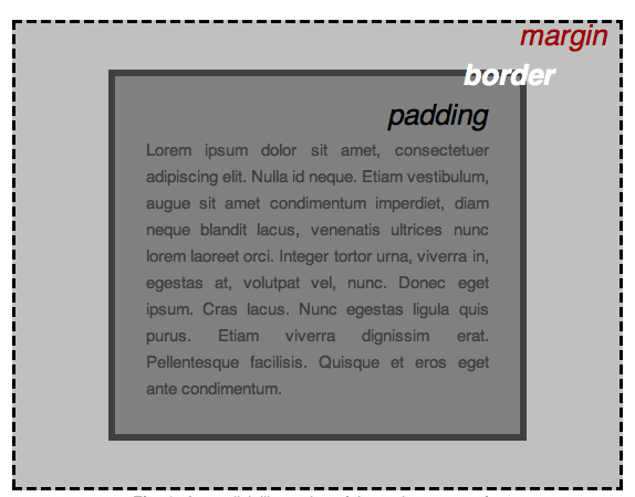
Figure 1: An explicit illustration of the various parts of an element box, labeled with associated CSS properties.
Putting whitespace around an object: the margin-top, margin-right, margin-bottom, margin-left, and margin properties
Margins can be specified singly, or in a shorthand rule. Furthermore, the shorthand rule still allows control of individual borders around an object. Valid values are usually specified in px or em units (pixels or ems). On print-specific stylesheets in, cm, or pt units might be used instead (inches, centimeters or points).
In all cases % (percentage) is a valid value, but needs to be used with care; such values are calculated as a proportion of the parent element's width, and careless provision of values might have unintended consequences. This challenge is explained in more detail during the discussion of the CSS box model below.
All inline elements except images lack margins, and will not take margin values. For a list of these elements, consult Table 2 below.
Auto margins
Depending upon the circumstances, provision of an auto value instructs the browser to render a margin according to the value provided in its own stylesheet. However, when such a margin is applied to an element with a meaningful width, an auto margin instead causes all of the available space to be rendered as whitespace.
Given the following rule:
  .narrowWaisted {
    width: 16.667em;
    margin: 1em auto 1em auto;
  }
A block element of the class narrowWaisted will center itself in the middle of the available canvas.
Or the right margin of an applicable element can be set to some relatively small value, while the left margin is assigned an auto value.
When that's done, such an element will instead appear nearly flush-right.
Negative margins
All of the margin properties can be assigned negative values. When this is done, an adjacent margin can be effectively "canceled out" to any degree. Given a large enough negative margin applied to a large enough element, the affected adjacent element can even be overlapped.
For example, consider the following simple div elements:
  <div id="header">
    <h1>Lovely header</h1>
  </div>
  <div id="content"><p>Overlapping text is entirely unreadable</p></div>
When styled with the following CSS
  body {
    background-color:white; font-family:Geneva, Arial, Helvetica, sans-serif;
  }
#header {

background-color: yellow;

}
h1 {

color:red;

font-size: 2em;

}
It creates the output shown in Figure 2:
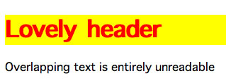
Figure 2: The two elements from our simple example. Nothing special to see here.
Here comes the interesting part. Now we'll add a fairly sizeable negative margin to the top of the bottom element, using the following rule:
#content {
  margin-top:-3em;
}
This gives us the visual effect of shifting the element up so it overlaps with the heading, as shown in Figure 3.
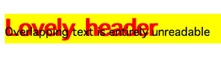
Figure 3: With a negative margin applied, the bottom element shifts upward and overlaps the heading.
Collapsing margins
In cases where two similar and adjacent block elements share margins that are greater than zero, only the larger of the two margins will be applied. For example, take the following rule:
p {
  margin: 1em auto 1.5em auto;
}
If a document including this style rule is rendered literally, the resulting margin between two paragraphs in series wouild be 2.5em, as the sum of the bottom margin of paragraph 1 (1.5em) and the top margin of paragraph 2 (1em). However, due to the application of collapsing margins, the margin between them is only 1.5em.
Lists and headings are peculiar among block elements, so their margins will not be collapsed into the margins of the other block elements.
Demonstration 1
In the text styling article, the typesetting of the opening section of an F. Scott Fitzgerald story was done with many of the tools made available by CSS. For the demonstration in this article, that same page is being put to use again, with some minor changes (principally, the addition of a container element around all of the copy). The text styling is unchanged, but the few layout styles applied to that demonstration have been removed.
For starters, margins will be added to all of the elements that will need them.
New rules:
  body { margin: 0; }
  #main { margin: 0 auto 0 auto; }
  h1 { margin: 0 0 1em 0; }
  .pullQuote { margin: auto 0 1em 1em; }
  p { margin: 0; }
  .attribution { margin: 0 0 1.5em 0; }
Adding a border to an object: border properties
There is a border shorthand property, but it's only useful when you want to provide a complete and consistent border around all four sides of an element. It's also possible to set the weight (width), style, and color of any of an element's four possible borders by using any meaningful combination of the following properties:
-
border-width -
border-style -
border-color -
border-top -
border-top-width -
border-top-style -
border-top-color -
border-right -
border-right-width -
border-right-style -
border-right-color -
border-bottom -
border-bottom-width -
border-bottom-style -
border-bottom-color -
border-left -
border-left-width -
border-left-style -
border-left-color
The border-width properties
These properties behave exactly as one would expect: they assign explicit weight to one or more borders.
The border-width shorthand property accepts values in the same notation as the margin shorthand property, except that percentage values are unsupported. You might well see yourself writing a rule like the following:
td {
  border-width: 1px 0 0 1px;
}
The border-style properties
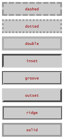
Figure 4: the eight common border styles in action.
The border-style properties commonly accept any of the following values:
dashedThe length of dashes, and the amount of whitespace between them, is determined by the browser.dottedThe amount of whitespace between dots (which may take on any shape with an aspect ratio of 1) is determined by the browser.doubleThe provided width will be divided into thirds and rendered in filled-negative-filled order.grooveAnoutsetwill be rendered immediately inside and flush to aninset.insetThe border will be shaded to make it appear as if the element to which it is applied is depressed into the canvas.noneEquivalent to specifying a-widthof zero.outsetThe border will be shaded to make it appear as if the element to which it is applied extrudes from the canvas.ridgeAninsetwill be rendered immediately inside and flush to anoutset.solidThe border appears as an unbroken, unshaded line.
When the border-style shorthand property is used, it can accept up to four values which are applied in the same fashion as margin shorthand values.
The practice of obscuring a border (rather than omitting it) is handled by the -color properties.
The border-color properties
Finally, it's possible to set any color on any individual border, with either a single property such as those listed above, or the border-color shorthand property. Refer to the explanation of the the margin shorthand property for details about the results of providing fewer than four values.
Like background-color, border-color can take a value of transparent. This can be useful in dealing with edge cases that require consistent composition but not consistent use of borders.
The border shorthand property and its four cousins, in more detail
Unlike the various -width, -style, and -color border properties, these five properties allow you to define the three characteristics of an object's four borders, or of any sigle border at a time. Valid border (etc) shorthand values contain any or all of the width, style, and color properties that apply to that border; the only limitation is that you must refer to either one side of an element at a time, or all four at once.
Consider the following border rule:
#borderShorthandExample {
  border: 2px outset rgb(160,0,0);
  padding: .857em;
  background-color: rgb(255,224,224);
}
An element to which the above rule is applied would look exactly like this paragraph.
When a value is omitted from a border shorthand rule, the rendered element will display a default result:
- Border width will be determined by the browser.
- Border style will be
solid. - Border color will be identical to the
colorapplied to the element in question.
Creating rules: the rationale for five border shorthand properties instead of one
The "rules" discussed here are lines drawn through a layout, not directives to follow. Such lines enhance contrast between an element and its neighbouring space, and in many cases they help to create the illusion of depth within a layout. This last result is exemplified by the existence of the inset and outset border styles.
While these same effects can be accomplished by putting borders around all four sides of an element, the ability to draw precisely defined lines in a layout allows its designer considerable control over details.
And why so many properties? They're just borders, right?
When a layout is created which demands exceptional skill from a stylist, there will be a need to account for edge cases; this was already raised in the earlier discussion of margins.
Because of the way in which site designs are executed, you will encounter many cases where this element or that might have similar structural properties to other elements in a document, but have different presentation requirements. In these situations it makes perfect sense to write one rule for the most common case, and additional rules for each of the edge cases. It's for this reason that the auto and inherit values exist: to use a default style as an edge case.
In the case of borders, edge cases might well require the alteration of a single characteristic of a border on a single side of an element — and when one wisely follows the KISS Principle, it's usually best to stick to changing only those details which need to be changed.
Demonstration 2
Certain sections of the document should be given embellishment in the form of rules and borders.
New rules:
h1 { border-bottom: 1px solid rgb(153,153,153); }
.pullQuote { border: 1px solid rgb(153,153,153); }
When margins alone aren't enough: padding properties
You will encounter elements with background colours in secondary or accent hues that require gutters between content and margins. In other situations, you'll need to provide space between borders and the copy near them.
In such cases and many others, you'll get considerable use from the padding, padding-top, padding-right, padding-bottom, and padding-left properties. These properties insert negative space between the margins or borders of an element and its content. See Figure 1 above for a clear illustration of the relationship between margins, borders, and padding.
These properties behave in exactly the same manner as margin properties, with the following exceptions:
-
autovalues are functionally useless in references to padding properties. - Negative padding values are invalid.
- Padding is never collapsed.
- Margin values are not applied to inline elements, but padding values are.
Demonstration 3
Gutters should be provided for the elements to which borders were previously added.
New rules:
body { padding: 0; }
h1 { padding: .5em 0 .5em 0; }
.pullQuote { padding: .5em; }
Working with element width and height
Most elements can have their dimensions altered as a matter of course. You've seen this capability demonstrated earlier in this article, during the discussion of auto margins.
The CSS properties used to manipulate the dimensions of elements are width, height, min-width, max-width, min-height, and max-height. These properties can then be divorced from (or linked to) the dimensions of element contents with the overflow property.
There's also a clip property which hides parts of an element inside its margins. However, it's omitted from this article because of its narrow scope of use.
width and height basics
As a rule, width and height produce exactly the results one would expect. However, their use carries some important caveats.
-
widthandheightcannot be applied toinlineelements... There are several elements (such asspan,strong, andem) that will ignore the application ofwidthandheightvalues under typical circumstances. A list of these elements can be found in the discussion of element types, later in this article. - ...except for images, which can be assigned
widthandheighteven though they are inline elements. The CSS 2.1 Recommendation refers to images as "replaced" elements, which means that the browsers should always treat them as possessing static dimensions. For this reason, those dimensions can be arbitrarily altered. -
widthandheightare only two of the properties that can influence the functional dimensions of an element. As a result, it's easy to put yourself in situations where an element is too small (usually too narrow) to hold its content as expected, leading to blowouts. The CSS box model discussion below addresses this issue. - Rendering bugs in Microsoft Internet Explorer (IE) make it necessary to specify explicit
widthorheightproperty/value pairs for some elements. There are some peculiarities about IE's rendering engine that can only be resolved with brute force (see the Glossary). Most of these peculiarities are known and slated to be removed from IE 8, but until that version has replaced its predecessors within the IE install base, this issue will be an inevitable test case. PositionIsEverything.net and the CSS-Discuss Wiki provide ample information about this issue and techniques that work around it. - Rounding algorithms will, from time to time, cause off-spec differences in layout between browsers which display content via LCD, LED, or CRT (
type="screen") display media. Thescreenmedia type ultimately requires all units to be coverted into pixel measurements, which may map differently from one browser to the next.
min-width, max-width, min-height, and max-height
From time to time you will encounter situations in which you need to constrain the size of an element — usually to ensure that a proportionally-sized column will always retain a readable width. The various min- and max- properties answer this requirement. As is the case with width and height, the results one can expect from using these properties are fairly predictable as a matter of course.
However, in the experience of this author, these properties have limited use (although other authors disagree). Like plain old width and height, they're subject to rounding errors that can deliver entirely unexpected results. More importantly, they are completely unsupported in IE 6, which still holds a considerable market share as of July 2008.
Demonstration 4
auto margins were placed to the left and right of the page container. Now it needs a width for those margin values to make any sense. Furthermore, the plan is to assign a float value to the pullquote, so that'll get a width, too.
New rules:
#main { width: 42em; }
.pullQuote { width: 14em; }
overflow: fencing in content, or setting it free
When an element's width or height are set, it's sometimes necessary to consider what results are desired in the event that the contents of that element take up more space than is strictly available. This is especially true on sites with both user generated content and strict layout specifications.
The overflow property and its four valid values — visible, hidden, auto, and scroll — are provided to handle such circumstances. Figure 5 illustrates the effect they have when applied to an element whose content spills out of its bounding box.
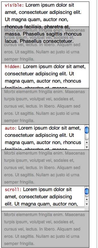
Figure 5: The effects of the CSS overflow property.
The results of the four overflow values
visible(default) Contents beyond the available dimensions of an element are displayed without affecting the flow or margins of adjacent elements. Consequently, content of one element may appear to collide with the content of its neighbours. Techniques for avoiding this outcome and special cases caused by rendering issues in IE are discussed in other articles.hiddenAny content which lies beyond the bounds of an element will be hidden from view.autoThe dimensions of an element will be constrained just as when thehiddenvalue is used, except that scrollbars will be created as needed to make overflowing content accessible to the visitor.scrollBoth vertical and horizontal scrollbars will be incorporated into the element, even if they're not needed.
The CSS box models: fitting everything together
Now that the fundamental layout properties have been covered, it's time to discover how the width of an element is rendered by the browser according to its CSS properties — and how to keep elements from blowing out your layouts. Some results will make perfect sense, while others will seem horribly counter-intuitive. To complicate matters, there are actually two layout algorithms to consider: the model specified by the World Wide Web Consortium (W3C) in the CSS 2.1 Recommendation, and the one used in older versions of IE.
Choosing the right units for your layout
As in the case of text, elements can be sized with either proportional units such as % or em, or static units like px. Something else to consider is that the browser canvas is always sized at a static value that cannot be assumed without using client-side script code to either retrieve that size, or resize the window — techniques which are ill-suited to the demands of accessibility, usability, and media portability.
The principal rule of sizing elements: mix proportional and static units with care, or not at all
The default value for both width and height is auto, which in Standard English is a directive to "use the available space." The result for block elements is that their computed width occupies all of that space. With respect to height, elements expand to enclose their content by default.
If you change width and height values, you must then be careful to ensure that the contents of an element will fit (with their margins, borders, and padding) into the width you've specified. The easiest way to do this by engaging in the following process:
- Consider the largest maximum width likely to be available for your layout, given common display resolutions and/or type sizes. As of this writing, this measurement will typically be something around 800 or 1024 pixels. The broader the expected audience of your site, the more likely it is that the smaller of these values should be chosen.
- Create a container element for your entire document that is set to an expected width less than the width worked out in step #1.
- Use the same unit type when setting layout properties for the elements within the container element created in step #2.
Choosing the right unit type for layout: advantages and disadvantages
| Unit | Advantages | Disadvantages |
|---|---|---|
| em |
|
|
| percentage |
|
|
| px |
|
|
Table 1: Advantages and disadvantages of the percentage, em, and pixel units in specifying layout properties.
The box model components
The box model is really just a series of directives that define how the various layout specifications of an element interact with one another. The components covered by the box model are:
- document canvas
- margins
- borders
- padding
- element widths and heights
- child element properties
The last of these items in turn includes the other five. However, for simplicity's sake this section will focus on simple parent-child element relationships, and reserve discussion of multi-level box model interactions for later articles that will delve into the finer points of page layout.
The W3C box model: everything is additive
The basic rule is that the computed width or height of an element is equal to:
margin + border + padding + (width|height)
In many cases the width and/or height will be set to its default value of auto, meaning that the canvas area put aside for content is equal to:
available_canvas - margin - padding - border
In such an equation, available_canvas is itself a discrete (if often auto-computed) value, less the amount of margins, borders and padding. This number is most important for the width of elements, because width calculation errors on the part of a designer will have the undesirable result of causing a horizontal scrollbar to appear in the browser window. Additionally, browsers always place elements at the left margin of the browser canvas that would otherwise overflow beyond the right margin of the browser window, unless instructed to do otherwise.
Consider the following style sheet rule:
#myLayoutColumn {
  width: 50em;
  margin: 1.5em auto 1.5em auto;
  border: .1em;
  padding: .9em;
}
As discussed during the explanation of margin properties above, one can expect #myLayoutColumn to center itself within its container element, whether that container is body, or something created by the production team.
Furthermore, if the activation of "strict mode" (through the use of an appropriate !DOCTYPE declaration) causes the W3C box model to be used, one can also expect the computed non-marginal width to be:
.1em + .9em + 50em + .9em + .1em = 52em
In screen media the browser will then take this value, round all of the values separately to the nearest pixel, and render the result accordingly.
Proportional margins and padding in the W3C box model
When the W3C box model is in use, proportional margins and padding are computed relative to the computed width of the containing element. To give one example, if you specify margin: 20% for an element that's contained within an element that is 800 pixels wide, the margin rendered around the first element will be 160 pixels on all sides (as 20% of 800 is 160).
If that same element is assigned padding: 5%, its computed content width will be 400 pixels:
20% + 5% + 5% + 20% = 50% 0.50 × 800 = 400
800 - 400 = 400
Working with document flow
Upcoming tutorials discuss the creation of multi-column layouts, so there are three CSS properties left to introduce in this article: display, float, and clear.
Element types and the display property
With the exception of html, body, and table parts, each element in the HTML 4.01 Recommendation that relates to primary content has an associated type of inline or block. Each type determines default layout behaviour in different ways:
Inline
- Text and images that immediately follow and/or precede inline elements are rendered on a common baseline with the content of the inline element, unless they're so long that they would otherwise overlap the edge of the containing element, in which case the inline content will wrap onto a new baseline underneath the first one.
- Lines of text within inline elements are laid out with soft linebreaks as needed (or allowed), except where this behaviour is modified by use of the
white-spaceproperty. -
margin,width,height, andfloatproperties in style sheet rules applicable to these elements (exceptimgandobject) are ignored. - Inline elements can only contain text or other inline elements.
Block
- These elements are rendered as discrete blocks within their containers.
- Unless assigned a
floatvalue ofleftorright, will always be rendered with preceding and following linebreaks. - Linebreaks between nested block elements that don't have any content between them will typically be collapsed.
- block elements with a width of
auto(the default) will always expand to fill the entire width available to them.
The display property has three commonly used values — block, inline, and none — of which two refer to the corresponding element types. The effect of changing an element's display value is to cause an inline element to behave like a block element, to make a block element behave like an inline one, or to alter the rendering of the document as if the element (and all of its contents) did not exist at all.
As a matter of course, it's vital to know which elements correspond to which types by default, relationships laid out briefly in Table 2:
| Element | Type | Subtype | Notes |
|---|---|---|---|
a
|
inline | special | |
abbr
|
inline | phrase | |
acronym
|
inline | phrase | |
address
|
block | Behaves similarly to p in common practice
| |
blockquote
|
block | Must contain at least one block element when the declared !DOCTYPE is Strict
| |
body
|
Encloses the entire document canvas; commonly takes on a margin (in IE, Firefox, and Safari) or padding (in Opera) of 10px in screen media
| ||
cite
|
inline | phrase | |
div
|
block | ||
em
|
inline | phrase | |
fieldset
|
block | Commonly rendered by default with border: 1px black;
| |
form
|
block | ||
h1 ... h6
|
block | heading | |
input
|
inline | formctrl | |
img
|
inline | special | |
label
|
inline | formctrl | |
li
|
block | Element type not specified in Document Type Definition, but this element may contain either block or inline elements; the complete CSS 2.1 Recommendation sets aside a display value for list items
| |
ol
|
block | list | |
p
|
block | May only contain inline elements; commonly rendered with top and bottom margins | |
span
|
inline | special | |
strong
|
inline | phrase | |
table
|
block | ||
ul
|
block | list |
Table 2: Frequently used HTML elements and their types. Only margins between two adjacent block elements of the same subtype will collapse.
Demonstration 5
How about removing the "Prologue" annotation from the title, just for demonstration's sake?
New rules:
.sectionNote { display: none; }
Causing elements to flow around others: the float property
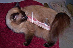
A photo is positioned to the left of this paragraph. Practically all of you will see that the following copy flows naturally around it, though some might need first to cease wondering why a well-known science fiction novelist would tape bacon to his cat—even if he was having a slow day. HTML attributes can be used to specify the layout behaviour you see, but in this instance the results were accomplished with CSS.
As one can imagine, the property/value pair that works this magic is float: left;. The finer points of working with floats will be addressed in later articles, but it's necessary to touch on the basics here. float: right is also a perfectly serviceable property/value pair, and for those occasions when you need to contradict a class assignment that invokes float, you can specify float: none.
The float property does come with a few use instructions:
- A
floatvalue will only matter if it's applied to a block element with an explicitwidth. -
float,clear, andmarginproperties all appear together in style sheet rules meant to create columns within a layout. - Causing a floated element to stretch to the bottom of its container is a tricky matter, but not impossible. The common way to do this is referred to as faux-columns.
Demonstration 6
Placement of a float value on the pullquote has been talked about, so now it gets done and the results can be seen. While we're at it, let's add some background color to help distinguish it from the main content.
New rules:
.pullQuote { float: right;
background-color: rgb(204,204,204); }
Forcing elements below their floated predecessors: the clear property
Like the float property, the clear property can be assigned one of the left, right, or none values. The both value is also supported.
While the float property directs how the content of subsequent elements should flow around it, the clear property directs how an element should flow around all of its neighbours—in many practical cases, not at all.
Figure 6 illustrates the behaviour of clear: left; in a layout where two initial consecutive elements have been assigned identical height values, and float values of left and right:
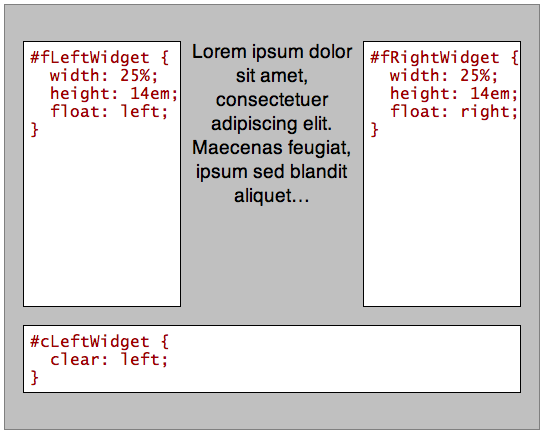
Figure 6: clear:left allows the bottom box to clear both columns, as they are the same height.
In the preceding demonstration, the default flow of #cLeftWidget would place it just below the Latin text — that is, between #fLeftWidget and #fRightWidget.
Consider what happens when the first of the same collection of elements is made shorter than its flush-right sibling, as seen in Figure 7.
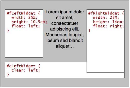
Figure 7: When the right column is longer than the left column, clear:left will not clear both columns and so clear:both must be used instead.
In the first example, the clear value of the trailing element is set to left in order to make a point: because both of the floated elements are the same height, the cleared element will be pushed below both. However, the second example proves that in order to achieve the same result with floated elements of differing heights, clear: both; must be used.
This discussion of the clear property is intended as a simple introduction to its effects, while later articles discuss the finer points of technique associated with its use.
Summary
Between differences in rendering engines, the need to cover a wide swath of traditionally defined ground, and the inability to predict the certain dimensions of a browser window, the layout of Web documents is fraught with hassles and caveats. However, the common level of CSS support has advanced to the point where Web documents are not hard to get to give decent results across browsers.
See also
External resources
- Bergevin, Holly, and Gallant, John. 2006. Explorer exposed. Position Is Everything. (accessed 1 July 2008).
- Bos, Bert, et al. 2007. Cascading style sheets level 2 revision 1 (CSS 2.1) specification. World Wide Web Consortium. etc. (accessed 30 June 2008).
- Raggett, Dave, et. al. 1999. HTML 4.01 specification. World Wide Web Consortium. etc. (accessed 30 June 2008).
- Raymond, Eric, and Steele, Guy, eds. 2003. Brute force. The Jargon File (Version 4.4.7). (accessed 30 June 2008).
- Scalzi, John. 2006. Clearly you people thought I was kidding. Whatever. (accessed 30 June 2008).
Exercise questions
- Under which circumstances is it best to use the shorthand
marginvalue, or a single margin property such asmargin-top? - When the shorthand
margin,padding, andborder-widthproperties are provided with all four values, in what order are those values applied to the four sides of an element? - If you want to place a rule under the text of each heading in a document, which property would you use?
- Which
border-stylevalue would you use to give an element an appearance like an interface button? - Yes or no: Will specifying a border around an element will also provide for a gutter around the content of that element, by default?
- If you create an element that isn’t as wide as its container, which property/value pair do you need to set to ensure that the element is horizontally centered within its container?
- Yes or no: If you place a container element within
bodyand set itswidthto a value greater than100%, will the behaviour of the document canvas change? - If an image is too large for its containing element, which property/value pair would you use to ensure that your page layout doesn’t blow out, and why?
- If you assign a
displayvalue ofblockto ana(link) element and give that element a reasonable height and width, how does the mouseover behaviour of that link change inscreendisplay media? - Under normal circumstances, a block element expands to fill the width of its container (less margins, borders, and padding). By default, does this behaviour truly change when that element is preceded by a
floated element — or merely appear to change? - If you intend to apply a
floatvalue to an element, which other property must you also set on that element? - If you wanted to make absolutely sure that an element would always expand to fill the width of its container, which property/value pairs would you set?
Attributions
This content was originally published on DevOpera, Opera's Developer Network. .