HTML forms basics
Summary
This article covers the basics of creating standards compliant, best practice HTML forms.
Introduction
Everyone has seen a form. Everyone has used one. But have you coded one?
Most areas where you can input information into web pages are created using HTML forms: entering text or numbers into a text box, ticking a check box, choosing a radio button, or selecting an option from a list. The form is then usually submitted to the website and the data is used in some way. Your customer details might be stored in a database for later use, or the website might be updated after you choose a product to view.
While it is easy to create a functional form, attractive and usable forms take a bit of work. In this article we’ll cover how to create elegant, accessible form structures with HTML, starting with the real basics and working up to some more complex features. We’ll then look at the new form capabilities of in HTML5 in the next article, HTML5 form features.
Step one: The basic code
Let’s start by building a comment form, the sort of form you would use on a website to allow people to give you feedback on something, such as an article you wrote or a product you sell. We’ll start it off very simply:
<form>
  Name: <input type="text" name="name" id="name" value="" />
  Email: <input type="text" name="email" id="email" value="" />
  Comments: <textarea name="comments" id="comments" cols="25" rows="3"></textarea>
  <input type="submit" value="submit" />
</form>
If you enter this into an HTML document and then open that document in a browser, the code is rendered something like this:

Figure 1: The basic form example.
Try it for yourself — enter the above code into your own sample HTML document and load it in a browser. As you examine the code, you’ll see an opening <form> tag, a closing </form> tag, and some bits in between. The form contains three input elements into which you can enter information: two single line text inputs, and a multiline text input. Let’s look at each part.
The <form> element
The <form> element is required to wrap around the form’s content — without it you don’t have a web form. The <form> tag can have a few attributes, which we’ll cover below. Note that you can’t nest a form inside another form.
The <input> element
The <input> element defines an area where you can type or paste information.
The type attribute
There are different types of <input> elements. We’ll look at them later, but in this case we are using <input type="text"> to specify that we want single line text input fields (the type attribute is mandatory). We have also put “Name:” and “Email:” text next to them, to give visitors an indication of what data we’d like them to enter there.
The name attribute
Every <input> element must also have a name attribute that you, the developer, specify. The only exceptions to this rule are special cases where the value attribute is set to the same value as the type attribute, e.g., type="submit" or type="reset". The name attribute is needed for the database or other data destination to uniquely identify that piece of data.
When the form is submitted, most scripts use the name attribute to place the form data into a database or into an email that can be read by a person. Thus, if the <input> element is for the visitor’s name, the name attribute would be name="name" or name="first-name", etc.
Also note that the <input> elements have id attributes whose values match those of the name attributes. This is standard practice, and helps ready the form for processing by JavaScript functions. More about this later.
The value attribute
Every <input> element should also have a value attribute. The value of this attribute depends on the element it is used on:
- In the case where the field contents are generic, the
valueattribute can be set to blank —value="". This tells the processing script to just use whatever the visitor types into the box. If you do enter a value into thevalueattribute, it will appear in the text input as an initial value that the user can then overwrite. - In the case of more complex input with a choice of options such as a checkbox or radio button, you can set the initial value to one of the choices. For example, you can set
value="yes"to have the initial choice of a yes/no radio button pair set to yes. - In cases where there is only one value so the user doesn’t enter anything, such as submit or hidden, you set the value to equal the final input. For example, you would use
value="submit"for a submit button.
Let’s walk through a more complete example of how the value attribute is used:
- To start, consider a blank (“”) value attribute, where the user enters generic text.
- The code says:
<input type="text" name="first-name" id="first-name" value="" /> - The user inputs: Jennifer
- The value of
first-nameis sent asJenniferwhen the form is submitted.
- The code says:
- Now, consider a predetermined value attribute.
- The code says:
<input type="checkbox" name="mailing-list" id="mailing-list" value="no" /> - The user checks the box, as they wish to join the website’s mailing list.
- The value of
mailing-listis sent as “yes” when the form is submitted.
- The code says:
the <textarea> element
After the two <input> elements comes something a bit different — the <textarea> element. This element provides a multiple line text input area, and you can even define how many lines are available. Note the cols and rows attributes — these are required for every textarea element, and specify how many columns (lines) tall and how many rows (characters) wide to make the text area.
<input type="submit">
Last but not least, there is a special <input> element with the attribute value="submit". Instead of rendering a text box for input, the submit input will render a button that, when clicked, submits the form’s data to whatever target the form has specified. We’ll learn more about this later in the article.
Step two: Adding structure and behaviour
When you run that example, fill in the form, and click Submit, it doesn’t do anything! Why not? And why does it look so bad, all mashed up on one line? The answer is that we haven’t structured it yet, or defined a place for the collected data to be submitted.
Let’s go back to the drawing board, with a new and improved form:
<form id="contact-form" action="script.php" method="post">
    <input type="hidden" name="redirect" value="http://www.opera.com" />
    <ul>
        <li>
            <label for="name">Name:</label>
            <input type="text" name="name" id="name" value="" />
        </li>
        <li>
            <label for="email">Email:</label>
            <input type="text" name="email" id="email" value="" />
        </li>
        <li>
            <label for="comments">Comments:</label>
            <textarea name="comments" id="comments" cols="25" rows="3"></textarea>
        </li>
        <li>
            <input type="submit" value="submit" />
            <input type="reset" value="reset" />
        </li>
    </ul>
</form>
This form looks like this when rendered in a browser:
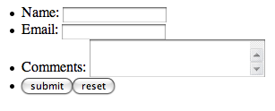
Figure 2: The second form example — looking better.
You can also put this example code into an HTML page and play with it, but if you try to submit the form you will get a 404 error — this is because the script.php file the action attribute points to does not actually exist; it is just there to give you the idea of what happens upon form submission. See the section covering the action attribute below for more information.
Here we have made a few additions to the basic, simple form. Let’s break it down:
Giving the form an id
We added an id attribute to provide a unique identifier for the form (contact-form) so that it can be more easily styled using CSS or manipulated using JavaScript. All ids must be unique within a page.
The method attribute: telling the data how to travel
Lights, camera, action! When you pressed the submit button in the first form and it did nothing, that was because it had no action or method. The method attribute specifies how the data is sent to the script that will process it. The two most common methods are “GET” and "POST".
- The “GET” method sends the data in the page’s URL. In your browser’s address bar you will sometimes see URLs like
http://www.example.com/page.php?data1=value1&data2=value2...; these are bits of data being transported using the “GET” method. Unless you have a specific reason to use "GET", it is probably best to avoid it if you are trying to send secure information, because anyone can see the information as it is transmitted via the URL. - The “POST” method sends the data, via the script that powers the form, either to an email that is sent to the site’s administrator or to a database to be stored and accessed later. “POST” is the more secure and usually the better option; see this W3C article for more information.
If you are concerned about the security of the data in the form, for example if you are submitting a credit card number to a shopping site, then you should use https with a secure socket layer (SSL). Basically, this means that data will be sent over the secure https protocol instead of the insecure http protocol. Have a look at the URLs next time you are paying for something on a shopping site, or using online banking — you’ll probably see https:// in your address bar, not http://. Although an https connection is a bit slower to transmit than http, the data is encrypted, so anyone hacking into the data connection can’t make hijack it while it is in transit. Talk to your web host for information on how they can provide you with https and SSL to use with your forms.
The action attribute: telling the data where to go
The action attribute specifies what script the form data should be sent to for processing. Many web hosts have a generic send mail script or other form scripts available for use (see your host’s documentation for information) that they have customized to their servers. On the other hand, you could use a server-side script that you or someone else has created to power your form. Most of the time, web developers use languages such as PHP, Perl, or Ruby to create a script that will process the form — you could, for example, send an email containing the form information, or input the form information into a database to be stored for later use. It is outside of the scope of this article to teach you how to write server-side code — please inquire with your host to find out what they offer, or find a nice programmer to befriend.
Hidden form inputs
The second line that’s been added to our Step Two form is the “hidden” input field — this is a redirect. Under the goal of separating markup structure from presentation and behaviour, it is ideal to use the script that will power the form to also redirect the user when the form is submitted. You don’t want your users to be left sitting there looking at the form page, wondering what to do next after they’ve submitted the form; we’re sure you’ll agree that it is a much better user experience to instead redirect your users after a successful form submission to a thank you page featuring “what to do next” links. This example specifies that after the form is submitted, the user will be redirected to the Opera homepage.
Structuring with an unordered list
To improve the look of the form, we have put all the form elements into an unordered list so that we can use CSS to hook into the HTML structure and make the form look better, by lining it up and giving it some polish. Some developers would argue against using an unordered list to mark up a form, and would suggest using a set of <div> elements instead. To be perfectly honest, either way is fine, so pick the one that suits you best. Whatever layout method you use, be sure to style it appropriately with CSS so it doesn’t look awkward and clunky.
Labels for accessibility
Last but not least in Step Two, we’ve labeled the form elements. It is best to give all the form elements corresponding <label> elements. These labels are tied to their respective form elements by giving the <input> and <textarea> elements ids that have the same value as the labels’ for attributes, or by nesting the input control inside the label element itself. This is great because it not only gives a visual indicator of the purpose of each form field on the screen, but it also gives the form fields more meaning semantically. In addition, a visually impaired person using the page with a screen reader can now tell which label goes with which form element and have more of a clue what data to fill into what input. The ids can also be used for targeting individual form fields with CSS styles.
By now you may be wondering why id attributes are included as identifiers in form elements as well as name attributes. The answer is that <input> elements without name attributes are not submitted to the server, so those are definitely needed. The id attributes are needed to associate form elements with their corresponding <label> elements. You should therefore use both.
The second form looks a bit better, but isn’t quite ready for publishing. Time to improve the structure further!
Step three: Adding some more complex form elements
The next version of the form code is:
<form id="contact-form" action="script.php" method="post">

<ul>
<li><label for="name">Name:</label> <input type="text" name="name" id="name" value="" /></li>
<li><label for="email">Email:</label> <input type="text" name="email" id="email" value="" /></li>
<li><label for="pwd">Password:</label> <input type="password" name="pwd" id="pwd" value="" /></li>
</ul>

<ul>
  <li>Please check all the emotions that apply to you:
    <ul>
      <li><label for="angry">Angry</label> <input type="checkbox" name="angry" id="angry" value="angry"></li>
      <li><label for="sad">Sad</label> <input type="checkbox" name="sad" id="sad" value="sad"></li>
      <li><label for="happy">Happy</label> <input type="checkbox" name="happy" id="happy" value="happy"></li>
      <li><label for="ambivalent">Ambivalent</label> <input type="checkbox" name="ambivalent" id="ambivalent" value="ambivalent"></li>
    </ul>
  </li>
  <li>How satisfied were you with our service?
    <ul>
      <li><label for="vsat">Very satisfied</label> <input type="radio" name="satisfaction" id="vsat" value="vsat"></li>
      <li><label for="sat">Satisfied</label> <input type="radio" name="satisfaction" id="sat" value="sat"></li>
      <li><label for="dcare">Didn't care</label> <input type="radio" name="satisfaction" id="dcare" value="dcare"></li>
      <li><label for="disat">Dissatisfied</label> <input type="radio" name="satisfaction" id="disat" value="disat"></li>
      <li><label for="vdisat">Very dissatisfied</label> <input type="radio" name="satisfaction" id="vdisat" value="vdisat"></li>
    </ul>
  </li>
  <li><label for="comments">Further comments:</label> <textarea name="comments" id="comments" cols="25" rows="3"></textarea></li>
</ul>

<ul>
  <li><label for="photo">Bio photo:</label> <input type="file" name="photo" id="photo" value="" /></li>
  <li><label for="location">Location visited:</label>
  <select name="location" id="location">
    <option value="">Select location</option>
    <option value="nyork">New York</option>
    <option value="vancouver">Vancouver</option>
    <option value="atlantis">Atlantis</option>
    <option value="alpha">Alpha Centauri</option>
    <option value="blackpool">Blackpool</option>
    <option value="bognor">Bognor Regis</option>
  </select></li>
</ul>

<li><input type="submit" value="submit" /></li>

</form>
When rendered in a browser, that form looks like this:
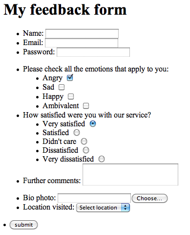
Figure 3: Some new, more complex form elements!
What have we added here? Let’s have a look.
Checkboxes: providing multiple yes/no choices
The first thing we added is a set of checkboxes:
<li>Please check all the emotions that apply to you:
  <ul>
    <li><label for="angry">Angry</label> <input type="checkbox" name="angry" id="angry" value="angry" checked="checked"></li>
    <li><label for="sad">Sad</label> <input type="checkbox" name="sad" id="sad" value="sad"></li>
    <li><label for="happy">Happy</label> <input type="checkbox" name="happy" id="happy" value="happy"></li>
    <li><label for="ambivalent">Ambivalent</label> <input type="checkbox" name="ambivalent" id="ambivalent" value="ambivalent"></li>
  </ul>
</li>
There is nothing special about these; each element creates a checkbox that can be checked on and off by the site visitor. They are identified by IDs, and their data is identified by their name attributes. When the form is submitted, any data items not checked are submitted as “off” or "no".
Radio buttons: a multiple choice option
Next, we have a set of radio buttons:
<li>How satisfied were you with our service?
  <ul>
    <li><label for="vsat">Very satisfied</label> <input type="radio" name="satisfaction" id="vsat" value="vsat" checked="checked"></li>
    <li><label for="sat">Satisfied</label> <input type="radio" name="satisfaction" id="sat" value="sat"></li>
    <li><label for="dcare">Didn't care</label> <input type="radio" name="satisfaction" id="dcare" value="dcare"></li>
    <li><label for="disat">Dissatisfied</label> <input type="radio" name="satisfaction" id="disat" value="disat"></li>
    <li><label for="vdisat">Very dissatisfied</label> <input type="radio" name="satisfaction" id="vdisat" value="vdisat"></li>
  </ul>
</li>
The only thing here that is different from the checkboxes (apart from the type attribute value of course) is the name values — notice that they are all the same. This is because whereas with checkboxes you are dealing with separate items of data with on/off values, while with sets of radio buttons you are dealing with a single item of data that cane take one of several values. Having the name attributes all set to the same value makes these radio buttons part of the same set, and you can only select one of them at once.
The checked attribute
Note the checked attribute on the above two bits of code, which makes the element selected by default when the page loads.
Uploading a file
<li><label for="photo">Bio photo:</label> <input type="file" name="photo" id="photo" value="" /></li>
This line of code creates a file uploader, used for uploading photos or other objects to be submitted with the form. Clicking the input field activates your operating system’s “File” or “Open” dialog and allows you to choose a file to be uploaded when the form is submitted.
Select and option: creating a multi-line dropdown menu
The last new bit of code looks like this:
<li><label for="location">Location visited:</label>
<select name="location" id="location">
  <option value="">Select location</option>
  <option value="nyork">New York</option>
  <option value="vancouver">Vancouver</option>
  <option value="atlantis">Atlantis</option>
  <option value="alpha">Alpha Centauri</option>
  <option value="blackpool">Blackpool</option>
  <option value="bognor">Bognor Regis</option>
</select></li>
The <select> element is quite different from the others we’ve seen so far: it creates a single line form control that, when activated, drops down to reveal multiple options, as defined in the <option> elements. The value attribute contains the actual data that is submitted for the selected option when you submit the form, and the text content inside the elements are the values the user sees.
Step four: further structuring with fieldsets and legends
The final form example is identical to the last one, except that we have wrapped the different major parts of the form in <fieldset> elements, and given each one its own <legend> element. For example:
<fieldset>

<legend>Login details</legend>

<ul>
<li><label for="name">Name:</label> <input type="text" name="name" id="name" value="" /></li>

  ...

</fieldset>
When rendered in a browser, these look like this:
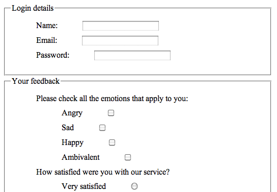
Figure 4: More structuring with fieldset and legend.
Explaining fieldset and legend
<fieldset> and <legend> are not mandatory, but they are very useful for more complex forms and for presentation.
The <fieldset> element allows you to organize the form into semantic modules. In a more complex form, you could use different <fieldset>s to contain address information, billing information, customer preference information, and so on. The <legend> element allows you to add a label to each <fieldset> section.
A little bit of style…
We’ve also applied a bit of CSS to this form, to style the structural markup. This is applied to the third form example using an external stylesheet. The two most important tasks we want the CSS to do are to add margins to line up the labels and input boxes, and to get rid of the unordered list’s bullets. Here is the CSS that resides in the external stylesheet:
#contact-form fieldset {width:40%;}
#contact-form li {margin:10px; list-style: none;}
#contact-form input  {margin-left:45px; text-align: left;}
#contact-form textarea {margin-left:10px; text-align: left;}
What does it do? The first line styles the fieldset border to not take up the whole page; you could also omit the border completely using {border: none;}. The second line puts a margin of 10 pixels on the <li> elements to put a little visual room between each list item, and gets rid of the bullets. The third and fourth lines set a left margin on the <input> and <textarea> elements so that they don’t crowd the labels and line up better.
You can see that this little bit of CSS makes our form look better, but you could improve it even more. For more information on styling forms, see Nick Rigby’s article, Prettier Accessible Forms.
Conclusion
This article examined the most basic elements and features of HTML forms. Everything examined here is available in HTML4; for a discussion of the new form features available in HTML5, see the next article, HTML5 form features.
See also
Exercise questions
It’s time to code your own contact form.
- Create a simple contact form that asks the user for their name, email address, and a comment.
- Add a checkbox asking if the reader would like to join your mailing list.
- Use some CSS to style your form: set a width to the form, align the labels to the left, put a background colour on to your page, etc.
- Find out what the
<optgroup>element does, and use it in your form.