Styling lists and links
Summary
In this article we provide a basic treatment of how to style HTML lists and links using CSS.
Introduction
Many web page elements can be forgiving in terms of design — if they aren’t “just right” it doesn’t matter too much. With lists and links it’s a different story; if you don’t get them right, you can cause some serious problems for people trying to use your website.
Links in particular have some key style requirements and user expectations. Poorly styled links can ruin the user experience on a website, as people have to stop and think about where to click. In the worst case, a user might not even be able to tell which items on the page are actually links!
In this article we’ll look at the core skills you need to create robust list and link styles. We’ll also discuss some ways to avoid key pitfalls of these elements and produce a final result that will work across different browsers, and be accessible to users with disabilities.
Styling Lists
First, we’ll go through the basics of styling lists with CSS, and then move on to look at some more advanced techniques.
Basic bullets and numbers
The fundamental thing to consider when creating a list style is what form of bullet or numbering you want to use. You might also choose to remove the bullets or numbers completely. As you learned in the HTML Lists article, there are many options available, set using the CSS list-style-type property.
For example, to set all unordered lists on your site to use square bullets, use this CSS:
ul li {
  list-style-type: square;
}
That will produce something like:

Figure 1: Unordered list with square bullets.
Some common list types:
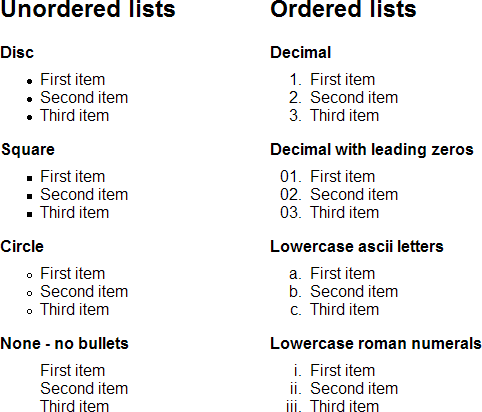
Figure 2: Common list types.
Note that the bullets and numbers will be rendered using the color which is set for or inherited by their li. If you need the bullet to be a different colour from the text, you must use an image instead, or work around the issue using other elements within the list items (this may be easy if all the items are links, for example).
Custom bullets using images
The standard set of unordered list bullets is adequate for basic content; however, it is a common design request to replace them with a custom image.
The CSS specification does include the list-style-image property for adding a custom list image. While this property works for basic image bullets, it has limited positioning options, and in some circumstances doesn’t work at all in Internet Explorer. So it has become a far more common practice to set a background image on the list items to serve as graphical bullets.
Imagine you have an unordered list of RSS feeds and you want to change the bullet to the standard orange RSS icon. We’ll give the list the class “rss” to differentiate it from other lists:
<ul class="rss">
  <li><a href="http://example.com/rss.xml">News</a></li>
  <li><a href="http://example.com/rss.xml">Sport</a></li>
  <li><a href="http://example.com/rss.xml">Weather</a></li>
  <li><a href="http://example.com/rss.xml">Business</a></li>
  <li><a href="http://example.com/rss.xml">Entertainment</a></li>
  <li><a href="http://example.com/rss.xml">Funny News</a></li>
</ul>
First we’ll set the list to have no list-style-type (removing the default bullets) and remove the margin and padding. Then, we add a background image (the RSS icon) to each list item, some left padding to move the text to the right so it doesn’t overlap the image, and some bottom padding to space out the list items:
.rss {
  margin: 0;
  padding: 0;
  list-style-type: none;
}

.rss li {
  background: #fff url("icon-rssfeed.gif") 0 3px no-repeat;
  padding: 0 0 5px 15px;
}
This produces a list with the RSS image instead of bullets:
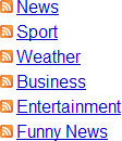
Figure 3: The list with RSS image bullets.
Here, we positioned the background image using pixels for a precise placement. Depending on the design you are creating, you might also use %, ems, or keywords. Just be careful when your design features content that might cause a list item to wrap over several lines — if you set the background to vertical center or 50% it can look quite strange:
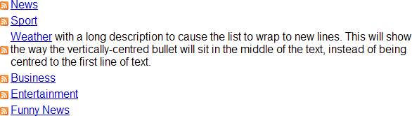
Figure 4: A demonstration of vertically-centred bullet images on a multi-line list item.
But by setting the image to align at the top of the list item, you maintain the default bullet behaviour, where the bullet sits on the first line of text:
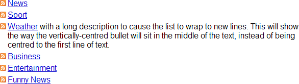
Figure 5: A demonstration of top-aligned bullet images on a multi-line list item.
List margins and padding
Clever use of margins and padding can make lists look much more polished and professional, but these techniques differ among different types of lists. In this section we’ll look at how to apply sensible margins and padding to the two most common list types.
Unordered lists
The default style for lists left-indents them, relative to surrounding paragraphs:
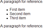
Figure 6: Default styled lists are indented on the left.
If you want unordered list items to sit at the same left-align point as the rest of your content, you must set some styles to control the indentation. Different browsers require different settings; some need the margin removed while others need the padding removed. The safe way to reset for all browsers is to set both to 0:
ul {
  margin: 0;
  padding: 0;
}
However, this may not have the expected effect; while it does cause the text to sit flush left, the bullets will still sit outside the text:
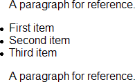
Figure 7: Bullets are positioned to the left of the text.
So, to align the bullets to the left you can now set a margin on the list items:
ul {
  margin-left: 0;
  padding-left: 0;
}

ul li {
  margin-left: 1em;
}
At this point you may still find a pixel-level difference between browsers, but the effect is basically as consistent as possible:
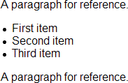
Figure 8: Bullets positioned together with the surrounding paragraphs.
Ordered lists
Now let’s consider the same issue for ordered lists. They are trickier because the numeric markers are aligned according to the list item with the largest number. For example, if you have 10 list items, all the numbers will be positioned to allow for the two-digit “10” item:
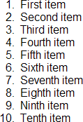
Figure 9: The numeric markers for items 1-9 have preceding padding so they right-align with item 10.
There really isn’t a convenient way to make an ordered list consistently left-aligned to the same position as the surrounding text, unless you set the list to list-style-type: decimal-leading-zero; which, while functional, isn’t very attractive:
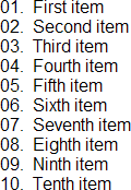
Figure 10: The leading zeros fill in the space for items 1-9.
It is more common to simply live with the difference in spacing. It does, however, mean that the markers of your ordered and unordered lists can’t easily and consistently be left-aligned. You can only line up the text of your lists:
ul, ol {
  margin-left: 0;
  padding-left: 0;
}

li {
  margin-left: 2em;
}
You need at least 2em of left margin to accomodate both ordered and unordered lists. Note the way the text of the items lines up in these two lists:
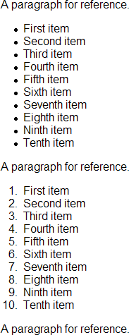
Figure 11: The text lines up in both ordered and unordered lists.
So, what to do?
You basically have three choices:
- Live with the default positioning of lists and their markers
- Explicitly line up the text of your lists
- Set a different style for
ulandol
There is no “right” or “wrong” approach, and it is quite common to simply leave things to the default settings for lists in general content.
Using list-style-position
If you want the text of multi-line list items to wrap below the list marker (not recommended), you must set the list-style-position property to inside, which produces this result:
Figure 12: List position “inside” causes the text to wrap below the marker instead of in line with the indented text.
For obvious reasons, this is not an especially popular style. By default, list-style-position is set to outside, which produces the results discussed earlier.
What about definition lists?
In general, definition lists don’t require a huge amount of attention, except to set a dt style (commonly bold text) and to control the indentation of the definitions:
dt {
  font-weight: bold;
}

dd {
  margin-left: 2em;
}
This sets up a clear and easy style for definition lists:
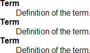
Figure 13: A simply-styled definition list.
Although definition lists can be rearranged with floats and positioning, they are quirky; generally, it’s better to keep things simple.
Nested lists
In the HTML Lists article you learned about nested lists. When you create CSS for lists you should take care to maintain clear design cues that show the relationship between a nested list and its parent (the list item that contains it). By far the most common way to do this is by indenting the nested list items; it is, in fact, the default setting across browsers.
If you set up your own list indentation, your base setting will simply be multiplied. For example, consider this CSS:
ul, ol {
  margin-left: 0;
  padding-left: 0;
}

li {
  margin-left: 2em;
}
Each subsequent child list item in the chain inherits the margin value from its parent list item, in addition to having another 2em of its own added on top. So a top level list item (one that doesn’t have a list item as a parent) will have a left margin of 2em, then a child list item of the first list item will inherit 2em from its parent, and then have another 2em added on to it, for a total of 4em, and so on.
Horizontal lists
One of the most common changes required when working with lists is to produce a horizontal list — that is, to make the items appear next to each other instead of one after the other. This is a common trick for site navigation. Let’s begin with a standard vertical list:
Figure 14: A simple list.
Now let’s convert this to a horizontal list:

Figure 15: A simple horizontal list.
To achieve this, we must do three things to our list:
- Remove the
marginandpaddingfrom the<ul> - Set the list items to
display: inline; - Give the list items some spacing to the right, to avoid having them run together
In the example, the list has the ID "mainmenu", so we’ll use that as a contextual selector to make sure we only change the list we intend to change. The CSS is:
#mainmenu {
  margin: 0;
  padding: 0;
}

#mainmenu li {
  display: inline;
  padding: 0 1em 0 0;
}
In this simple example, setting the list items to display: inline; is enough; however, float: left; can also achieve a similar look.
Faux columns
Earlier, we created a list of RSS feeds with graphical bullets. Now let’s imagine that list has been placed in a sidebar on your site. You want the list to appear in two columns, with a border around the whole group:
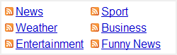
Figure 16: A list of feeds in two columns, with an RSS icon for each bullet.
Let’s assume the basic list is inside a <div>, which sets the width and border. The basic list would look something like this:
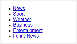
Figure 17: The unstyled list inside the border.
To achieve the faux columns effect, add the RSS icon as demonstrated earlier; then, add a 5px margin to the top, right, and left:
.rss {
  margin: 5px 5px 0 5px;
  padding: 0;
}

.rss li {
  list-style-type: none;
  background: #fff url("icon-rssfeed.gif") 0 3px no-repeat;
  padding: 0 0 5px 15px;
  display:-moz-inline-box;
}
Note that display:-moz-inline-box; is added to get the example to display correctly in Firefox 2.
We don’t need to add a bottom margin, as the last list item’s padding will cover that:
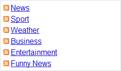
Figure 18: Halfway there; we now have correct spacing and icon bullets.
Now we set the list items to display: inline-block;, and set their width to 40% and right margin to 2% (we could also use pixel widths). We also must explicitly set the <ul> to 100% width to ensure that the list wraps and sizes correctly:
.rss {
  margin: 5px 5px 0 5px;
  padding: 0;
  width: 100%;
}

.rss li {
  display: inline-block;
  width: 40%;
  margin: 0 2% 0 0;
  list-style-type: none;
  background: #fff url("icon-rssfeed.gif") 0 3px no-repeat;
  padding: 0 0 5px 15px;
  display:-moz-inline-box;
}
The inline-block display setting positions an element inline, but allows it to have a width and height. In most browsers this will be enough to create the column effect, but for Internet Explorer you must also float the list items to the left. To accomplish this, let’s use a conditional style for all versions up to IE7:
<!--[if lte IE 7]>
  <style type="text/css">
    .rss li {
      float: left;
    }
  </style>
<![endif]-->
We now have the desired two column effect:
Figure 19: The completed list.
Legacy browsers
If you are required to produce this design for older browsers that don’t support inline-block, then you must float the list items to the left and use a clearing fix like the one described in the article Clearing a float container without source markup. Thankfully most modern browsers have now made inline-block a valid display property, so unless you have a very large browser share for older browsers you should be able to use the inline-block method.
Lists conclusion
We’ve now covered a core set of styling choices and methods for lists. You can build on these examples and combine them to create a large number of designs. Because lists are very commonly combined with links, let’s look at them next.
Styling Links
Styling links can be a bit of an art form. There are many different requirements at play and it can be hard to accommodate them all, while still creating an aesthetically pleasing result. That said, it is quite possible so long as you keep some simple rules in mind:
- understand the different link states
- do not stray too far from user expectations
- use colours carefully
If you follow these rules you can produce links that are clear and easy to use.
Understanding link states
Let’s begin with link states. There are five states: unvisited/default, visited, focus, hover, and active.
- unvisited
- The default state of a link when it has not been activated or visited previously.
visited - The state of a link the user has already visited.
focus - Applies while the link has focus — for example, while a keyboard user’s cursor is on that link. Note: IE does not currently support the focus state, and just uses
activein place offocus.
hover - Applies while a user is “hovering” over the link with a pointer like a mouse, but has not yet clicked the link.
active - Applies while the user activates the link — literally during the time they are clicking it. In some browsers this style also applies when the link has been opened in another window or tab.
You should always specify CSS for each state, because they all convey information to the user about the fact they are interacting with a link. If in doubt about focus, hover, and active you can style focus and hover identically, as their functions are similar enough that the same link style should not cause confusion. You can then add some simple variation for active, such as setting the text to italics. In a pinch you can style all three the same way.
Note that these states are not all mutually exclusive. Although it is not really possible for a link to be unvisited and visited at the same time, it is perfectly possible for a link to be hovered, active, and visited at the same time.
How browser evolution set user expectations
To better understand some common user expectations about links, it helps to know a little web history.
You may hear people refer to the “Netscape defaults” for links. This harkens back to the very early days of the web, when browsers set the colours for content and authors didn’t have much control over the rendering of their pages. Text was black, the background was grey, and all links were underlined; unvisited links were blue, visited links were purple, and active links were red. And that was about it:
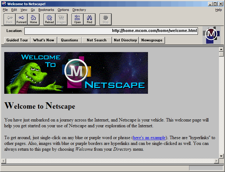
Figure 20: A screenshot of Mosaic/Navigator.
While this did get a bit monotonous, it was at least consistent, and it set the baseline for user expectations. To this day users interpret underlined text as a hyperlink. They may not expect all links to have underlines, but they expect all underlines to be links. It is best not to clash with that expectation.
Some sites still use blue and purple links, and those link colours are still the default for unstyled content in most browsers. While you can always go retro and stick with this colour set, users are generally comfortable with other options — within certain boundaries.
User expectations
There are some general rules for user expectations regarding links:
- Users expect links to look different from other text which is not a link
- Users expect links to react when they hover or focus on the link
- Users expect links to change after they have visited that link
- Users expect consistency in link styles of the same functionality so they know what to click
- Users expect underlined text to be a link, so don’t use underlines for anything else
You should always follow these basic rules, as they will help your users quickly identify and use links. You do not want to create styles that make users stop and think, “which bits are the links?”
These expectations translate to some simple coding rules:
- set styles for all link states
- only use underlining for links
Use colour carefully
When you are styling links, be careful not to rely entirely on colour to distinguish between link states. Not everyone sees colour in the same way, so you should combine colour with styles (such as different underlines, icons, or reversed colours) for differentiation.
You should also check that your colour choices have enough contrast—this is easy using tools like the Colour Contrast Analyser (for both PC and Mac) or the Web Accessibility Toolbar for Opera (both from the Paciello Group).
The Colour Contrast Analyser allows you to use a colour picker to select the foreground and background colours on screen, and then receive a simple evaluation of their contrast:
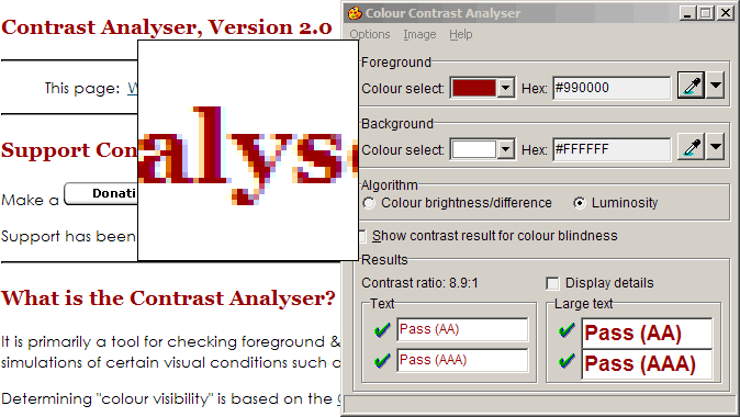
Figure 21: Screenshot of the Colour Contrast Analyser in use.
If all four results show a pass, the colour combination is okay. Remember to check all link states; you may need to enter some of them manually in the “hex” field to check focus, hover, and active.
Getting down to business: the CSS
Now that you understand some ground rules for links, let’s get into some code. This section details all the CSS you’ll need to sucessfully style links.
Styling link states in the right order
First, be aware that if you do not place your links styles in the right order in your stylesheet, the settings will override each other and the link states won’t work. Your link styles must always be in the following order:
linkvisitedfocushoveractive
A common mnemonic for remembering this is "Lord Vader’s Former Handle, Anakin". (If you’re not a Star Wars fan, I’m afraid you’ll just have to remember it the hard way!) Also popular, however, is the mnemonic "LoVe Fears HAte".
The different link states are styled using their “pseudo classes” — :link, :visited, :focus, :hover, and :active — which you append to the link element selector a. So your starting CSS should look like this:
a:link {}
a:visited {}
a:focus {}
a:hover {}
a:active {}
If you want to set a CSS rule for all links in all states, you can style a directly, before styling the pseudo-classes. Just remember to place the generic rule first, to preserve the order:
a {}
a:link {}
a:visited {}
a:focus {}
a:hover {}
a:active {}
This is useful if you are planning to replace the default underline with a bottom border, which is a common way to gain better visual control of the style.
Controlling defaults
By default, most browsers set all links to have an underline and focus state links to have an outline:
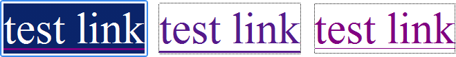
Figure 22: Left to right: the default focus styles for Opera 9, Firefox 2, and IE7.
If you are replacing these styles with something else, you can change or disable these defaults.
Underlining
Underlining is set using the text-decoration property:
a {
  text-decoration: underline;
}
You can disable the underline by setting the property to none:
a {
  text-decoration: none;
}
Even if you are preserving the underline style, you may find it easier to disable text-decoration and use border-bottom instead to set a faux underline. We will go through this in the example below.
Outline
The focus outline is controlled by the outline property. Outline is much the same as border, but it does not take up space or cause the page to re-flow when it appears (note that it is not supported in IE7 and below). The easiest way to control all four sides of an outline is with the shorthand property:
a:focus {
  outline: thick solid #000;
}
This example would produce:

Figure 23: Example rendering of a thick black outline.
If you are in doubt about what to do with the outline, just leave it to the browser default.
Recreating the Netscape defaults
As an easy example of link styles, let’s recreate the old Netscape defaults of blue, purple, and red. We’ll keep the underline, but extend the active state to use italics. We’ll also increase the text size for the sake of the example, and set the page to use a white background:
body {
  background: #fff;
  color: #000;
  font-size: 2em;
}

a {
  text-decoration: underline;
}

a:link {
  color: #0000CC;
}

a:visited {
  color: #6D006D;
}

a:focus {
  color: #CC0000;
}

a:hover {
  color: #CC0000;
}

a:active {
  color: #CC0000;
  font-style: italic;
}
This should produce:

Figure 24: recreating the Netscape defaults.
Faux underlines using border-bottom
Many designers have observed that the default link underline is a bit thick, and cuts through descenders of lowercase type — that is, the line goes through the bottom of the letters g, j, p, q, and y:

Figure 25: The underline cuts through lowercase type descenders.
You might instead like the underline to be thinner and to not touch the text. To carry out this common effect, we’ll use a border instead of an underline:

Figure 26: Using a border instead of an underline gives nicer results.
First, disable the underline for all link states, then set a bottom-border to match the link colour for each state:
body {
  background: #fff;
  color: #000;
  font-size: 2em;
  line-height: 2em;
}

a {
  text-decoration: none;
}

a:link {
  color: #00c;
  border-bottom: 1px solid #00c;
}

a:visited {
  color: #6D006D;
  border-bottom: 1px solid #6D006D;
}

a:focus {
  color: #c00;
  border-bottom: 1px solid #c00;
}

a:hover {
  color: #c00;
  border-bottom: 1px solid #c00;
}

a:active {
  color: #c00;
  border-bottom: 1px solid #c00;
  font-style: italic;
}
This should produce:

Figure 27: The faux-underline in action.
If you use this faux border method, be careful that you have sufficient line-height set to avoid the underline clashing with the next row of text.
Styles that don’t rely on colour
Because the example so far relies purely on colour to distinguish four of the five link states, we should take the next step and make the bottom borders unique for visited, focus, and hover. Let’s give visited links a dotted border, and hovered and focused links a dashed border:
body {
  background: #fff;
  color: #000;
  font-size: 2em;
}

a {
  text-decoration: none;
}

a:link {
  color: #00c;
  border-bottom: 1px solid #00c;
}

a:visited {
  color: #6D006D;
  border-bottom: 1px dotted #6D006D;
}

a:focus {
  color: #c00;
  border-bottom: 1px dashed #c00;
}

a:hover {
  color: #c00;
  border-bottom: 1px dashed #c00;
}

a:active {
  color: #c00;
  border-bottom: 1px solid #c00;
  font-style: italic;
}
This should produce:

Figure 28: Changing the border style for each link state.
Accepting focus and hover as equivalent styled states, this method means the link states are now distinguished by more than just colour. Even if you were to view these links in black and white, you could identify the different link states:

Figure 29: The link states are now distinguishable even in black and white.
Icons on links
Some sites use icons and symbols to add information about their links. For example, some sites use an arrow to indicate that a link goes to an external site, or they use a tick (check mark) to show that the link has been visited.
These effects are simple to achieve with background images:

Figure 30: An example of links with distinguishing icons.
To add an arrow icon to external links you could add the class “external” to the link tag:
<a href="http://example.com/" class="external">external link</a>
Then in your stylesheet, set a background image for that class — remembering to add padding to accommodate the image:
a.external {
  background: #fff url("icon-external.gif") center right no-repeat;
  padding-right: 30px;
}
This example would apply the icon to all instances of external links, in all states. If you want to restrict the icon just to unvisited external links, you can combine classes and the link state pseudo-classes in your selector:
a.external:link {
  background: #fff url("icon-external.gif") center right no-repeat;
  padding-right: 30px;
}
Combining classes and states opens up a wide range of creative possibilities for your links. Remember to check your colours; your only limitation from this point is creativity.
Conclusion
A good grasp of styling lists and links is essential for web developers, as they are used everywhere, and are routinely combined to create site navigation. While a clear link style is critical for the ease of use of any site, bad link styles can be seriously confusing for everyone and may even make a site unusable for some people. Use good judgement in your styles, don’t violate user expectations and, above all, be consistent.
See also
Exercise questions
- How do you choose between basic list styles, for example square bullets or Roman Numerals on an ordered list?
- What is an image sprite and why would you use one?
- Why is colour contrast important and how do you make sure your link colours are using suitable colours?
- What is the correct order for setting styles on the different link states?
Further reading
- WCAG Samurai Errata for WCAG 1.0, with specific reference to Guideline 2. Don’t rely on colour alone.
- Type and Colour (a chapter from Building Accessible Websites, by Joe Clark)
- Juicy Studio: Highlighting Links
- Max Design—Simple, accessible external links
- Resource Center—Contrast Analyser 2.0 (Paciello Group)
- A List Apart: CSS Sprites: Image Slicing’s Kiss of Death
Note: This material was originally published as part of the Opera Web Standards Curriculum, available as 32: Styling lists and links, written by Ben Buchanan. Like the original, it is published under the Creative Commons Attribution, Non Commercial - Share Alike 2.5 license.