The Web Standards Model — HTML, CSS and JavaScript
Summary
Continuing with our course, the concepts/internet_and_web/How_does_the_Internet_Work — HTML, CSS and JavaScript have been introduced. Now it’s time to dig a little deeper and to look at each of these — what they do, and how the three interact with each other to create a website.
Why separate?
That’s usually the first question that gets asked about web standards. You can accomplish content, styling and layout just using HTML — font elements for style and HTML tables for layout, so why should we bother with this XHTML/CSS stuff? Tables for layout, etc. is how it used to be done in the bad old days of web design, and many people still do it like this (although you really shouldn’t), which is one of the reasons why we created this course in the first place. We won’t be covering such methods in this course. Here are the most compelling reasons for using CSS and HTML over outdated methods:
- Efficiency of code: The larger your files are, the longer they will take to download, and the more they will cost some people to view (some people still pay for downloads by the megabyte.) You therefore don’t want to waste your bandwidth on large pages cluttered up with styling and layout information in every HTML file. A much better alternative is to make the HTML files stripped down and neat, and include the styling and layout information just once in a separate CSS file. To see an actual case of this in action, check out the A List Apart Slashdot rewrite article where the author took a very popular website and re-wrote it in XHTML/CSS.
- Ease of maintenance: Following on from the last point, if your styling and layout information is only specified in one place, it means you only have to make updates in one place if you want to change your site’s appearance. Would you prefer to update this information on every page of your site? I didn’t think so.
- Accessibility: Web users who are visually impaired can use a piece of software known as a “screen reader” to access the information through sound rather than sight — it literally reads the page out to them, and it can do a much better job of helping people to find their way around your web page if it has a proper semantic structure, such as headings and paragraphs. In addition keyboard controls on web pages (important for those with mobility impairments that can’t use a mouse) work much better if they are built using best practices. As a final example, screen readers can’t access text locked away in images, and find some uses of JavaScript confusing. Make sure that your critical content is available to everyone.
- Device compatibility: Because your HTML/XHTML page is just plain markup, with no style information, it can be reformatted for different devices with vastly differing attributes (eg. screen size) by simply applying an alternative style sheet — you can do this in a few different ways (look at the [mobile articles on dev.opera.com] for resources on this). CSS also natively allows you to specify different style sheets for different presentation methods/media types (eg. viewing on the screen, printing out, viewing on a mobile device.)
- Web crawlers/search engines: Chances are you will want your pages to be easy to find by searching on Google, or other search engines. A search engine uses a “crawler”, which is a specialized piece of software, to read through your pages. If that crawler has trouble finding the content of your pages, or mis-interprets what’s important because you haven’t defined headings as headings and so on, then your rankings in relevant search results will probably suffer.
- It’s just good practice: This is a bit of a “because I said so” reason, but talk to any professional standards-aware web developer or designer, and they’ll tell you that separating content, style, and behaviour is the best way to develop a web application.
Markup, the basis of every page
HTML and XHTML are markup languages composed of elements, which contain attributes (some optional and some mandatory.) These elements are used to mark up the various different types of content in documents, specifying what each bit of content is supposed to be rendered as in web browsers (for example headings, paragraphs, tables, bulleted lists etc.)
Elements define the actual content type, while attributes define extra information about those elements, such as an ID to identify that element, or a location for a link to point to. You should bear in mind that markup is supposed to be as semantic as possible, ie it is supposed to unambiguously describe the function of the content. Figure 1 shows the anatomy of a typical element.
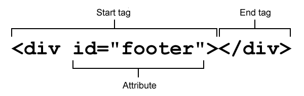
Figure 1: Anatomy of an (X)HTML element.
With that in mind, just what is the difference between HTML and XHTML?
What is XHTML?
HTML is the oldest web language, and the most common one you’ll find on the web - it is a bit more forgiving in terms of strict syntax rules. XHTML on the other hand is a reformulation of HTML as an XML vocabulary, XML being a separate markup language with much stricter syntax rules. The difference between XHTML and HTML doesn’t really matter so much any more, unless you find youself working in a web team in the future that has coding guidelines that favour one style or another. If you are using HTML5, which we will be doing throughout this course, then you are free to use HTML or XHTML syntax. Choose whatever you are most comfortable with, as long as you stick to the best practices outlined in the course.
Main syntax differences between HTML and XHTML. (Source: The web standards model)
HTML:
- Elements and attributes are case insensitive, eg.
<h1>is the same thing as<H1>. - Certain elements don’t need a closing tag (eg. paragraphs,
<p>), while others (called “empty elements”) shouldn’t have a closing tag (eg. images,<img>). - Attribute values may be written without being enclosed in quotes.
- Shorthand can be used for certain attributes (ie
<input required>).
XHTML:
- Elements and attributes are case sensitive; they are all lowercase.
- All elements must be explicitly closed (eg.
<p>A paragraph</p>). Elements without content should be closed using a slash in the start tag (eg.<hr></hr>and<hr/>mean the same thing). - Attribute values must be enclosed by quotes.
- The full attribute form must be used for all attributes (eg.
<input required="required">).
Table 1: Differences between HTML and XHTML.
Validation, what’s that?
Because HTML/XHTML are standards (and CSS too, for that matter), the World Wide Web Consortium (W3C) has created great tools called validators to automatically check your pages for you, and point out any problems/errors your code might have, such as missing closing tags or missing quotes around attributes. The HTML validator is available online. It will automatically detect whether you’re using HTML or XHTML, and which doctype you’re using. If you want to check out your CSS, there is also a CSS validator available. You can also find a special HTML5 validator online, which tends to be more up to date than the W3C one, as far as HTML5 is concerned.
For more information on validation, see Validating your HTML . For more information on doctypes, see Choosing the right doctype for your HTML documents.
CSS — let’s add some style
Cascading Style Sheets gives you fine control over the formatting and layout of your document. CSS works on a system of rules, which select the elements you want to style, and then set values for different properties of the elements. You can change or add colors, backgrounds, font sizes and styles, and even position things on your web page in different places. Here is an example CSS rule:
p {
   line-height: 2;
   color: green;
}
Now any content enclosed within <p></p> tags will have double the line height, and be colored green.
The example below will give you more of an idea of how CSS styles HTML; we’ll start looking at CSS in way more detail in CSS basics.
JavaScript — adding behaviour to web pages
Finally, JavaScript is the scripting language that you use to add behaviour to your web pages — it can be used to validate the data you enter into a form (tell you if it is in the right format or not), provide drag and drop functionality, change styles on the fly, animate page elements such as menus, handle button functionality, and a million other things. Most modern JavaScript works by finding a target HTML element, and then doing something to it, just like CSS, but the way it operates, the syntax etc. is rather different.
JavaScript is a more complicated and expansive subject than HTML and CSS, so to keep things simple and avoid confusion at this stage, I won’t be discussing it in the below example. In fact, you won’t be looking at JavaScript in this course again until Programming - the real basics.
An example page
There are a lot of details I haven’t covered here, but we’ll get through everything during this web design course! For now, I’ll present you with a real page example, just to give you a taste of what you’ll be working with in the rest of the articles.
The example I present below is a references page, which you could use to cite references at the end of say, a psychology essay on the group dynamics of a web development team, or a report for work on broadband Internet use in the United States. Please note, that if you’re a stickler for strict academic writing, this example shows APA formatting (I had to pick one). You can download a zip file containing the example HTML and CSS for this example.
index.html
<!DOCTYPE html>
<html xmlns="http://www.w3.org/1999/xhtml">
<head>
  <meta charset="utf-8"/>
  <title>References</title>
  <style type="text/css">
    @import url("styles.css");
  </style>
</head>
<body>
  <div id="bggraphic"></div>
  <div id="header">
    <h1>References</h1>
  </div>
  <div id="references">
    <cite class="article">Adams, J. R. (2008). The Benefits of Valid Markup: A Post-Modernistic
    Approach to Developing
    Websites. <em>The Journal of Awesome Web Standards, 15:7,</em> 57-62.</cite>
    <cite class="book">Baker, S. (2006). <em>Validate Your Pages.... Or Else!.</em>
    Detroit, MI: Are you out of your mind publishers.</cite>
    <cite class="article">Lane, J. C. (2007). Dude, HTML 4, that's like so 2000. <em>The
     Journal that Publishes Genius, 1:2, </em> 12-34.</cite>
    <cite class="website">Smith, J. Q. (2005). <em>Web Standards and You.</em>
    Retrieved May 3, 2007 from Web standards and you.</cite>
  </div>
  <div id="footer">
    <p>The content of this page is copyright © 2007 <a href="mailto:jonathan.lane@gmail.com">J. Lane</a></p>
  </div>
</body>
</html>
I’m not going to dissect this file line by line, as you’ll see many examples in future articles, however, a few major things to take note of are as follows.
Line 1 is what’s called the document type declaration, or doctype. In this case, the page is an HTML5 page. The original idea of doctypes was to specify a set of rules that your markup has to follow, and can be validated against, but in actual fact all it really does is to make your browser render the page properly, in what is called "standards mode". The HTML5 doctype is therefore the shortest sequence of characters that will do this. See Choosing the right doctype for your HTML documents for more on doctypes.
Lines 5 to 7 import a CSS file into the page — the styles contained in this file will be applied to the various elements on the page. You’ll see the content of the CSS file that handles all of the formatting for the page in the next section. I’ve assigned a different class to each of the different types of reference. Doing this lets me apply a different style to each type of reference — for instance in our example I’ve put a different color to the right of each reference to make it easier to scan the list.
The page looks like Figure 2 without the CSS applied:
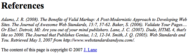
Figure 2: the raw HTML, without any CSS styling
Now let’s take a look at the CSS that styles the HTML.
styles.css
body {
  background: #fff url('images/gradbg.jpg') top left repeat-x;
  color: #000;
  margin: 0;
  padding:0;
  border: 0;
  font-family: Verdana, Arial, sans-serif; font-size: 1em;
}

div {
  width: 800px;
  margin: 0 auto;
}

#bggraphic {
  background: url('images/pen.png') top left no-repeat;
  height: 278px;
  width: 362px;
  position: absolute;
  left: 50%;
  z-index: 100;
}

h1 {
  text-align: center;
  text-transform: uppercase;
  font-size: 1.5em;
  margin-bottom: 30px;
  background: url('images/headbg.png') top left repeat;
  padding: 10px 0;
}

#references cite {
  margin: 1em 0 0 3em;
  text-indent: -3em;
  display: block;
  font-style: normal;
  padding-right: 3px;
}

.website {
  border-right: 5px solid blue;
}

.book {
  border-right: 5px solid red;
}

.article {
  border-right: 5px solid green;
}

#footer {
  font-size: 0.5em;
  border-top: 1px solid #000;
  margin-top: 20px;
}

#footer a {
  color: #000;
  text-decoration: none;
}

#footer a:hover {
  text-decoration: underline;
}
I went a little overboard with styling up this page, adding some neat background effects in order to show you some of the things that can be accomplished using CSS.
Line 1 sets some defaults for the document such as text and background color, width of border to add around the text, etc. Some people won’t bother to explicitly state defaults like these, and most modern browsers will apply their own defaults, but it is a good idea, as it allows you more control over how your website will look across different browsers.
On the next line I’ve set the page to be 800 pixels wide (although I could have specified a percentage here to have the page expand/contract based on the size of the browser window). The margin setting I’ve used here will ensure that the page content stays centered in the window.
Next let’s turn our attention to the background images used in the page (these are applied using the background: url declarations.) I’ve got 3 different background elements on this page. The first is a gradient that tiles across the top of the page giving us the nice blue fade. Second, I’ve used a semi-transparent PNG for the pen graphic in order to provide enough contrast with the text above it and to pick up the gradient (semi-transparent PNG images don’t work in Internet Explorer 6 or below, but they work in pretty much every modern browser; see Dean Edward’s IE-fixing JavaScript for an IE6 solution to this issue, which also fixes some of IE6’s CSS support issues.)
Finally, I’ve used another semi-transparent PNG for the background of our page heading. It gives the heading a little added contrast, and provides a neat effect.
The fully styled example looks like Figure 3.
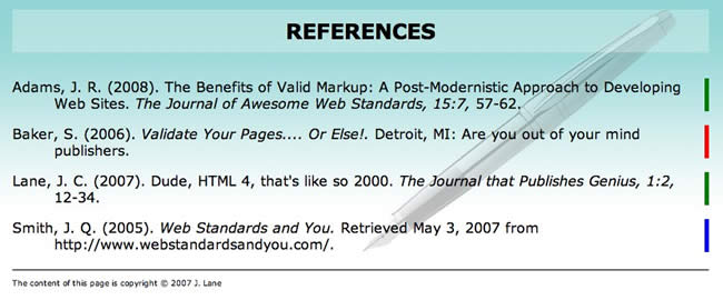
Figure 3: The finished example with styles applied.
The reality of it all
Something you should bear in mind when learning web standards is that what we are working towards here is an ideal. It would be so much easier if all web designers and developers used modern web standards and best practices to build websites, and all browsers in use today supported web standards perfectly. Unfortunately, neither is true - for a start, the web professionals making websites today have learned how to do so in many different ways, and at many different times. Some are still making websites using bad practices like tables and spacer gifs, which is what most of us used to do back in the late nineties. Most web professionals taught themselves, and even those of us who did do an official qualification of some kind did not necessarily get taught “the right way” to do things. Many of the university and college courses out there are …shall we say… behind the times.
If you talked to many of those who do things using the old methods about updating their skill set, they would probably say “why bother - my way works, and I don’t have time to learn new skills, so I’m just sticking to what I know.” You can understand this argument, but if they could just take the time to update their skills, I’m sure they would find creating cross browser websites and maintaining their code a lot easier. They would also get better accessibility and SEO thrown into the bargain. For now, I’d advise those of you learning to do things right from the start with courses like this to carry on doing what you are doing! Also, if you get the chance to pass on some of these modern best practices to others, then you will be doing the Web a favour.
And in terms of web browser support, all modern browsers now support HTML, CSS and JavaScript really well. The problem lies in legacy support for old versions of Internet Explorer - IE 6, 7 and 8 still have significant usage figures, so you may still be called upon to support these in web projects. You can work around lack of support for various features, and sometimes lack of support will mean a lesser (eg. it may not look as nice) experience that still works ok, rather than the site not working at all. This may still be fine, depending on your particular situation.
We’ll include more details on what to do with older browser support in subsequent chapters.
Summary
There is nothing mystical about HTML, CSS and JavaScript. They’re simply an evolution of the web. If you’ve already had some exposure to HTML, there is nothing to “unlearn”. Everything you know is still relevant, you’ll just have to handle certain things a different way (and be a little more careful in your markup).
Aside from getting the satisfaction of a job well done, web standards development just makes sense. The counter-arguments to developing with standards is that it’s time consuming and a pain in the neck having to make a layout work across browsers. The opposite argument could be applied to making a non-standards-based layout work across a range of devices and with future browser versions. How can you be certain that your hobbled-together markup will display at all in future versions of Opera, Firefox, Safari, Chrome, Internet Explorer, etc.? You can’t, unless you follow the rules.
See also
External resources
Introduction to HTML & CSS - a practical course on the free e-Learning platform Codecademy.
Exercise questions
- What’s the difference between a class and an ID?
- What role do XHTML, CSS and JavaScript each play on a website?
- Take the index.html file from the example provided, and change the formatting using the CSS alone (I’d suggest editing the file using a text editor such as Notepad or Text Wrangler). Do not make any changes to the HTML.
- Add an icon for each of the different reference types (a different icon for articles, books and web resources). Create your own icons for this purpose, and make them appear alongside the different reference types using CSS alone.
- Hide the copyright notice at the bottom of the page.
- Change the look of the title, make it distinctive.
- What sorts of things could you do to the CSS to make this example work well on a mobile phone browser?